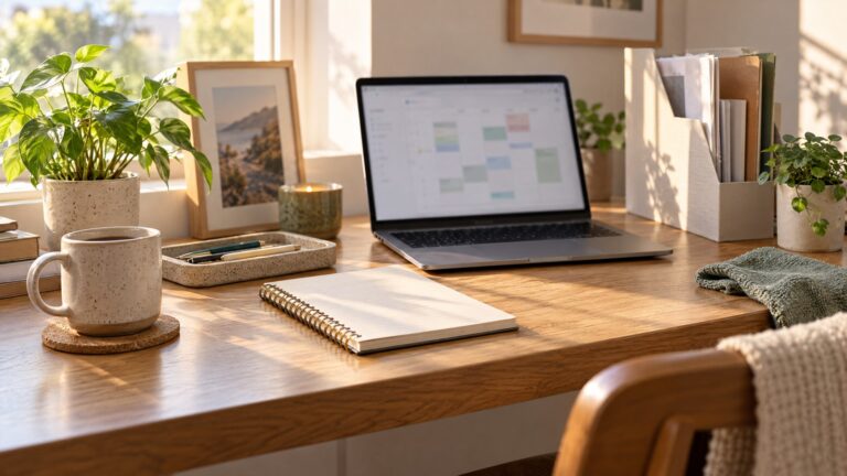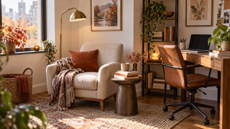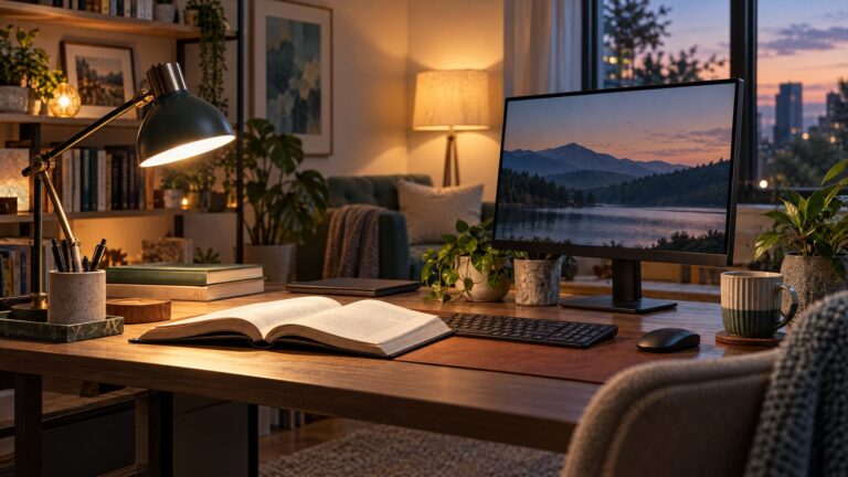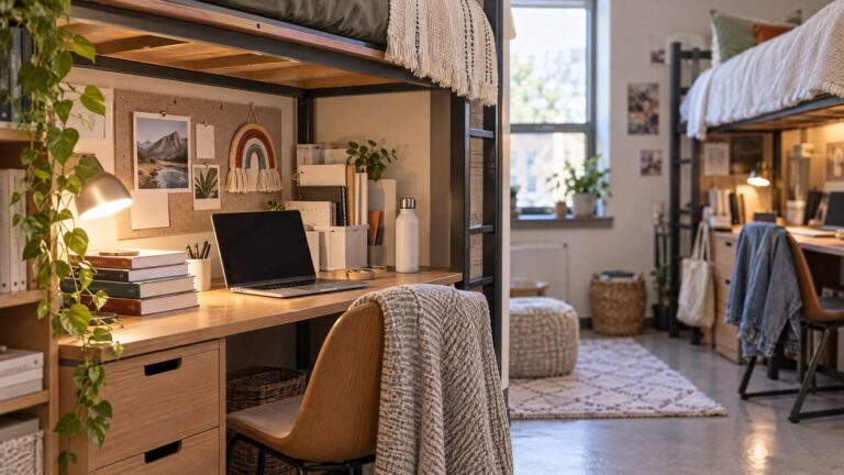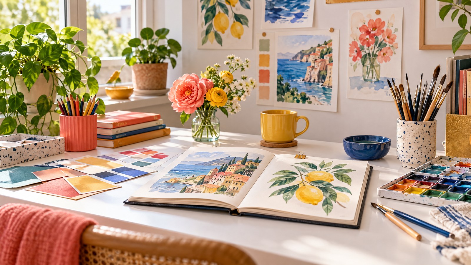
Colorful Desk Decor Ideas for a Creative Space That Still Feels Organized
A bright, inspiring desk doesn’t have to mean cluttered chaos. For makers and designers, color is fuel: it sparks ideas, sets mood, and can even help you locate tools at a glance. The trick is a controlled color strategy—selecting palette roles, creating color zones for tasks, adding a small rotating inspiration board, and keeping the active work surface clean. Below are practical, stylish ways to make your desk colorful and deliberately organized so your creativity thrives without becoming visually overwhelming.
Why a controlled color strategy works
- Color evokes energy, focus, and emotion. But too many competing hues make it harder to see and prioritize.
- Giving colors specific roles—accent, background, and tool-identifiers—transforms color from decoration into a visual system.
- Small rituals (weekly resets, rotating inspiration) let color feel fresh while preserving a clear workspace.
Use the following sections to build a colorful desk that supports making, sketching, crafting, or digital design.
Choose palette roles, not just pretty colors
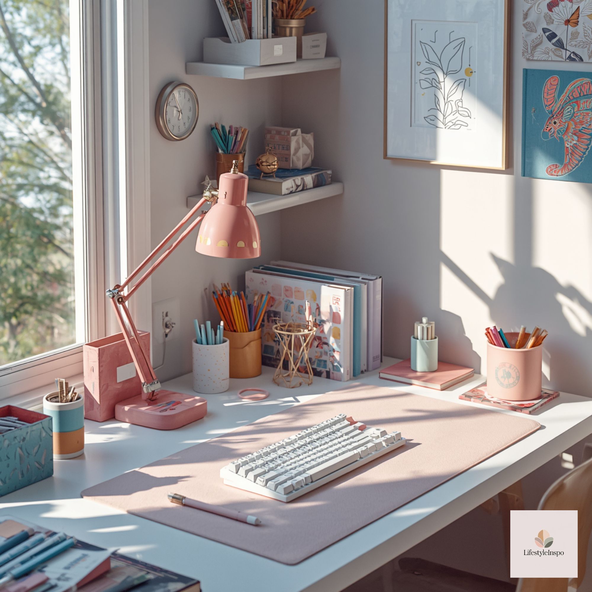
Start by picking a base palette with three clear roles:
- Base neutrals: two to three calm tones for large surfaces (desk mat, shelves, pegboard). These keep visual noise low.
- Accent color(s): one or two saturated hues that pop in small areas (pen cup, bulb lamp shade, sticky notes).
- Tool-identifiers: bright, distinct colors assigned to categories of items (e.g., blue = writing, coral = cutting tools, chartreuse = measuring devices).
Actionable example: pick warm sand and soft gray as base neutrals; choose teal as your everyday accent; assign magenta to all creative markers and lemon to measuring tools. When each object has a role, your eye learns to filter — the room feels colorful but ordered.
Create color zones for function and flow
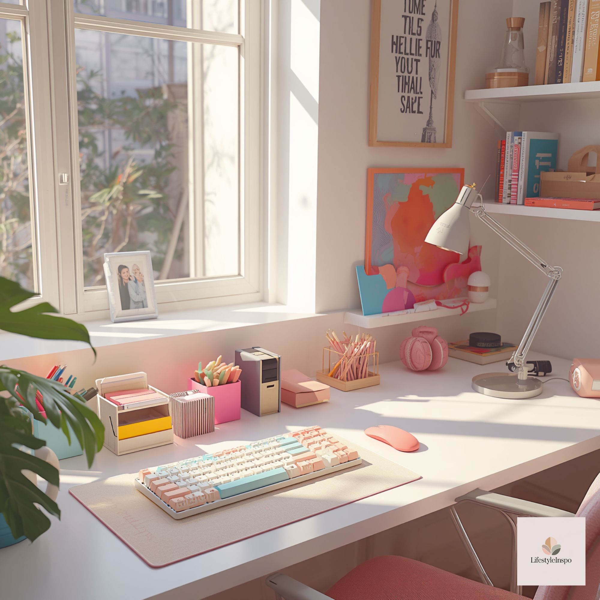
Divide your desk into three functional zones and let color guide their use:
- Deep work zone (center): neutral mat, minimal color, only essential tools for the current task.
- Tools and supply zone (left/right): use your tool-identifier colors here—organizers, trays, or drawer fronts in those hues.
- Inspiration and reference zone (near top/back): bolder accents and rotating visuals live here so they don’t compete with the immediate work area.
How to implement: place a neutral desk mat in the center. On the left, use a teal small-drawer unit labeled with adhesive color tabs (each tab matches the tool-identifier color). On the back wall, reserve a color-rich area for inspiration pieces framed by a thin accent border.
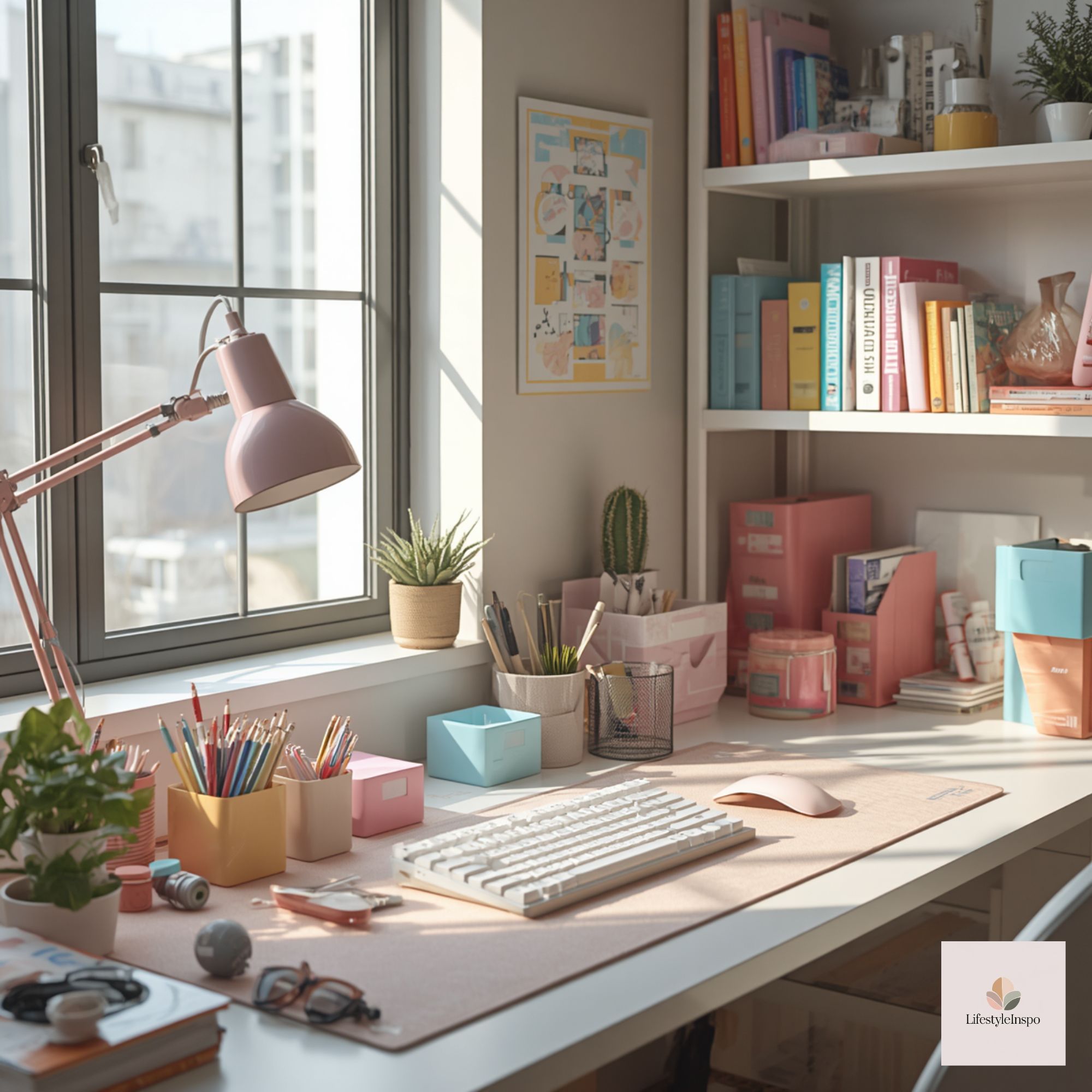
Color-zone tools: simple organizers that guide habits
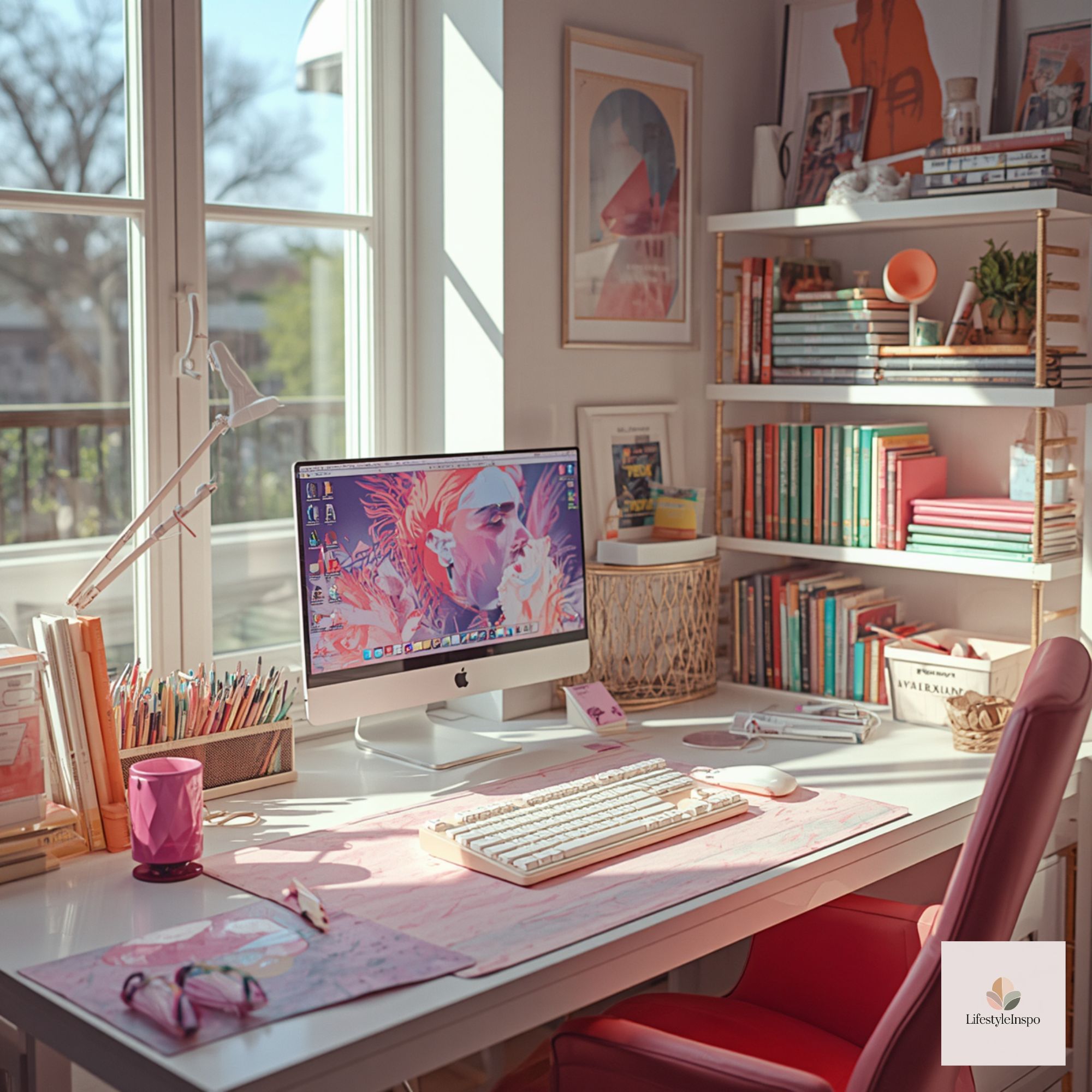
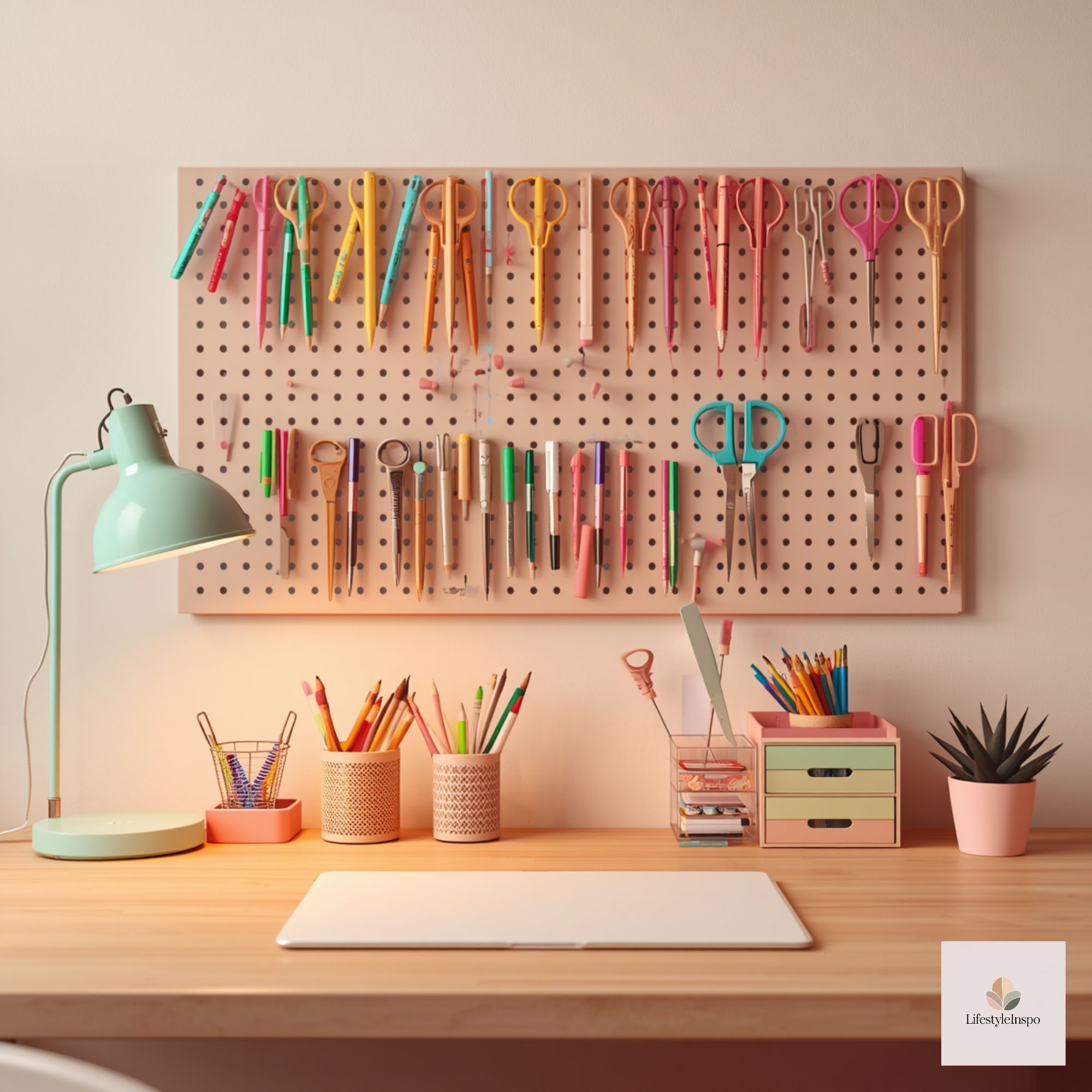
Use containers and holders in the tool-identifier colors. This makes tidying fast—just return items to containers that match their function.
Specific items to consider:
- Stackable acrylic trays in your accent hue for current projects.
- Mesh bins or fabric pouches in tool-identifier colors for pens, markers, and rulers.
- A small magnetic tin painted or covered with colored washi for metal bits.
Tip: label each container with a brief white label that contrasts with the container color. The labels keep the system readable even when colors are similar.
The small rotating inspiration board—keep it fresh, keep it small
A compact, changeable inspiration board serves creativity without adding clutter. The idea: one focused canvas of inspiration that rotates weekly or monthly so your eye only processes a limited set of visuals at once.
How to set it up:
- Choose a 9×12″ or A4 board that hangs above or sits on the back of the desk—small enough to avoid dominating the space.
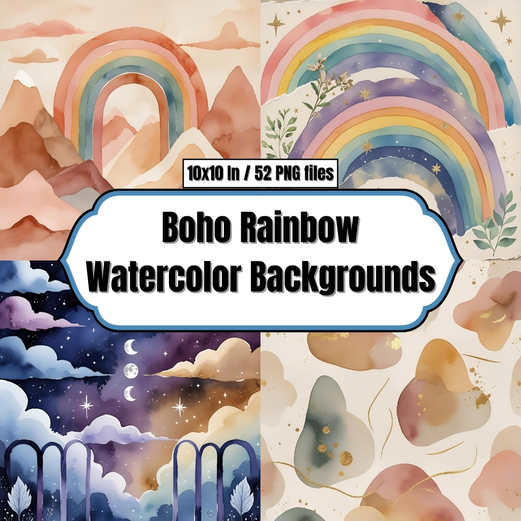
- Use clip art, fabric swatches, sketches, and a single printed digital asset as the focal point. For example, the Boho Rainbow Watercolor Backgrounds are digital clip-art assets that can inspire a color direction or be used as a background image in digital mood boards—remember to review the seller’s usage terms before reproducing files.
- Swap one or two items each week to keep ideas evolving while preventing a long collage of competing items.
Boho Rainbow Watercolor Backgrounds – Digital Paper Clip Art
Practical sequence: Monday morning, clip a single quote and one color swatch to the board. Thursday, replace the quote with a new sketch. Monthly, update the board’s color palette based on what you’re working on.
Use digital assets as inspiration, not finished decor
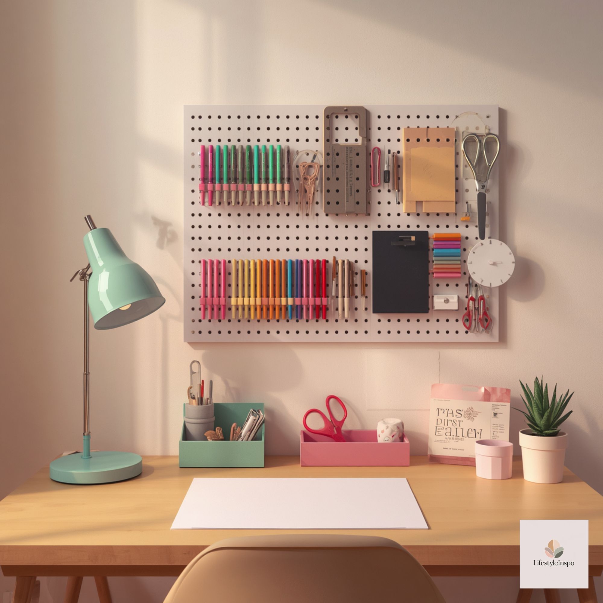
Digital clip-art and background files are excellent mood references and can help coordinate color across physical items, but treat them as inspiration rather than physical decor unless you follow the seller’s permitted uses.

Examples of digital assets that work well as guides:
- Boho Rainbow Watercolor Backgrounds are downloadable digital paper that can inform gradient and accent choices on your desk. Use them on-screen or as part of a digital mood board rather than assuming they’re printable decor—always check usage terms before reproducing.
- Art Room Background Scenes offer stylized room or studio visuals you can reference to try arrangement ideas or color pairings on a larger scale. Again, these are digital assets meant for inspiration.
How to use them practically: open a background file on a tablet or monitor as a color reference while shopping for organizers, or sample the palette on-screen to choose paint chips and textiles. This keeps your physical purchases aligned to a coherent color story.
Keep the active workspace clean: rituals and practical storage
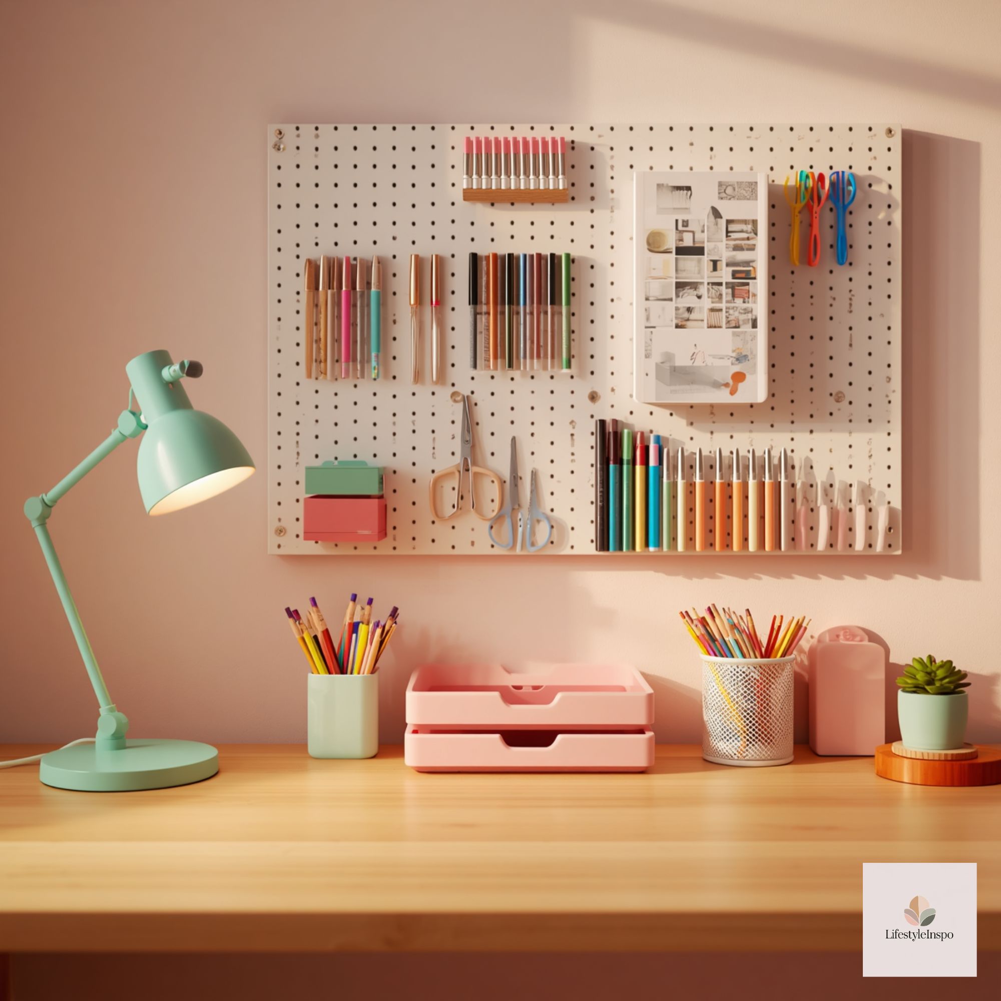
A colorful desk reads as tidy when the active area stays visually calm. Adopt small rituals and storage methods that respect the color system.
Daily ritual:
- End-of-day 5-minute reset. Put tools back into their color-coded containers, clear unrelated papers, and snap the inspiration board into its single-focus mode (remove anything that’s been there more than two weeks).
Storage solutions that preserve the center:
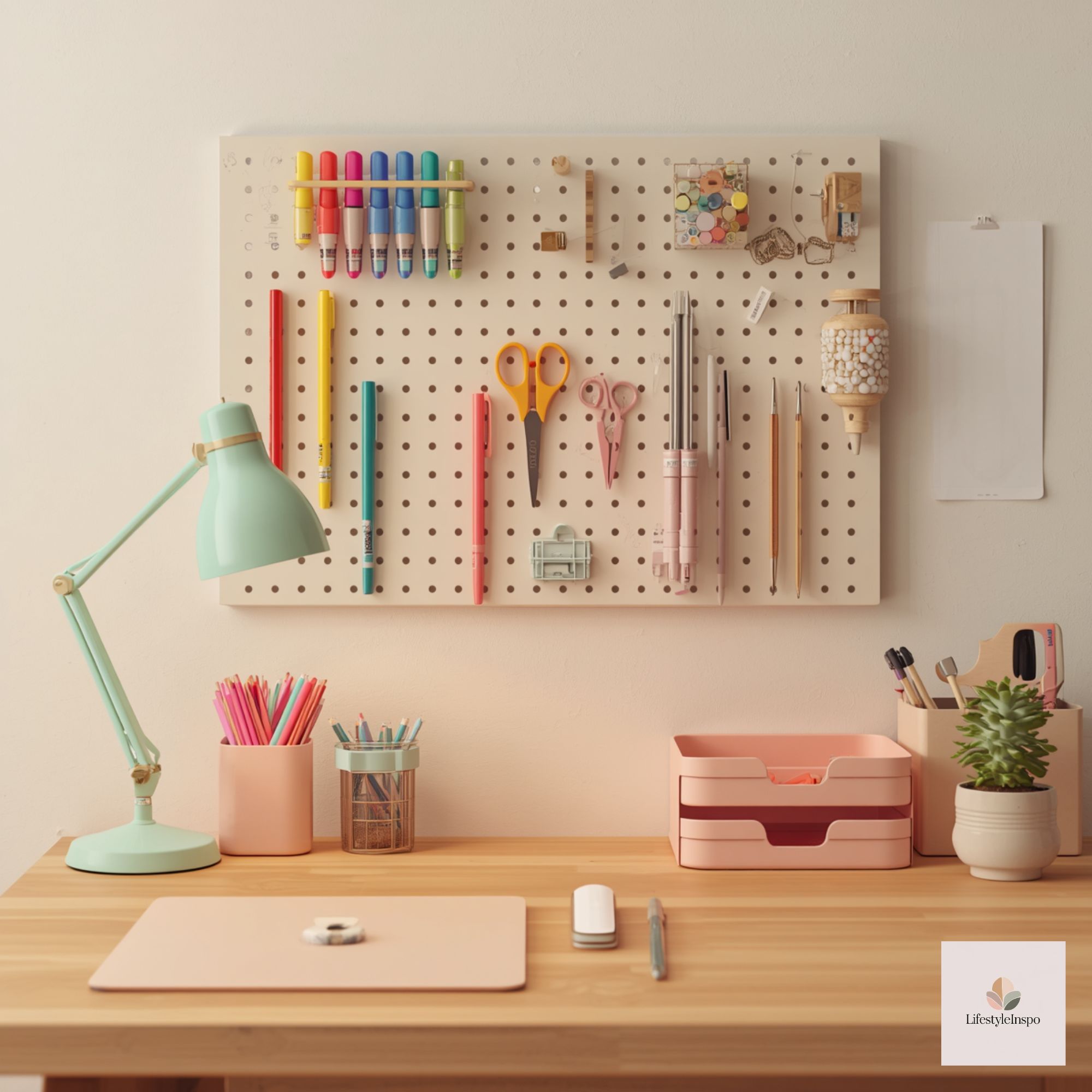
- A slim roll-up pencil holder in a neutral tone can protect the active area from tool clutter while keeping color-coded items accessible.
- Under-desk shallow drawers or an on-desk caddy matching your base neutral keep small items tucked away but easy to reach.
- Use clear-front boxes or labeled opaque bins for materials; the box fronts become a controlled stripe of color instead of an accidental collage.
Textures and small accents—layer without chaos
Colorful decor doesn’t have to be flat. Introduce textures selectively to add depth while keeping the eye guided:
- A woven desk pad in a neutral with a single accent edge.
- A felt coaster in your accent color for mugs.
- Small ceramic dishes in tool-identifier colors to corral clips, pins, and odd bits.
Layering rule: limit textures to two materials (e.g., wood and felt, or linen and metal). Too many different finishes creates visual friction.
Lighting and reflective balance—accent, not overload
Lighting should enhance color without competing. Use two layers:
- Functional task light in a neutral or accent shade positioned for shadow-free work.
- A small accent lamp or strip light behind the inspiration zone to make colors pop without flooding the desktop.
Practical note: if you want a colored lamp, choose a matte finish or a fabric shade that tones down reflections. That prevents shiny colors from becoming the dominant visual element.
Sample setups for different creative practices
Below are three concrete desk setups that use controlled color strategies, each aimed at a different maker or designer.
Graphic designer:
-
- Base neutrals: charcoal desk mat, white shelving.
- Accent color: teal (pen cup, mousepad edge).
- Tool-identifiers: lime for color swatches, magenta for markers.
- Digital inspiration: open Art Room Background Scenes on a secondary monitor to test composition and color direction (use as reference only; check reproduction rights).
Illustrator:
-
- Base neutrals: warm oak desk + soft-gray mat.
- Accent color: coral (lamp shade, small tray).
- Tool-identifiers: cobalt for pencils, mustard for paint brushes.
- Inspiration board: small rotating board with one printable sketch and one digital color swatch.
Crafter:
-
- Base neutrals: white desk with pale blue shelf.
- Accent color: sunflower yellow (storage box edges).
- Tool-identifiers: color-coded bins for scissors, tapes, and stamps.
- Keep active work area clear by using a neutral roll-up mat for messy projects.
Maintain contrast for visibility and safety
When color-coding, ensure sufficient contrast between tools and the background so you can locate items easily. A neon tool on a neon background loses its identifier role; a neon tool on a neutral background remains distinct.
Quick rule: for every tool-identifier color, test it against your base neutral—if it blends or causes strain, switch to a higher-contrast option.
Conclusion
Colorful desk decor ideas don’t have to mean visual chaos. By assigning palette roles, organizing into color zones, using color-coded tooling, keeping the active surface clean, and incorporating a small rotating inspiration board, you get the best of both worlds: a space that stimulates ideas while supporting focused work. Treat digital assets like the practical inspiration they are—use them on-screen or as mood guides and always confirm usage rights before printing or reproducing. With deliberate choices and a few simple habits, your desk becomes a lively, organized studio that reflects your creative practice.
About the Author