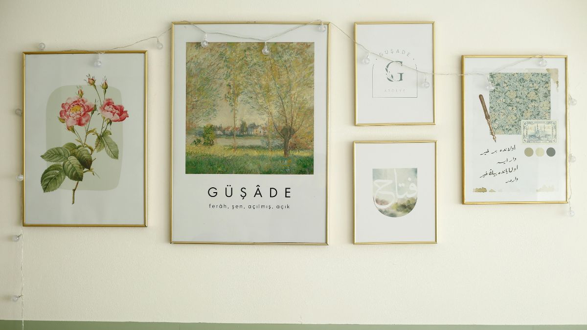
How to Create a Printable Gallery Wall (Without Spending a Fortune)
Nobody tells you this when you move into your first real apartment: the walls are the expensive part. Not the couch, not the rug — the walls. Framed art alone can eat a decorating budget before you’ve even picked a paint color, and suddenly that “effortless, curated” gallery wall you saved to a Pinterest board two years ago feels permanently out of reach.
Here’s the good news: it isn’t. A printable gallery wall — art you download, print at home or at a local shop, and frame yourself — is how a lot of the most photogenic apartments online actually get their walls looking like that. It’s not a shortcut so much as it’s the smart way in, and once you know the layout tricks, nobody can tell the difference between a $40 print and a $400 one.
This is your full guide to pulling it off, from planning your layout to picking pieces that actually feel like you.
Why Printable Art Is Having a Moment
Printable art isn’t a trend so much as a quiet correction. For years, “real” decor meant something shipped to you in a box from a big-name retailer, at big-name retailer prices. But renters move more often, budgets are tighter, and people want their spaces to change with them — not stay frozen because they spent too much to redo it.
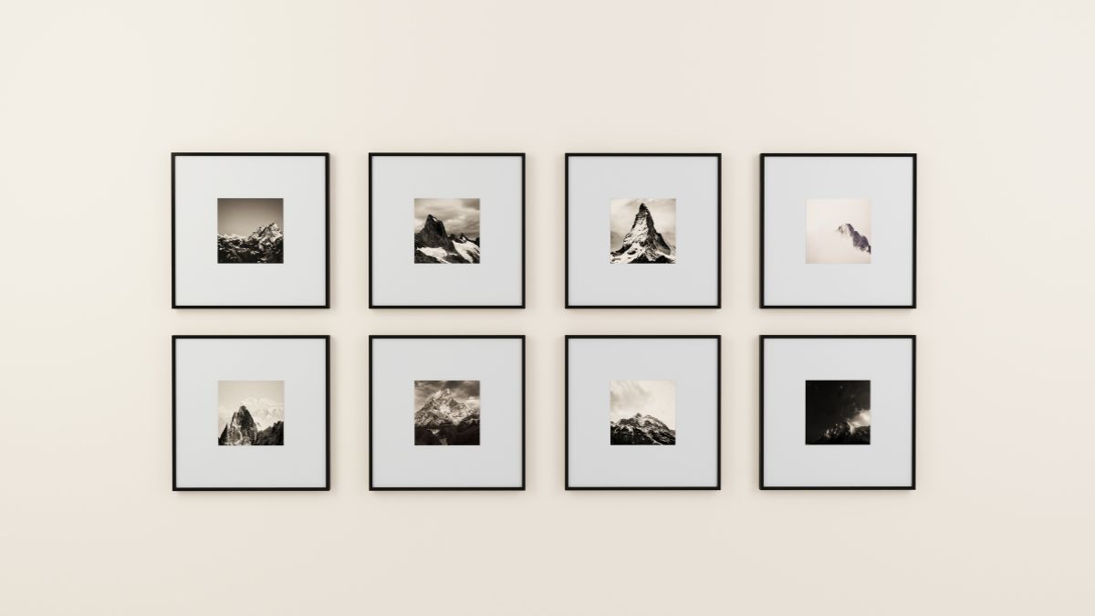
A printable download solves all three problems at once. You buy the file once, you can reprint it in a new size if you move, and most sets cost less than a single coffee run. It’s also just more fun: instead of scrolling the same five big-box art collections everyone else has, you’re picking from independent shops with genuinely distinct styles.
Step 1: Pick a Loose Color Story First
Before you fall in love with any single piece, zoom out. The number one thing that makes a gallery wall look “put together” instead of “random stuff I liked” is a shared color thread running through it — not matching frames, not matching subjects, just a palette that makes sense together.
Botanical greens and soft yellows. Warm neutrals with one punch of color. Whatever you choose, write it down before you start browsing, because it’s very easy to get thirty tabs deep and lose the plot.
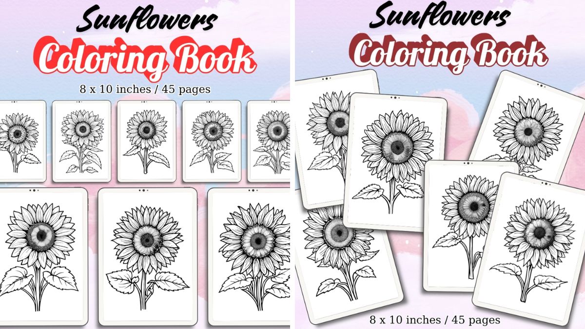
A piece like this Sunflowers Coloring Pages set is a great anchor for a warm, golden-hour palette — the kind of collection that makes a whole wall feel sunlit even in a north-facing room. Print one large-scale bloom as your centerpiece and build outward from there.
Step 2: Mix Scale, Not Just Subject Matter
The most common gallery wall mistake is using pieces that are all the same size. Even if the art varies, uniform sizing reads flat and a little stiff — like a hotel hallway. Real, lived-in gallery walls mix scale: one oversized statement piece, a handful of medium prints, and two or three small accents tucked into the gaps.
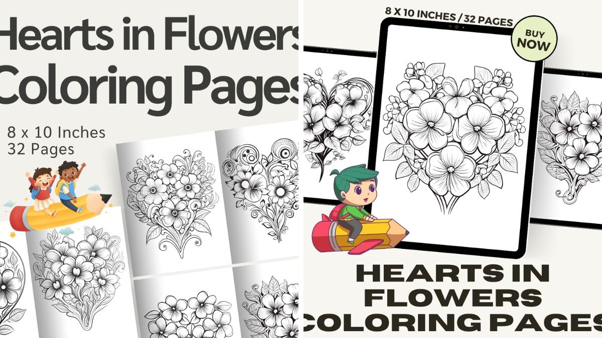
This is where florals genuinely shine, because botanical line work holds up beautifully at both large and small scale. A Hearts in Flowers print — with its delicate combination of soft blooms and linework — works gorgeous as a small accent piece nestled between two bigger frames, adding a little romance without competing for attention.
Step 3: Lay It Out on the Floor First (Always)
This step is non-negotiable, and it’s the one people skip when they’re excited and just want to start hammering nails. Lay your prints — framed or unframed — on the floor in the arrangement you’re imagining. Live with it for a day if you can. Walk past it. Make coffee and glance at it from across the room.
You will change your mind at least once, and it costs nothing to move paper around on the floor. It costs a lot more to spackle over three extra nail holes.
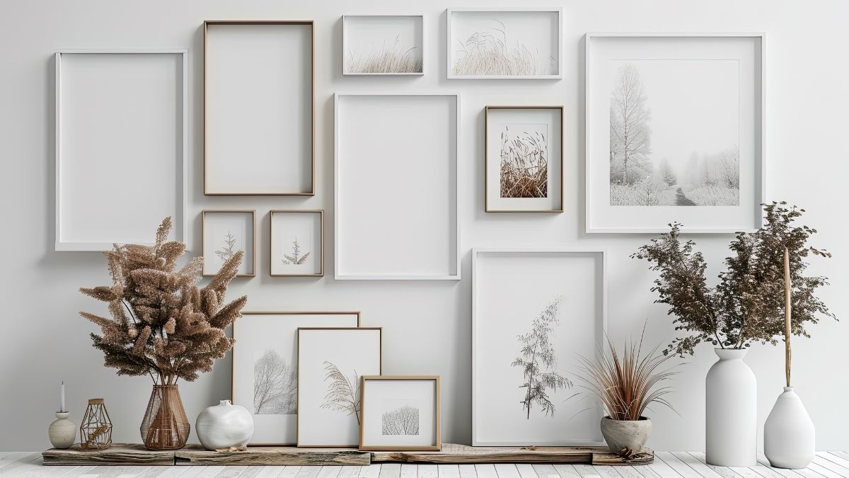
A simple rule that never fails: keep your spacing between pieces consistent — two to three inches is the sweet spot — and treat the whole arrangement as one shape, whether that’s a loose grid, an organic cluster, or a horizontal line above a console table.
Step 4: Frame Smart, Not Expensive
You don’t need eight different frame styles to make a gallery wall feel intentional. In fact, the opposite is usually true — sticking to two or three finishes (say, natural wood and matte black) reads far more curated than a frame from every era of your life.
Budget frame sets from big box stores work perfectly well here. The print is doing the visual heavy lifting; the frame just needs to stay out of its way. If you want a little variety without chaos, try matting your smaller pieces in white and letting your statement print go frameless with just washi tape or a simple clip frame for a more relaxed, editorial feel.
Step 5: Let a Few Pieces Do Double Duty
One thing seasoned decorators do that beginners often miss: choosing art with a little bit of texture or pattern so the wall doesn’t feel like a flat collage of squares. Geometric shapes are perfect for this — they break up all the organic floral lines without clashing with them.

The Geometric Watercolor Shapes digital paper set is an easy way to add that contrast. Print a few of the shapes large and simple, mat them generously, and use them as visual breathing room between your busier floral pieces.
Step 6: Add One Unexpected Piece
Every gallery wall that actually looks like you — and not a showroom — has one piece that doesn’t perfectly match the rest. Maybe it’s a family photo, a ticket stub in a tiny frame, or a print that speaks to something you love outside of the “aesthetic.”
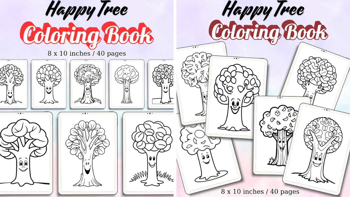
If nature and growth feel like part of your story, a piece like the Happy Tree print adds a sweet, whimsical note that keeps the whole wall from feeling too serious. Gallery walls are allowed to have a sense of humor.
A Few Practical Printing Tips
- Print at home for drafts, print at a shop for final copies. Home printers are great for testing scale and placement, but a local print shop or an online service will give you noticeably crisper color and thicker paper for the pieces staying up long-term.
- Matte paper over glossy, almost always. Glossy paper reflects light and can wash out detail, especially near windows.
- Size up before you size down. It’s almost always better to print one piece slightly larger than you think you need than to end up with a wall that feels like it’s shrinking into the corner.
The Takeaway
A gallery wall doesn’t need a big budget — it needs a plan, a loose color story, and a little patience with the floor-layout step everyone wants to skip. Once it’s up, nobody walking into your space is going to ask what you paid for each piece. They’re just going to ask where you found them.
About the Author