Make a Camera-and-Flowers Print Feel at Home in a Creative Studio
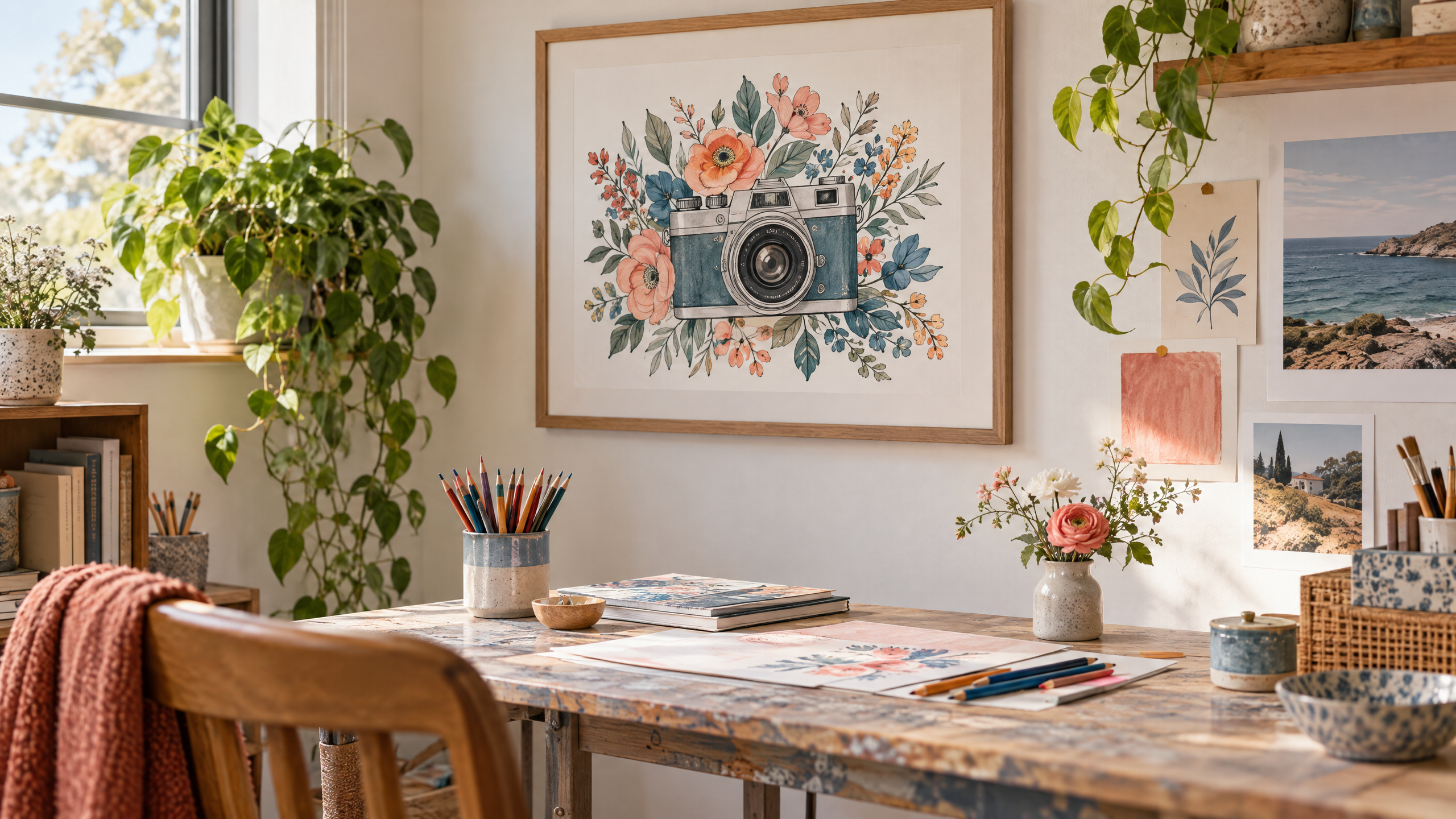
A creative studio should feel intentional: a place where ideas land, craft supplies are within reach, and the walls reflect what you make and who you are. If you’ve found a charming camera-and-flowers coloring page and want it to look like purposeful creative studio wall decor—not a hastily taped print—this is the guide for you. Below you’ll find specific layout plans, framing and matting choices, lighting and placement strategies, storage-friendly display ideas, and ways to adapt the look to different budgets and rental constraints. Think of the coloring page as a starting point—an image you can customize with color and mixed media, then elevate into a gallery-quality focal point.
Why a camera-and-flowers motif works in a studio
- Dual symbolism: a camera suggests observation and documentation; florals bring softness and life. Together they speak to creative process—seeing and making.
- Versatility: inked outlines are ideal for coloring, watercolor washes, or mixed-media overlays. That means the same page can look minimal and graphic or richly textured depending on how you finish it.
- Scaleable: the image works as a single statement piece, part of a small curated grid, or integrated into a larger gallery wall.
Before you start: practical prep and mindset

- Check the product details and terms on the seller’s listing so you know what to expect (file/format or print options, commercial-use rules if needed). For the specific camera-and-flowers coloring pages referenced here, see Camera With Flowers Coloring Pages.
- Decide how much customization you want. Will you color the page yourself? Add collage elements? Scan and digitally scale it? Your chosen method affects framing and durability choices.
- Measure your wall and identify the “viewing distance.” Studio walls are often seen from a few feet away while you work; scale your pieces accordingly. A 20–30″ framed print is typically comfortable as a near-surface focal point; a grid of smaller 8–12″ frames creates a reading experience that rewards closer inspection.
Camera With Flowers Coloring Pages / Sheets of Camera With Flowers {Coloring Book}
Layout plans: three curated compositions for a creative studio wall
1) The Center-Focused Anchor
- Best for: a wall behind a central easel, mannequin, or clearing where you photograph work.
- Composition: one large camera-and-flowers piece (24–30″ frame) centered about 60–66″ from the floor to the midline—this keeps it at eye level for standing and seated studio tasks.
- Styling tips: surround the frame with functional accents rather than purely decorative ones—quilted pegboard shelves, a slim rail with clips for recent sketches, or a small magnetic rack for metal tools. These should be balanced and not clutter the primary image.
- Materials: choose a deeper frame (1″ or more) and UV-protective glass or acrylic if you expect sunlight or frequent handling.
2) The Mini-Gallery Grid
- Best for: narrow walls or rooms with multiple creative zones.
- Composition: four identical 11×14 pieces or a mix of one 16×20 plus three 8x10s. Use the camera-and-flowers page as the primary motif (repeat it in one or two frames) and pair it with complementary patterns—monochrome botanical studies, neutral abstract washes, or black-and-white photography from your archive.
- Styling tips: keep mats consistent (same color and width) and frames identical in finish to create cohesion. Lay out the grid on the floor first to test balance before hanging.
- Functional integration: add a slim shelf below the bottom row to house frequently used brushes or a small tray with color swatches tied to the palette you applied to the prints.
3) The Asymmetrical Studio Collage
- Best for: makers who prefer a lived-in, experimental feel.
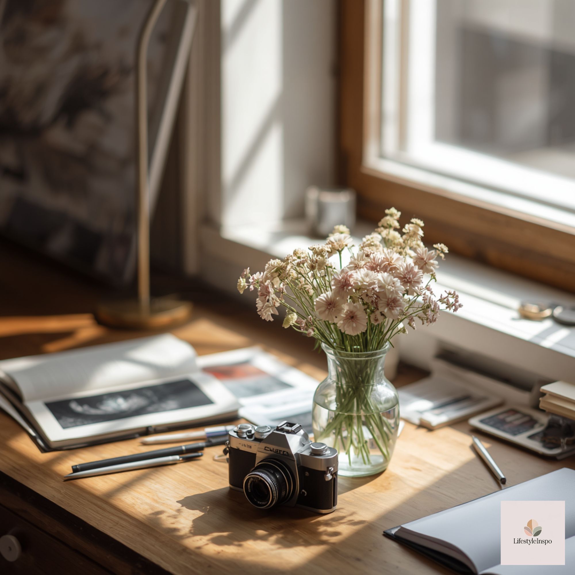
- Composition: a dominant camera-and-flowers print offset with smaller framed tools—vintage lenses, found botanical prints, and clipped, smaller colored versions of the same page. Vary orientations and create a cascading effect that follows the natural line of adjacent furniture or a tall piece of equipment.
- Styling tips: mix frame materials—raw wood, black metal, and washed oak—for an eclectic but curated look. Use matching neutral mats to unify disparate frames. Leave one or two frames intentionally empty as a staging area for rotating works-in-progress.
- Practical note: asymmetry reads as intentional when the spacing is disciplined. Aim for 2–3″ between frames, and use a central invisible axis (an imaginary vertical line) to maintain visual flow.
Framing, matting, and materials: small choices that make a big difference
- Paper and backing: if you color the page with wet media, use a backing that resists buckling—mount on archival foam-core or use a lightweight watercolor board. If you’ll be scanning and printing at a lab, choose a paper with the weight and finish you prefer; check lab specs.
- Mats: a white or warm off-white mat brightens the image; a charcoal or pale-sage mat can highlight particular tones you’ve added. A 1.5–3″ mat is visually pleasing for 8×10 and 11×14 prints; larger works can support wider mats.
- Frames: metal frames feel modern and clean; natural wood frames bring warmth. Choose frames with glazing that protects ink if you’ll add watercolor or media that might fade. For a casual studio, clear acrylic glazing reduces breakage risk.
- Float-mounting: for a craft-forward look, float-mount the paper within the frame so its deckled or raw edge shows. This is especially nice if you hand-color and enjoy the tactile aspect of the paper edge.
- DIY framing alternatives: use high-quality clips and a hanging rail for a slick, changeable setup. Magnetic frames are renter-friendly and allow quick swaps of newly colored pages.
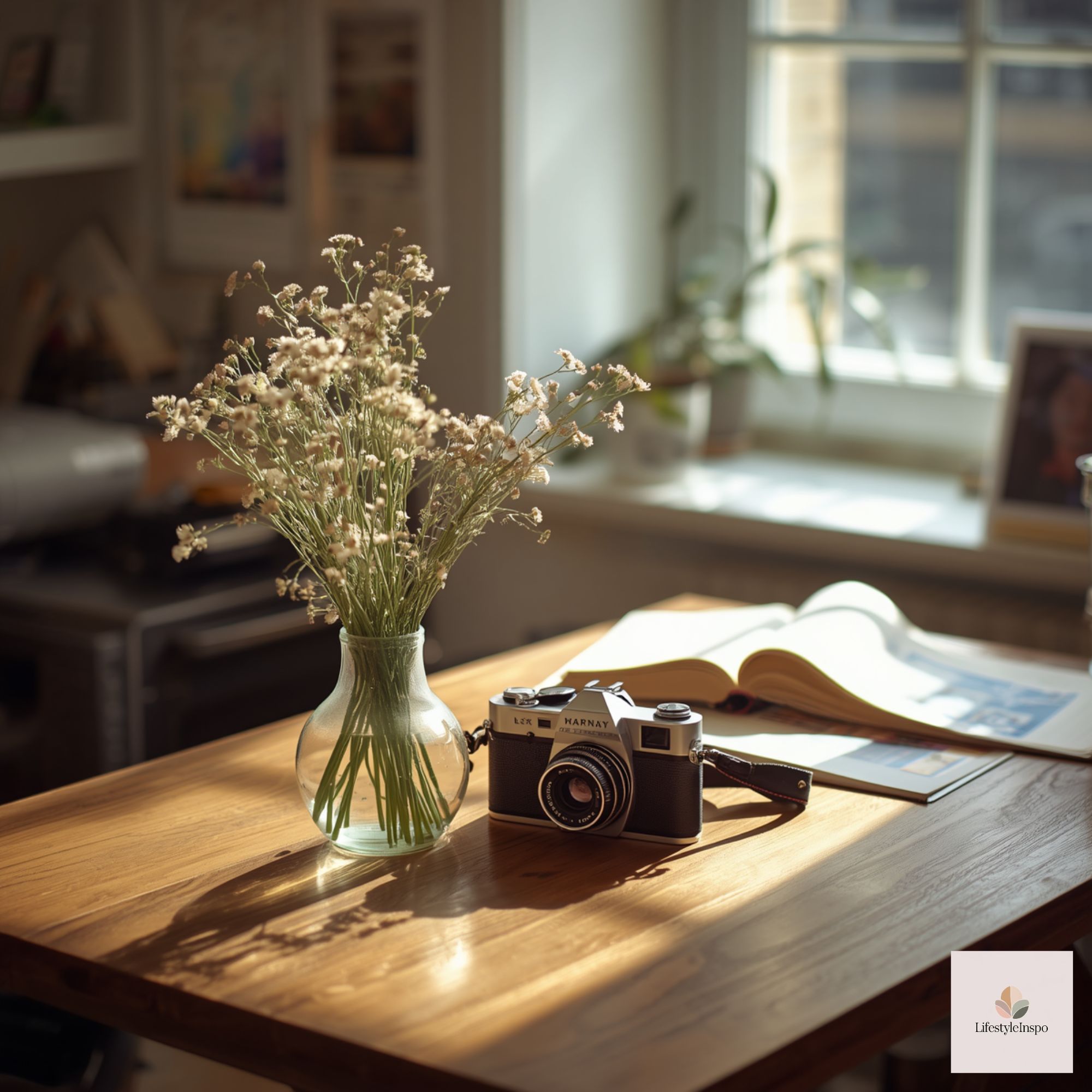
Lighting and placement to keep art visible and protected
- Avoid direct sunlight: prolonged exposure can fade colored inks and papers. Position your creative studio wall away from east- or west-facing windows when possible, or install UV-filtering film if relocation isn’t an option.
- Layer lighting: combine overhead fixtures with adjustable wall-mounted picture lights or an articulating sconce aimed at the focal piece. For a budget option, a clamp lamp with a directional LED bulb attached above the frame gives excellent task lighting while being easy to reposition.
- Color temperature: use neutral to warm LEDs (2700K–3500K) to keep colors true without being harsh. If you photograph works against the wall, consider including a daylight-balanced bulb (5000K–6500K) in your portable lighting kit to preview how colors will read in evenly lit images.
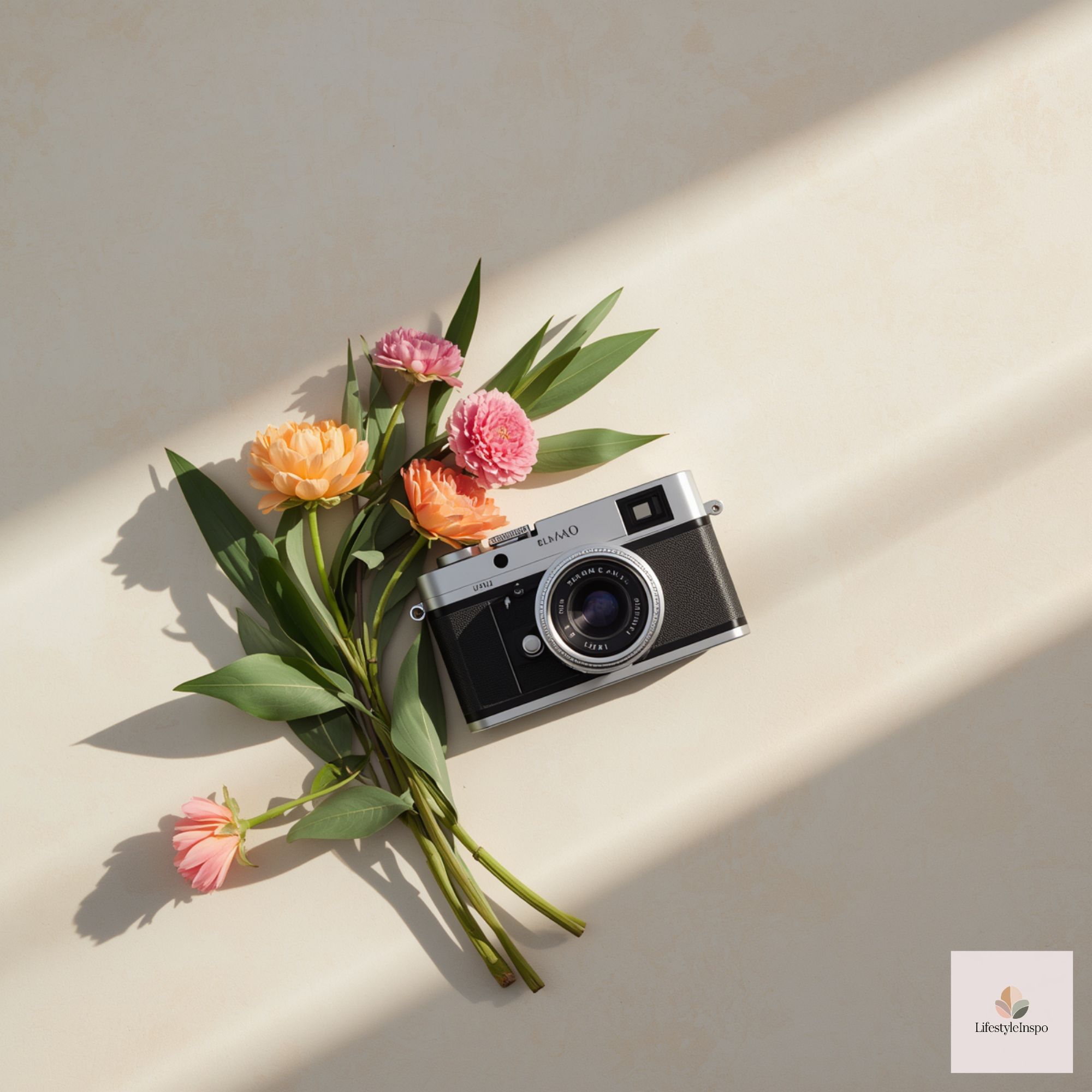
Integrating hobby supplies so the wall feels lived-in, not cluttered
- Concealed-but-accessible storage: shallow wall cabinets or floating shelves with labeled boxes keep paint, pens, and extra pages within reach without crowding the art. Choose containers that harmonize with the frames—reclaimed wooden boxes for a warm look, matte metal tins for an industrial aesthetic.
- Vertical pegboard: mount a framed camera-and-flowers piece as the center of a small pegboard vignette. Use hooks and baskets around the frame for scissors, rulers, and rolls of washi tape. The framed page becomes both inspiration and anchor.
- Display trays and hooks: install small brass hooks beneath a shelf to hold rolls of ribbon or measuring tape. A slim ledge with a shallow tray allows you to display current color swatches or a small jar of freshly mixed pigments.
- Rotate supplies as art: one practical trick in a small studio is to “frame” favorite brushes or oddities in shadow boxes mounted near the artwork. They function as decor and usable tools—turning storage into a visual element.
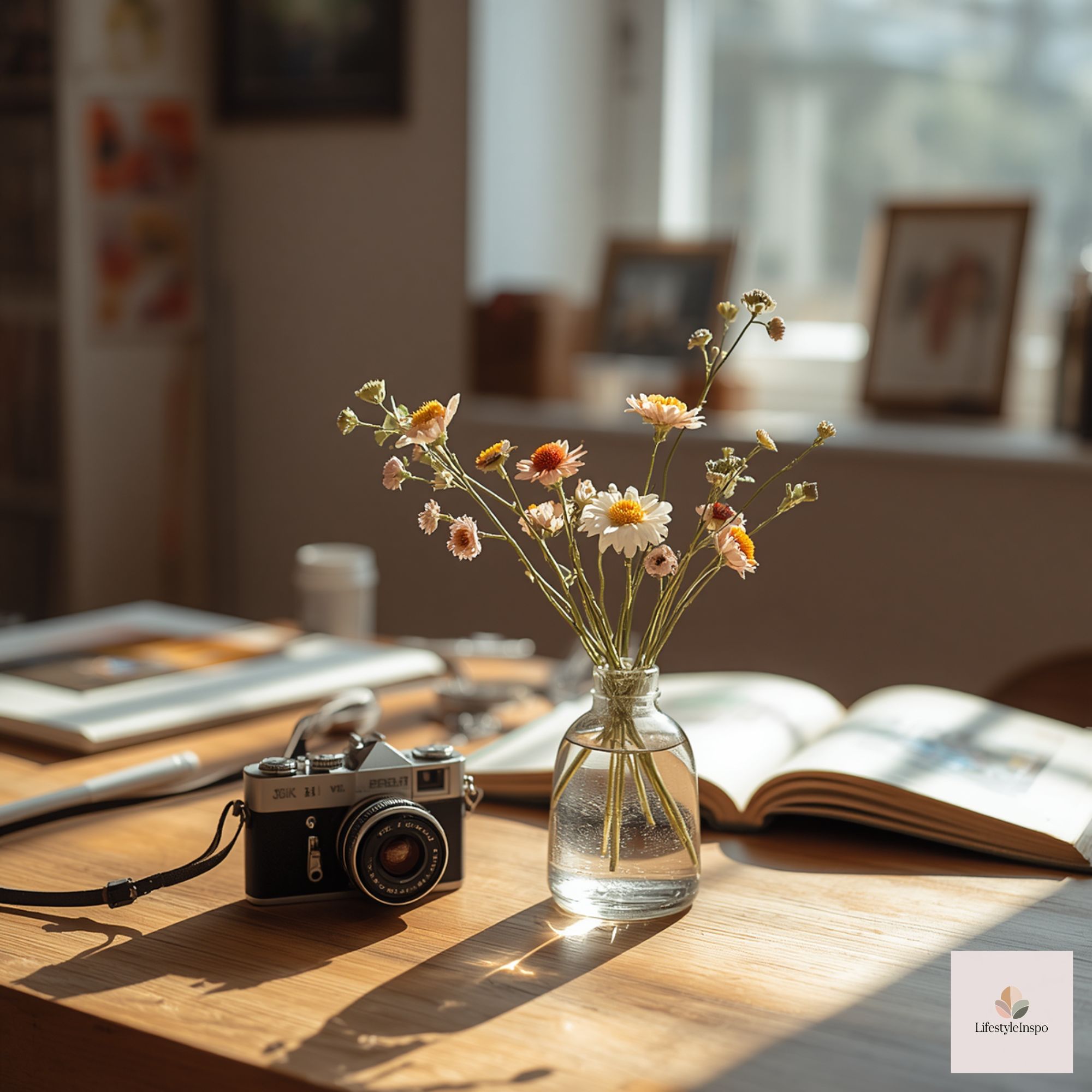
Coloring and finishing ideas to suit different tastes
- Minimal monochrome: keep the camera-and-flowers page black-and-white and add a single accent color in the mat or one small painted area. This is an elegant choice for a neutral-themed studio.
- Tonal washes: apply diluted watercolor washes to the florals only, leaving the camera linework crisp. This gives a contemporary, dressed-up look without overwhelming the graphic.
- Bold mixed media: layer gouache, gold leaf accents, or embroidery on top of printed outlines for texture. If you do this, use spacers in the frame so the surface isn’t crushed and consider framing under glass to protect delicate elements.
- Repeated motif experiment: color several copies differently—one pastel, one bright, one monochrome—and arrange them in a grid for visual play. This multipanel approach reads as intentional and studio-centric.
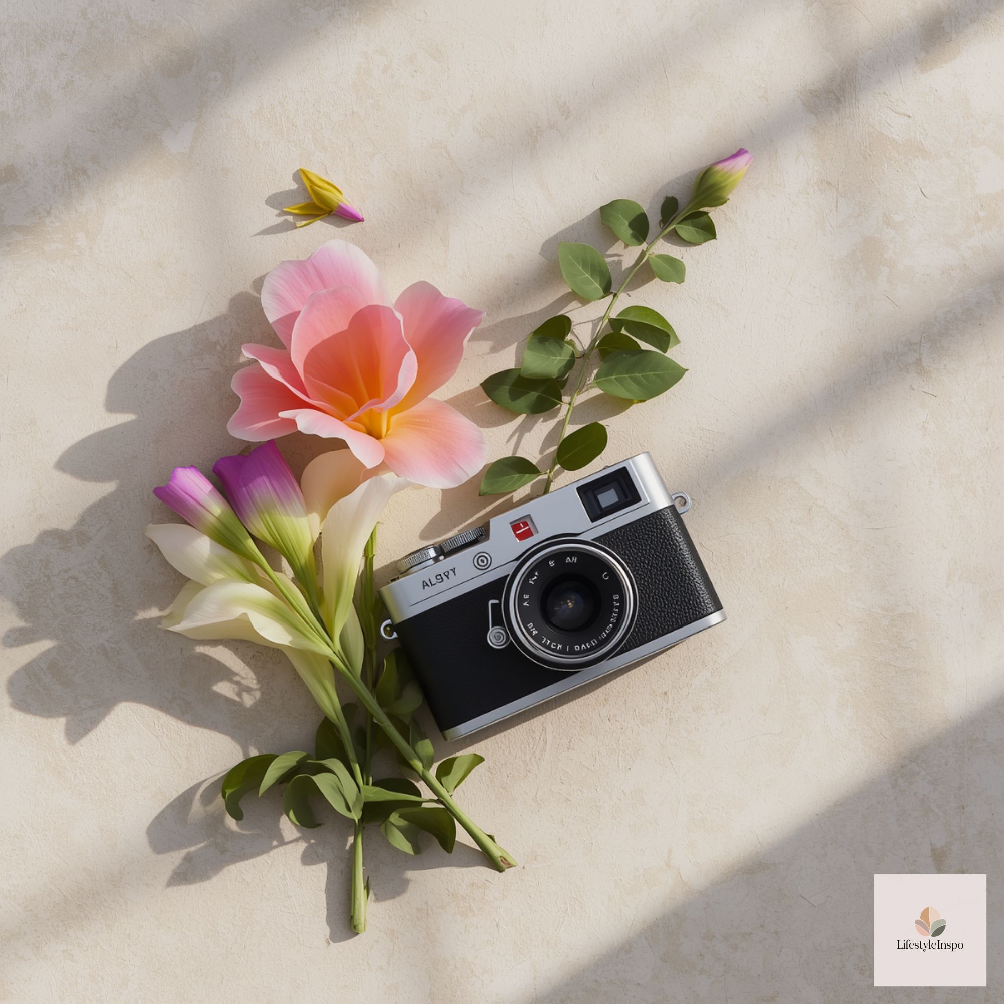
Rental-friendly hanging solutions and damage-minimizing tricks
- Command strips: choose weight-rated picture hanging strips that match the frame size. They’re excellent for renters and avoid nail holes.
- Picture rail hooks: if your studio has picture rail molding, use gallery hooks to easily rearrange without wall damage.
- Adhesive hooks for ledges: use discrete adhesive hooks to support narrow display ledges; they remove cleanly if you relocate.
A short, practical walkthrough: hang a finished camera-and-flowers focal piece in 20 minutes
- Choose the frame and mat for the size of your colored page.
- Measure wall and mark the center at 60–66″ from floor to frame center.
- Use a level and two small marks to map out top-mounting hardware; if using Command strips, attach to the upper corners.
- Hang and step back—view from the main working position, not just standing directly in front.
- Surround with a single functional accent: a small shelf for current palettes, a peg to hold your favorite scissors, or a clamp lamp above for illumination.
Adaptations for different budgets
- Under $50: print the page at home on heavier paper, trim it, and use a thrifted frame painted to coordinate with your palette. Clip frames or document holders create an affordable, clean look.
- $50–$200: order professional printing on archival paper, buy a solid frame with UV acrylic, and add a mat. This provides longevity and a gallery finish.
- $200+: commission custom framing with float-mounting, museum-quality glazing, and inset spacers for mixed-media finishes. Add adjustable picture lights for professional presentation.
Sizing cheat sheet (visual impact vs. available space)
- Small (8×10 to 11×14): great for clusters or narrow walls.
- Medium (16×20): strong single-piece option for small studio walls; balances presence with flexibility.
- Large (20×30 and up): works as a true focal wall but needs proportional wall real estate and considered negative space.
Maintenance and evolving displays
- Rotate work seasonally or as your projects evolve—this keeps the studio fresh and ensures your walls remain sources of inspiration rather than noise.
- Protect finished pieces from paint splatters by placing them slightly offset from messy zones (spray areas, wet tables). Use a clear acrylic shield if a piece must hang near active surfaces.
- Keep a small “archive box” for spare copies of the coloring page and any colored variants so you can swap them into frames quickly.
Closing thoughts
A thoughtfully displayed camera-and-flowers coloring page can elevate your creative studio wall from functional to intentionally beautiful. Whether you keep the look minimal, build a lively asymmetric collage, or integrate the page into storage-forward displays, the choices you make—scale, framing, lighting, and how you incorporate supplies—will determine whether your wall feels curated or cluttered. Start with a single framed page, test one layout, and allow the wall to evolve with your practice. For the specific camera-and-flowers coloring pages that inspired these ideas, check Camera With Flowers Coloring Pages.
Takeaway: Treat the coloring page as a flexible seed—frame it well, light it properly, and let storage and composition choices support both creativity and calm in your studio.
About the Author