A Cheerful Creative Studio Starts With the Backdrop
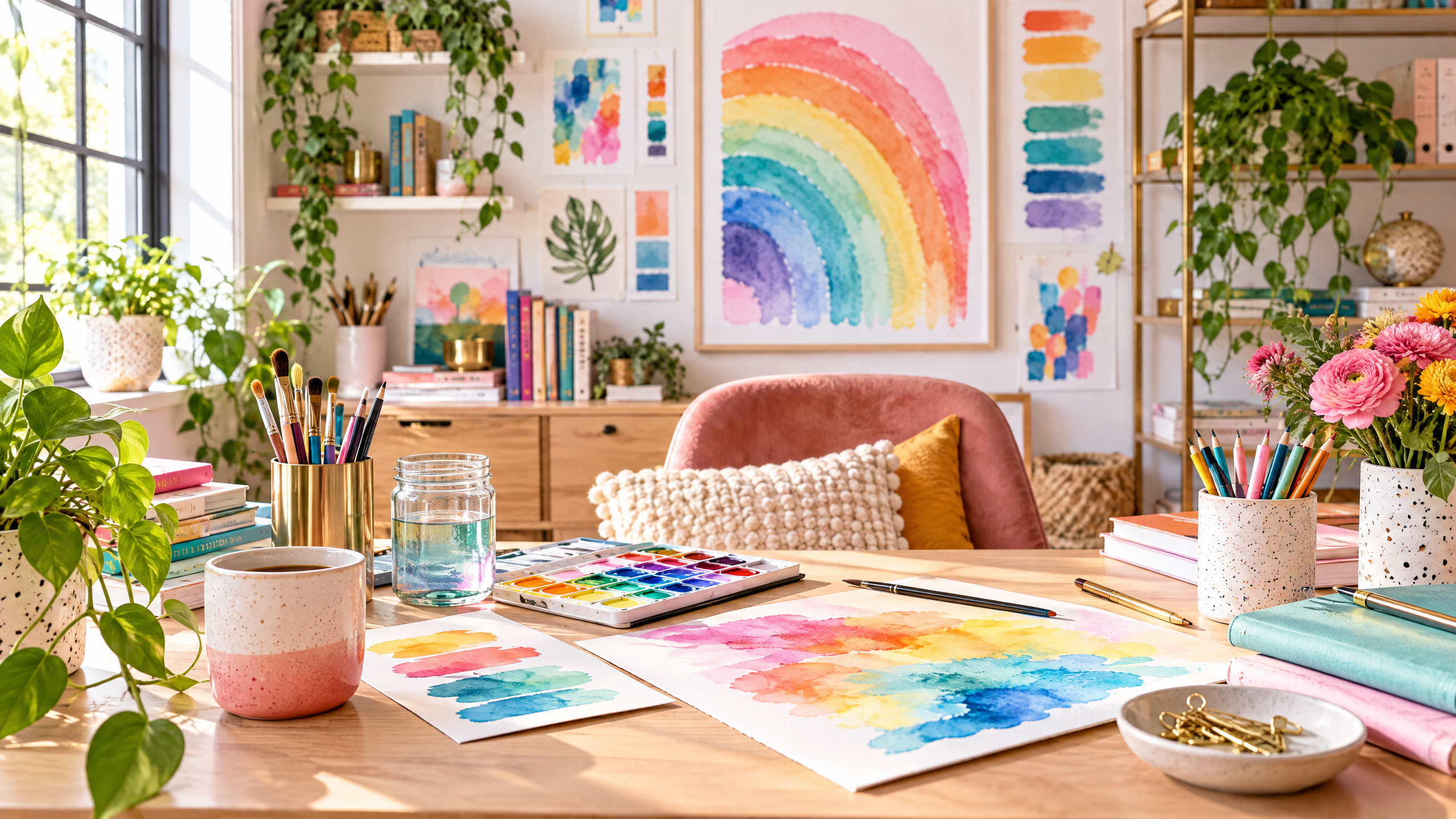
Whether you make art, stitch garments, design invitations, or create content for an online audience, the place you spend time in shapes how you work. A backdrop is more than something pretty to look at during a photoshoot — it sets tone, influences mood, and can be the jumping-off point for the rest of your creative studio decor ideas. Think of it as the emotional wallpaper of your space: an easy, high-impact way to shift the energy from bland to buoyant.
In this piece you’ll find practical, tested approaches to choosing and styling backdrops, ways to integrate cheerful pattern and color without overwhelming small spaces, budget-minded swaps, accessibility considerations, and step-by-step styling to make a studio that’s both inviting on camera and delightful to work in every day.
Why the backdrop matters more than you think
A backdrop is the anchor for your creative environment. It frames your photos and videos, helps your products or work stand out, and signals the personality of your brand or practice. But beyond visuals, a harmonious backdrop can boost focus and lift mood — two essentials for consistent creative output.
Strong backdrops do three practical things:
- Clarify focus: a well-chosen backdrop reduces visual noise and highlights your subject.
- Define atmosphere: color and texture set emotional context — calm, playful, or sophisticated.
- Offer flexibility: layered backdrops can pivot with seasons, projects, or platforms.
Choose a backdrop that complements your process
Selecting the right backdrop starts with how you work. Ask yourself:
- Are you photographing small products, doing flat-lays, or filming tutorials?
- Do you need a backdrop that’s easy to change between scenes?
- Is your space multi-use (studio by day, living room by night)?
Once you know how the backdrop will be used, consider mood and color psychology. Soft pastels soothe; saturated rainbows energize; neutrals create a clean, editorial canvas. For creatives craving cheerful, layered color, watercolor backgrounds bring a handcrafted, warm quality that reads beautifully both on camera and in person.
Why watercolor works so well
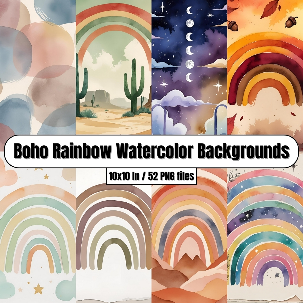
Watercolor backgrounds strike a pleasing balance between pattern and subtlety. They provide movement and depth without distracting from the subject. Because watercolor blends colors organically, it reads as artisanal — a good match for makers and creatives who value craft-forward aesthetics.

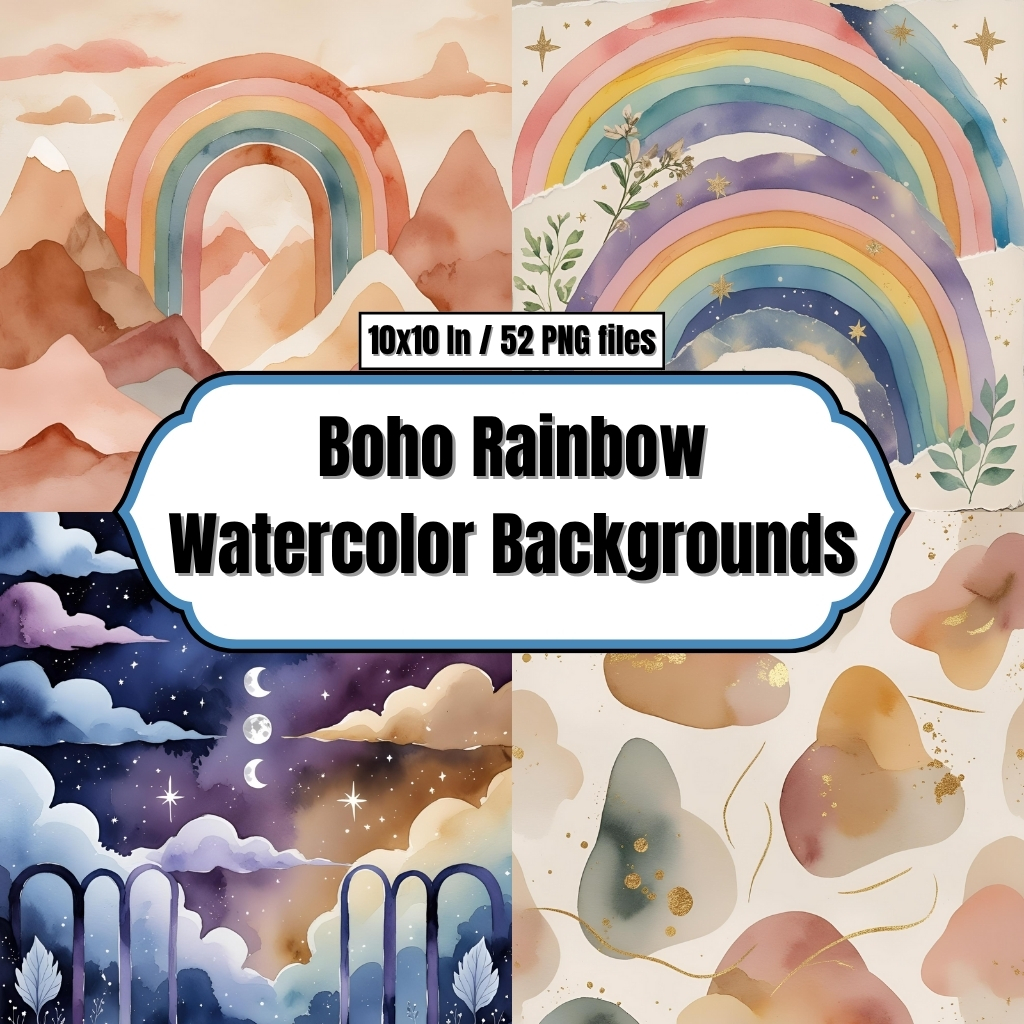
If you want a joyful starting point, try Boho Rainbow Watercolor Backgrounds — their soft, arching hues create an instant happy-but-refined backdrop that pairs well with neutral furniture and natural materials. For brighter, more saturated looks that pop on camera, Bright Rainbow Handpainted Watercolor Digital Papers bring bolder handpainted texture and color contrast ideal for high-energy branding and product shots.
Boho Rainbow Watercolor Backgrounds – Digital Paper Clip Art
Bright Rainbow Handpainted Watercolor Digital Papers – Digital Clip Art
Practical styling steps to build a cheerful studio around your backdrop
Below are concrete steps to design a cohesive studio using your backdrop as the focal point.
Step 1 — Pick the primary backdrop and anchor it
Decide which watercolor backdrop will be your main visual. If you’re leaning toward a warm, bohemian vibe that’s soft and inviting, choose Boho Rainbow Watercolor Backgrounds. If you want vivid, handpainted charm that instantly reads joyful, choose Bright Rainbow Handpainted Watercolor Digital Papers. Anchor that backdrop on one wall — behind your main desk or filming area — to create a dedicated “stage” for your work.
Step 2 — Layer with complementary neutrals
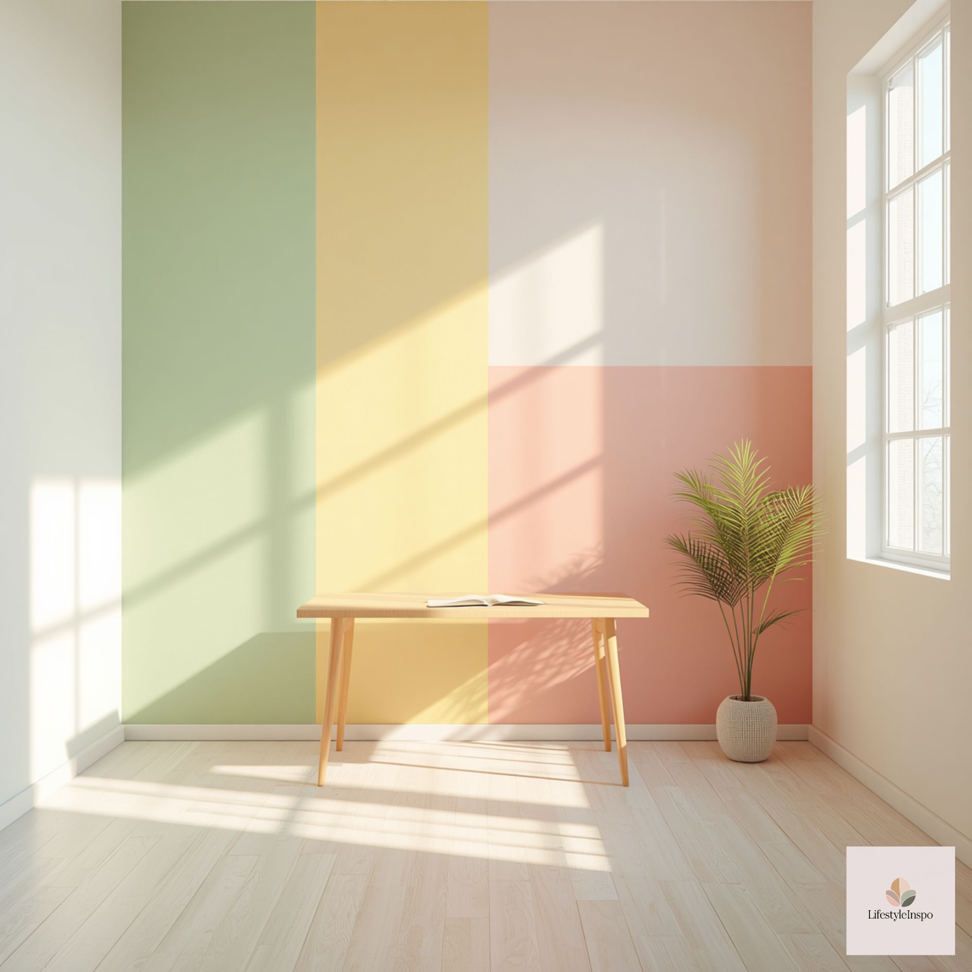
Balance the color intensity with grounding neutrals: warm wood tones, cream rugs, cane chairs, and matte white shelves. These materials let the backdrop do the talking while keeping the space calm enough for focused work.
Step 3 — Add a secondary art wall or magnetic board
Install a low-profile picture rail or thin cork panel nearby for rotating mood boards, in-progress pieces, and inspiring photos. Keep this wall more neutral (soft cream or pale gray) so pinned items and the primary backdrop both read clearly in photos and on camera.
Step 4 — Curate textiles and small accents
Introduce textiles that echo the backdrop’s palette without duplicating it exactly. A throw pillow with a subtle terracotta hue, a woven basket in mustard, and a few green plants can tie the space together. Use patterns sparingly — one or two complementary prints are enough.
Step 5 — Consider lighting with the backdrop in mind
Soft, diffused daylight is ideal. Position your workspace so natural light hits the backdrop indirectly; directional light will create unwanted shadows and glare. For evening shoots, a softbox or LED panel with adjustable temperature will preserve the true colors of your watercolor backdrop.
Step 6 — Create a photo-ready surface
If you photograph products or flat-lays often, keep a small tabletop or roll-up surface that complements the backdrop (think soft white or warm plywood). This gives you an anchor that contrasts gently with the rainbow hues and keeps your subjects crisp.
Step 7 — Store backups and switch easily
If you use digital or removable backdrops, store alternate patterns rolled or in flat sleeves. For fabric or paper backdrops, invest in a simple stand or wall-mount system so you can swap backgrounds quickly between shoots.
Styling ideas for different creative uses
Below are suggestions tailored to common creative practices.
For makers and product photographers
- Use a slightly desaturated portion of the backdrop as the main shooting area so product colors remain accurate.
- Place props (like scissors, ribbons, or paintbrushes) in neutral tones to avoid color contamination.
- Make a small “hero” area with a pedestal or vintage tray where you stage finished goods against the watercolor backdrop.
For content creators and tutorial hosts
- Position the backdrop so your head-and-shoulders frame includes a tasteful margin of pattern above and behind you — it should complement, not compete.
- Use one consistent backdrop color for a series to build visual brand recognition; swap in one accent backdrop for seasonal content.
- Keep the backdrop smooth — iron or steam fabric backdrops to avoid creases that read poorly on camera.
For illustrators and designers
- Display a rotating selection of finished work on the neutral wall and photograph pages against the watercolor backdrop for portfolio shots.
- Use the backdrop as inspiration: sample colors directly from the watercolor palette to create cohesive stationery, packaging, or social posts.
Budget-friendly backdrop options and swaps
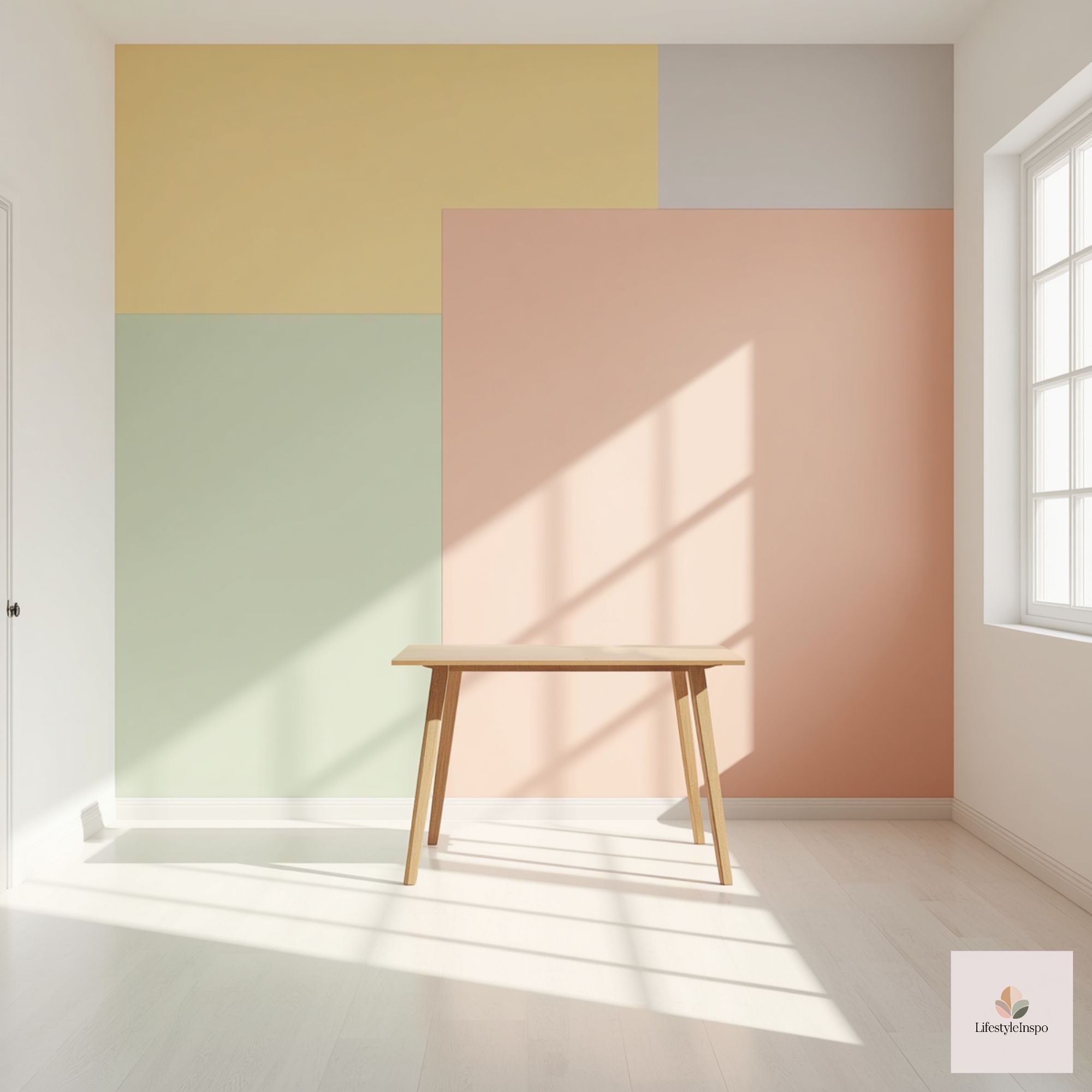
You don’t need to break the bank to achieve a polished backdrop-forward studio. Consider these swaps:
- Paper rolls vs. fabric: Paper rolls are inexpensive and disposable; fabric is reusable and drapes better. Choose based on frequency of use.
- DIY easel: If you can’t mount a backdrop, clamp it to a portable easel or hang it over a tension rod in a doorway.
- Print-on-demand art: If the exact watercolor pattern you want isn’t available as a large print, consider ordering smaller prints of Boho Rainbow Watercolor Backgrounds or Bright Rainbow Handpainted Watercolor Digital Papers to mount on boards for modular use.
- Thrifted anchors: Secondhand frames, lamps, and wooden crates provide personality without a high cost.
Small-space solutions
Many creatives work in compact apartments or shared rooms. Here’s how to make a backdrop-centered studio without sacrificing living space:
- Use a single wall as your studio stage; mount the backdrop so it can be rolled up when not in use.
- Opt for multi-functional furniture: a fold-down desk combined with a mounted backdrop becomes a dedicated studio when needed.
- Keep the backdrop narrow — a vertical strip behind a chair or table can be enough to frame a headshot or tabletop photo.
- Use clip lights and collapsible reflectors that can be stored inside a closet to maximize square footage.
Accessibility and comfort considerations
Designing for accessibility ensures your studio is comfortable and usable long-term.
- Height and reach: Mount your backdrop and storage at reachable heights. Adjustable stands and rails reduce the need to climb or use ladders.
- Motion-friendly layout: Keep a clear path to frequently used areas and place storage within easy reach.
- Seating comfort: Invest in an ergonomic chair or supportive stool for long creative sessions, especially when working on fine detail.
- Visual clarity: Choose backdrop contrasts that do not create visual strain; softer transitions in watercolor make it easier to focus.
How to maintain and refresh your backdrop over time
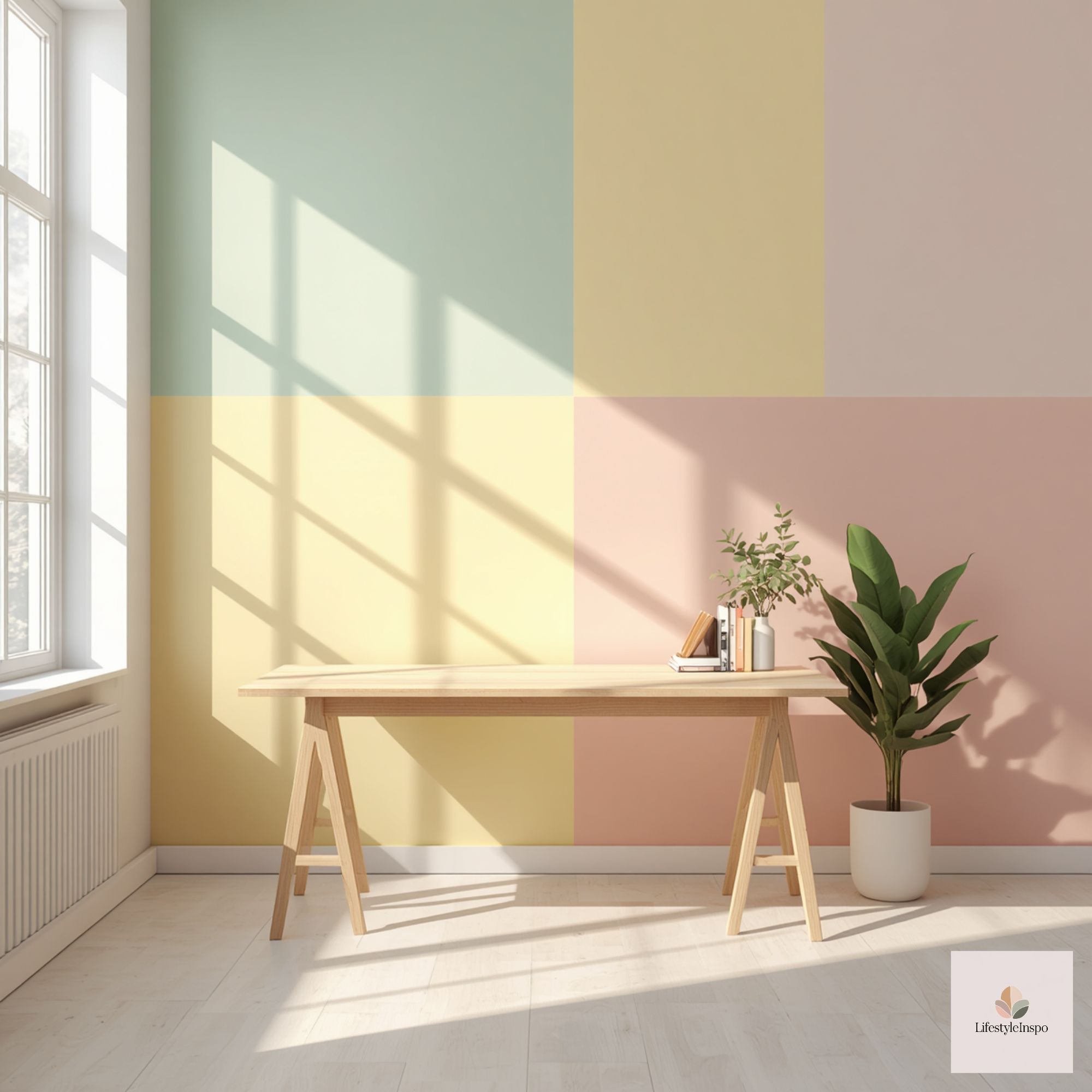
Treat your backdrop as a living element. Rotate colors seasonally, swap accents monthly, and keep a simple cleaning routine: dust fabric backdrops regularly and spot-clean stains promptly. If you use paper backdrops, store unused rolls flat or in tubes to prevent creasing.
Quick refresh ideas
- Change a few small props or plants to shift the mood without replacing the backdrop.
- Layer a translucent curtain or string lights in front of the backdrop for soft texture at night.
- Pin temporary mood clippings (fabric swatches, paint chips) to the neutral wall to evolve your space with current projects.
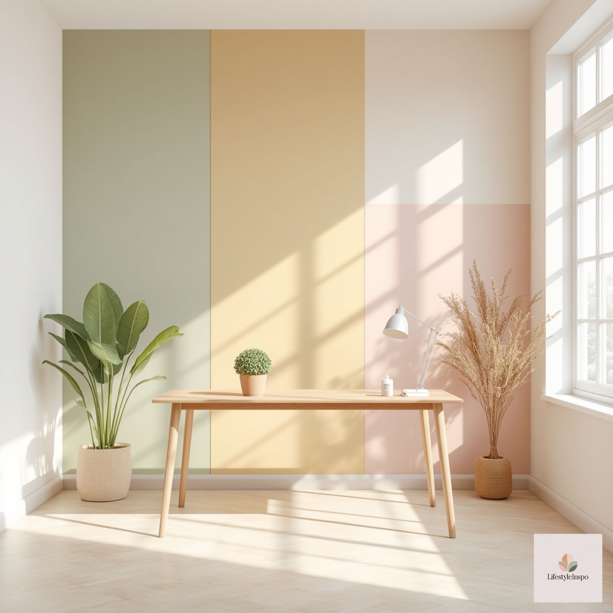
Product picks that pair well with watercolor backdrops
If you want to create the buoyant, handcrafted look described above, consider integrating these direct backdrop options into your studio plans:
- Boho Rainbow Watercolor Backgrounds: A soft, bohemian-inspired rainbow backdrop that brings warmth and subtle arching color.
- Bright Rainbow Handpainted Watercolor Digital Papers: Bold, handpainted rainbow textures that offer punchy color and handmade charm.

Both options are versatile starting points whether you photograph products, film tutorials, or simply want a cheerful studio to work in. Choose the one that best matches the energy you want to cultivate — soft and dreamy, or vivid and playful — and build the rest of your space in conversation with it.
Ready to brighten your studio? Start by choosing the backdrop that matches your mood, then build your space around it with a few complementary neutrals, a plan for lighting, and accessible storage. If you’re unsure which watercolor vibe fits you, bookmark this piece and try swapping small prints in your studio until you land on the one that feels right.
About the Author