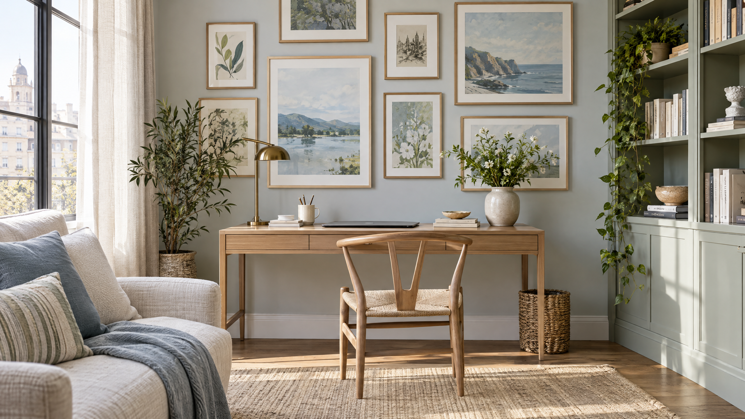
The Collected Home Office: How to Build a Gallery Wall That Still Feels Calm

A gallery wall can transform a home office from a utilitarian workspace into a reflective, inspiring room you actually want to spend time in. But many attempts at “collected” walls tilt toward cluttered or chaotic—too many frames, competing colors, and a lack of rhythm that distracts rather than comforts. The trick is to curate deliberately: choose elements that feel like they belong together, leave breathing room, and anchor the composition with a cohesive palette and texture.

This guide gives practical, step-by-step home office gallery wall ideas to help you build a space that’s both personal and peaceful. You’ll find layout templates, styling tips, budget-friendly options, and accessibility and small-space considerations—plus gentle recommendations for calming digital prints to help set the tone, like Calm And Serene Watercolor Backgrounds and Blue Green Watercolor Backgrounds.
Calm And Serene Watercolor Backgrounds – Digital Paper Clip Art
Blue Green Watercolor Backgrounds | Digital Paper Clip Art for Teachers & Students (PNG)
A “collected” gallery wall reads like a story—family photos, favorite prints, found objects, and layered textures create depth and personality. In a home office, that narrative can be intentionally soothing: choose artwork and materials that reduce visual noise and foster focus. Think of the gallery as a backdrop that supports work—not competes with it.
Key benefits:
- Visual interest that feels curated, not chaotic
- A personalized environment that encourages comfort and creativity
- Flexible design language that can evolve over time without needing a full redo
Start with a Calm Palette and a Single Anchoring Element
Home office gallery wall ideas that feel calm begin with restraint. Pick a two- or three-color palette (including neutrals) and let one piece anchor the arrangement. A soft watercolor print—like Calm And Serene Watercolor Backgrounds or Blue Green Watercolor Backgrounds—works beautifully as an anchor because the tones are subtle and the texture adds depth without becoming dominant.
How to choose your palette:
- Base neutral: warm white, soft gray, or a pale beige
- Accent color: muted blue-green, dusty rose, or deep charcoal
- Metal/wood accents: choose one finish (black metal, aged brass, light oak) and stick with it to keep the look cohesive
Anchor piece placement:
- Center above the desk if your desk is the focal point
- Slightly off-center if the desk sits to one side; the anchor can balance adjacent shelving
- Consider scale: an anchoring print should be large enough to read from your chair without overwhelming the wall
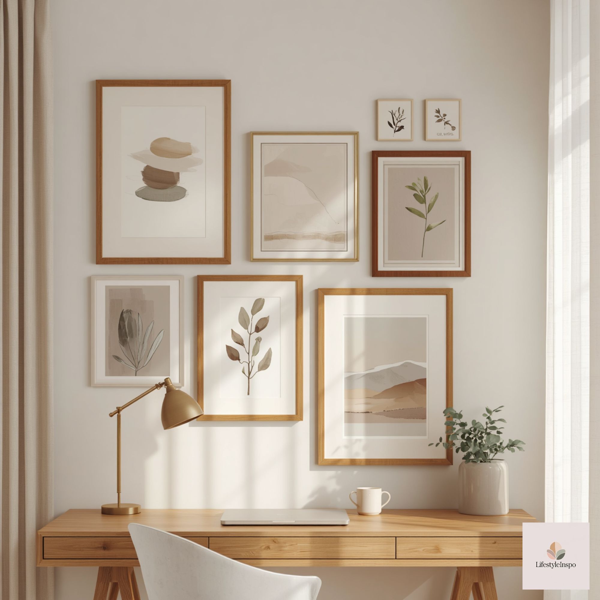
Bringing in Calming Artwork: Where to Use Watercolor Backgrounds
Soft abstract pieces and watercolor backgrounds are ideal for office walls because their organic shapes and translucence don’t compete with screens or paperwork. Use Calm And Serene Watercolor Backgrounds as a central focal point to set the mood; complement them with Blue Green Watercolor Backgrounds in smaller frames or as part of a pairing to create tonal harmony.
Placement ideas:
- Large single print over the desk for a minimalist, serene vibe
- Two complementary watercolor prints side-by-side to create balance and symmetry
- A trio: one larger watercolor with two smaller coordinating pieces above or beside it
Build a Balanced Layout: Mix Scales and Shapes
A calm gallery is all about balance. Mixing scales and shapes—square frames, vertical and horizontal pieces, and a round mirror or shelf—creates visual interest while avoiding monotony.
Rules of thumb:
- Odd numbers read as more organic: groups of three or five are easier on the eye
- Vary frame widths: pair thin metal frames with a couple of chunkier wooden frames
- Leave negative space: keep 2–4 inches between frames for a tighter gallery or up to 6 inches for a relaxed, airy feel
Simple layouts to try:
- Symmetrical grid: Good for small walls; use matching frames and evenly spaced spacing for a tidy, composed look
- Central anchor + satellite pieces: A large watercolor in the middle with smaller prints, a shelf, or a plant on either side
- Stair-step arrangement: Works if your desk is shorter than the wall; pieces ascend diagonally to draw the eye upward
Layering and Texture: Go Beyond Frames
To keep a gallery wall from feeling flat, add depth with objects that aren’t just paper in frames. Try a woven wall basket, a small floating shelf that holds a ceramic vase, or a lightweight textile square. These elements bring tactile warmth and create focal shifts that feel collected rather than contrived.
Ideas for tactile additions:
- A small shelf with a succulent or a candle (use flameless candles for safety)
- Woven fiber piece or macramé knot for a touch of softness
- A round or oval mirror to reflect light and add contrast to rectangular frames
Curate with Intent: Choosing Photos, Prints, and Objects
A calm gallery is curated, not filled. Choose items that connect to your life or values, but edit ruthlessly. Fewer, well-chosen pieces will make the whole arrangement read as intentional and considered.
Selection process:
- Gather everything you think you want to include on the floor.
- Remove anything that’s too bright or has busy patterns.
- Pair down until each piece contributes to the mood or narrative.
- Reconsider similar pieces—if two items are serving the same visual function, keep the stronger one.
Art pairing tip:
- Use the watercolor backgrounds mentioned earlier to add cohesion. For instance, a Blue Green Watercolor Background can be paired with a black-and-white photo and a small botanical print to create a calm, layered trio.
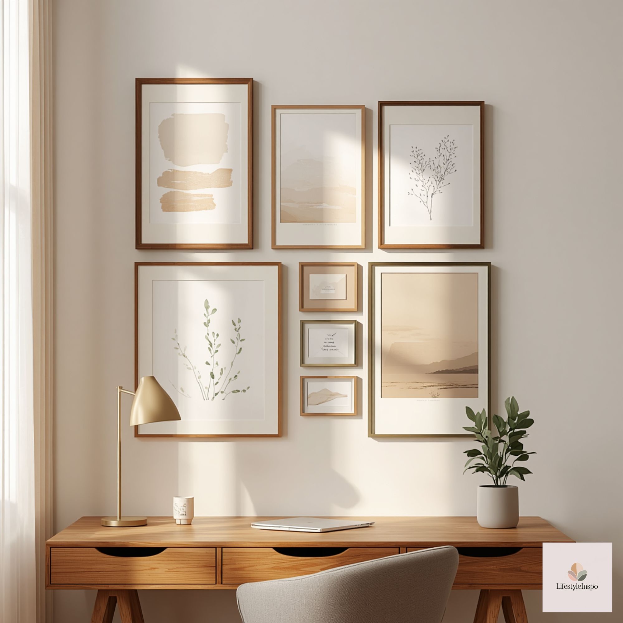
Timeless Framing and Matting Choices
Frames and mats are the unsung heroes of a gallery wall. Quality choice will elevate even inexpensive prints.
Framing guidelines:
- Stick to two frame finishes maximum to avoid visual clutter
- White mats create breathing room and highlight prints; colored mats can work if consistent across the arrangement
- Consider frames with a slight texture—raw wood or brushed metal—to keep things grounded
Practical Styling Steps: From Empty Wall to Calm Canvas
Step 1: Measure and map
- Measure your wall and the area directly above your desk. Sketch the arrangement on paper, or use masking tape on the wall to block out the sizes.
Step 2: Select an anchor
- Choose one large piece (Calm And Serene Watercolor Backgrounds is a great candidate) and place it where your eye naturally rests while seated.
Step 3: Layer secondary pieces
- Add 2–4 smaller prints (use Blue Green Watercolor Backgrounds to echo the palette) and incorporate a textured object or small shelf.
Step 4: Test with paper templates
- Cut kraft paper to frame sizes, tape to the wall, and adjust spacing until it feels balanced from a seated view.
Step 5: Hang smart
- Use picture-hanging hardware appropriate for your wall type. Hang the center of the anchor at eye level when seated—typically 48–52 inches from the floor, but adjust for your chair height.
Step 6: Edit and live with it
- After a week, remove or reposition anything that feels distracting. A gallery should evolve with how you use the space.
Small-Space and Accessibility Notes
Small-space solutions
- Vertical arrangements make walls feel taller without needing wide expanses.
- Consider a slim ledge shelf instead of multiple frames; you can swap prints easily without new holes.
- Use multifunctional items: a pinboard with a framed watercolor print above can combine function and beauty.
Accessibility and ergonomics
- Keep commonly used items within easy reach and hands-free. If the gallery includes meaningful photos or objects, place them at a height where they can be appreciated while seated.
- Ensure light sources are glare-free—position prints to avoid reflections from windows or desk lamps.
- For neurodivergent or sensory-conscious folks, avoid busy patterns and flashing lights; lean into soft textures and muted tones to reduce visual overstimulation.
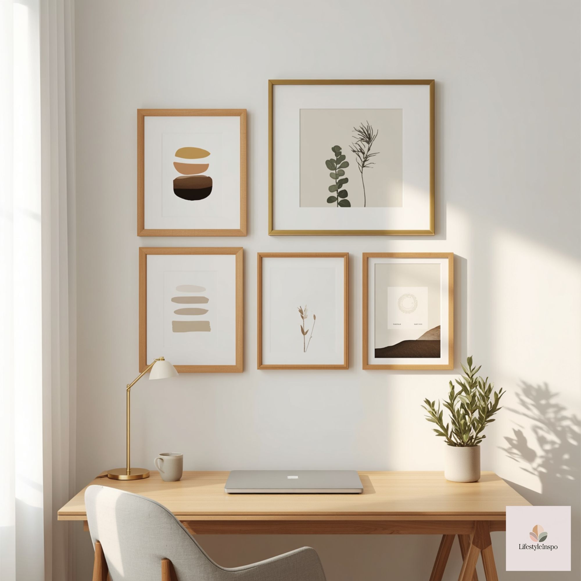
Budgeting for a Collected Look
You don’t need to spend a lot to achieve a curated gallery. Here’s a simple budget approach.
Low budget (under $150)
- Use printable art and inexpensive frames from big-box stores.
- Buy one statement anchor print—consider a watercolor background like Calm And Serene Watercolor Backgrounds—and pair it with thrifted frames.
Mid budget ($150–$500)
- Invest in a larger statement print and one or two higher-quality frames with mats.
- Add a small woven piece or shelf for texture.
Higher budget ($500+)
- Commission a local artist or purchase museum-quality prints.
- Opt for custom framing, artisan-made woven hangings, and sustainably sourced shelving.
Swap and save tip:
- Start with a neutral gallery and rotate seasonal prints. The base structure stays the same; swapping out two pieces each season refreshes the space without a major expense.
Lighting to Keep It Calm
Appropriate lighting can make or break the serenity of your gallery wall. Aim for soft, layered light rather than harsh overhead glare.
Lighting suggestions:
- Use an adjustable desk lamp with warm LED bulbs for task lighting.
- Install a picture light or directional track light with a dimmer for evening ambiance.
- Natural light is lovely—position the wall so it benefits from indirect sunlight rather than harsh midday rays.
Maintenance and Seasonal Refreshes
A calm gallery needs minimal but thoughtful maintenance. Dust frames, rotate art every few months, and reassess the wall when your workspace changes. Small swaps—like replacing one print with a new watercolor—can breathe new life into the whole composition.
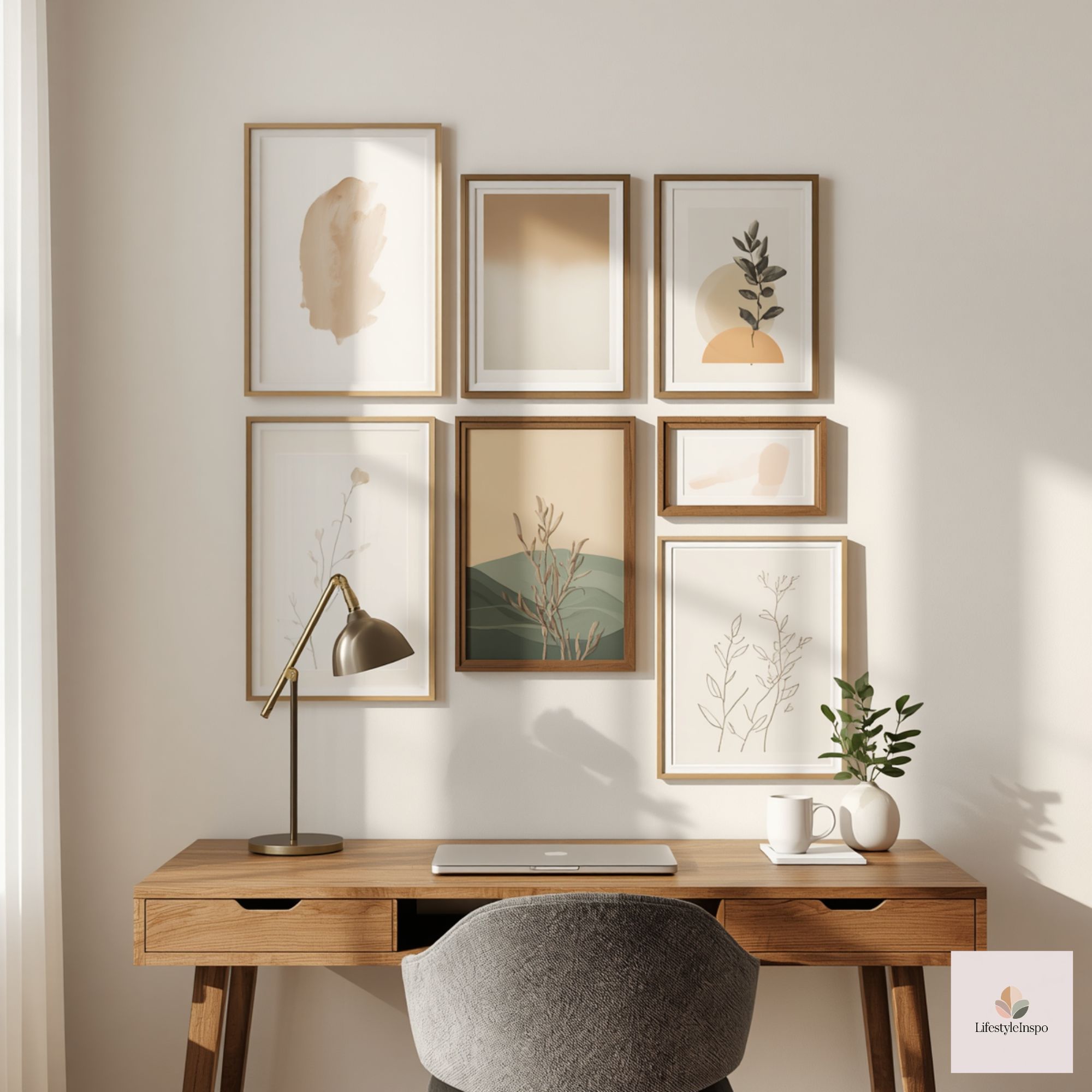
Final Styling Checklist
Before you call the gallery done, run through this checklist:
- Does the wall read calming from a seated perspective?
- Is there a clear anchor piece and a limited palette?
- Have you mixed scale, shape, and texture?
- Is the spacing consistent and comfortable?
- Have you considered glare and accessibility?
If you answered yes to most of these, you’re ready to enjoy a gallery wall that feels collected and calm.
Gentle Call to Action
Ready to start curating? Begin with an anchor that sets the tone. Explore Calm And Serene Watercolor Backgrounds and Blue Green Watercolor Backgrounds to create a soothing base for your collected home office gallery wall.
FAQ (exactly 3 concise Q&A)
Q: What’s the best size for an anchor piece above a home office desk?
A: Choose an anchor that spans roughly two-thirds the width of your desk or sits comfortably centered above it—large enough to be legible from a seated position but not so large it overwhelms the wall.
Q: How much space should I leave between frames?
A: Leave 2–4 inches between frames for a denser gallery and 4–6 inches for a more relaxed, airy arrangement; maintain consistent spacing throughout.
Q: Can I mix family photos with abstract art?
A: Yes—mixing personal photos with abstract pieces creates a curated, layered look. Keep a limited palette and consistent framing to maintain calm cohesion.
About the Author