How to Style Playful Kitchen Art Without Making the Room Feel Childish
There’s something irresistible about food-themed artwork in the kitchen: it feels friendly, seasonal, and a little bit joyful. Yet many people balk at playful kitchen wall art because they worry it will read as juvenile or theme-parky. The good news: you can keep the whimsy and dial up the sophistication with a few deliberate design moves. Think color echo, confident framing, scale balance, restrained accessories, and swaps that let your art evolve without redecorating the whole room.

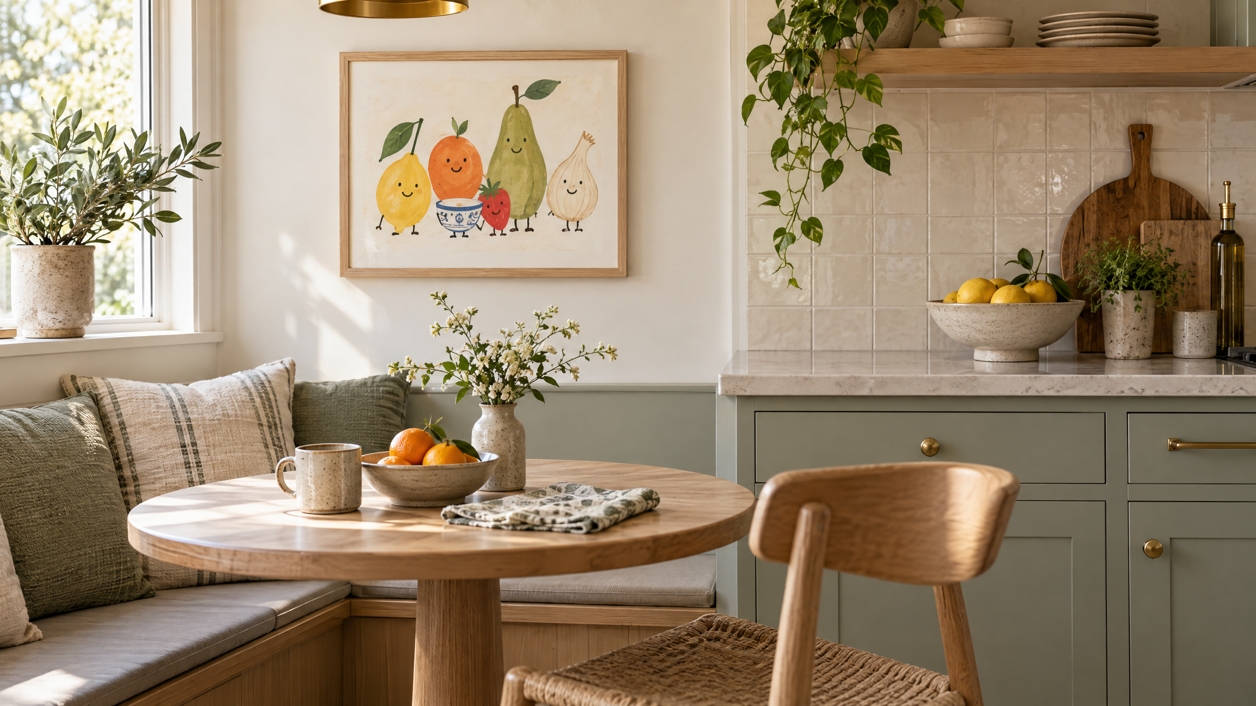
Below are practical, adaptable strategies to style playful kitchen wall art in a breakfast nook that feels clearly adult — plus a realistic styling workflow, budget-conscious and renter-friendly options, and a mini-guide to creating gallery-ready prints from clipart like Fun Food Pair Cuties Clipart – Vol.1.
Fun Food Pair Cuties Clipart – Vol.1 – {Omnimart24h Clip Art}
Why playful needn’t mean childish
Playful kitchen art hits the sweet spot between personality and utility: it can brighten mornings, spark conversation, and anchor a small dining area. The difference between charming and childish is largely about context. A tiny unframed print taped to the wall reads casual in exactly the way you don’t want; a scaled, well-framed series on a pale neutral wall reads intentional and curated. The principles below will help you achieve that elevated-but-approachable look.
Start with a clear color echo
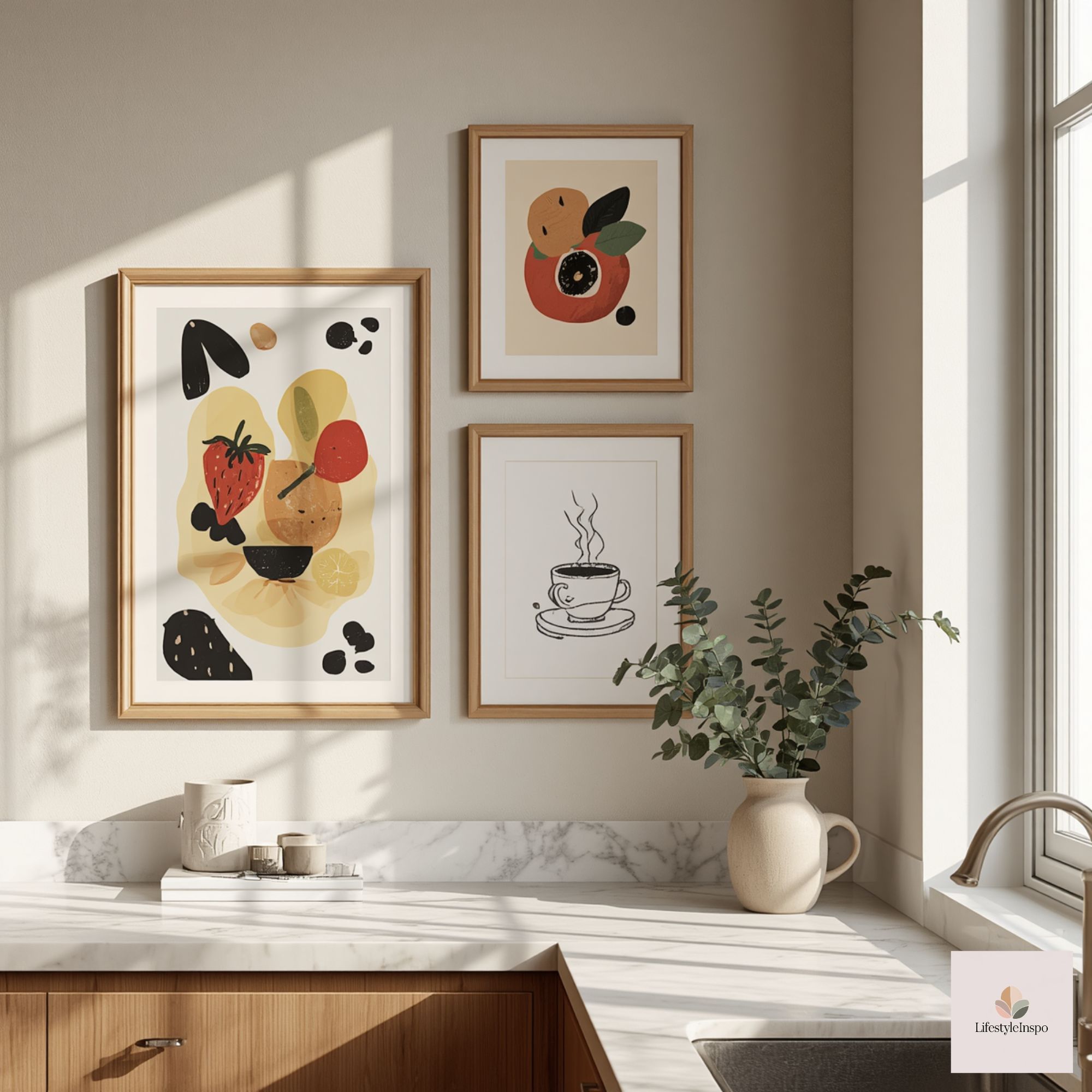
Color echo is the simplest trick to make whimsical illustrations feel cohesive in an adult space. Pull two to three colors from your artwork and repeat those tones in textiles and small accessories so the nook reads like a designed vignette, not a leftover from a kid’s craft table.
How to choose and echo color
- Pick an anchoring hue: Choose one saturated color from the artwork (a warm red, mustard yellow, mint green) and make it the visual anchor. For example, if your print has a bright orange, consider a single orange accent cushion or a ceramic sugar jar.
- Use supporting neutrals: Counter bright hues with soft neutrals—warm white, dove gray, or a light wood tone—to keep the palette calm.
- Repeat in small doses: Echo colors in the runner, a single placemat, a vase, or even a stack of plates. Too many matching items feels contrived; one or two repeated notes read intentional.
A palette example for a breakfast nook
If the art includes lemon yellow and teal:
- Anchor: teal seat cushion or ceramic bowl.
- Support: oatmeal table runner, light oak table.
- Accent: tiny lemon-yellow linen napkins or a small potted succulent with a yellow planter.
Frame with confidence
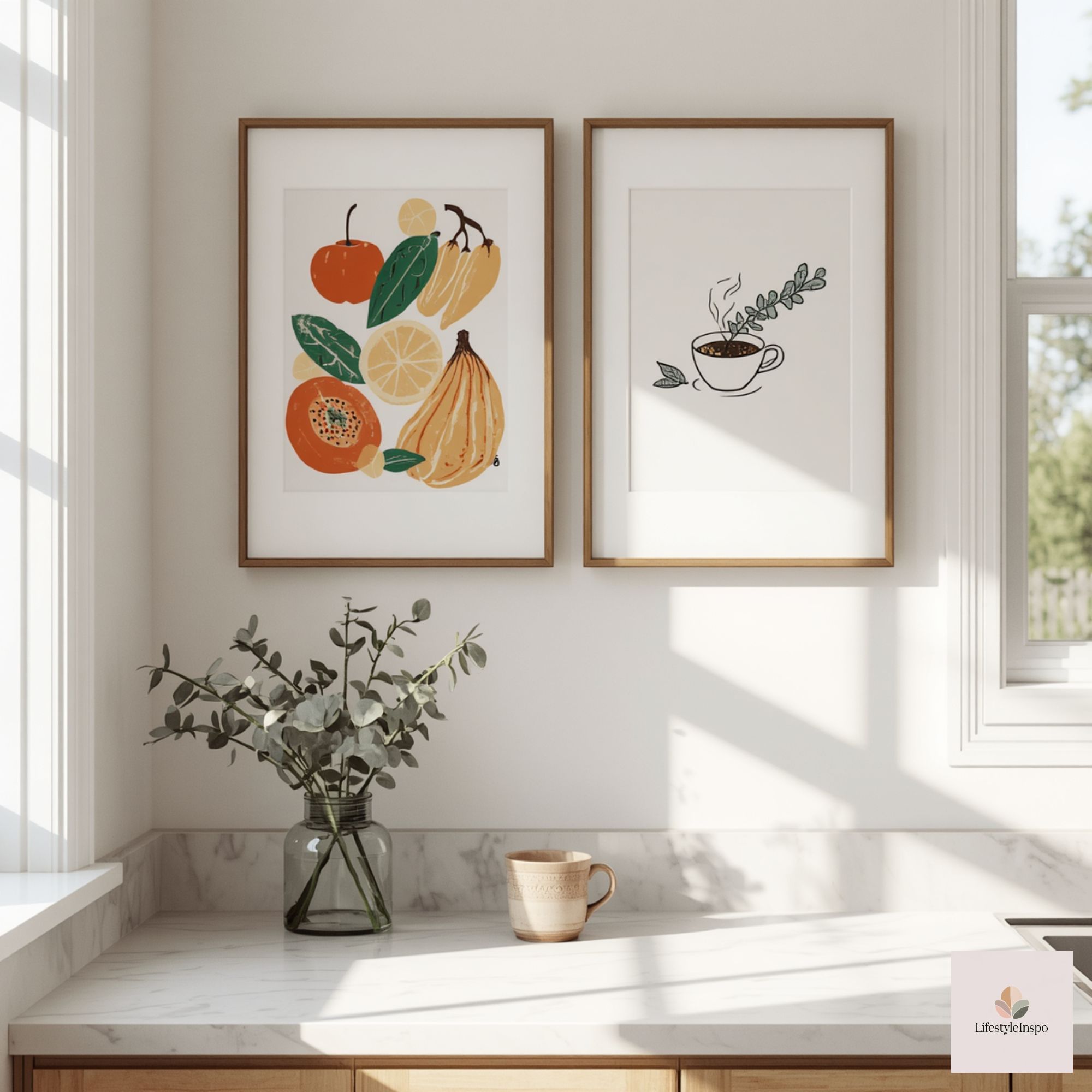
Framing is where playful illustrations are most easily elevated. The frame’s material, matting, and size transform a clipart-style image into gallery-worthy wall art.
Framing rules that make clipart feel grown-up
- Go big on the mat: A generous white (or off-white) mat creates breathing room and signals the print is important. A 2–3 inch mat works for smaller prints; larger works for bigger frames.
- Choose classic frames: Simple black, walnut, or thin brass frames read sophisticated. Avoid novelty frames (plastic glitter, novelty shapes).
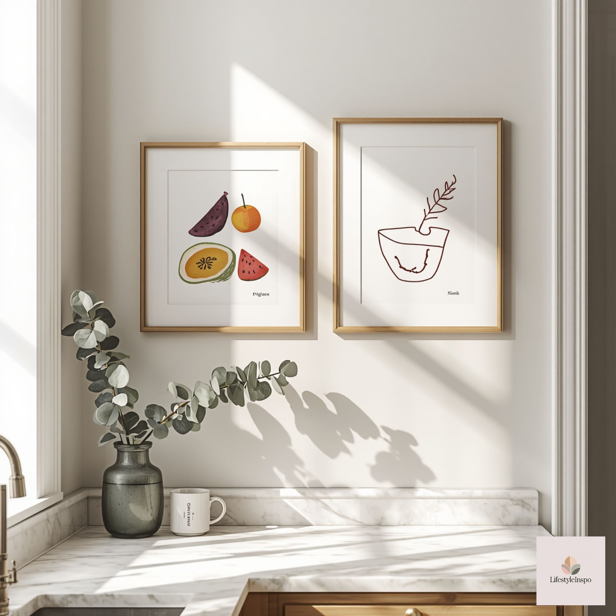
- Match frame finish to hardware: If your knobs and light fixtures are brushed brass, consider a thin brass frame. If they’re matte black, a black frame will harmonize.
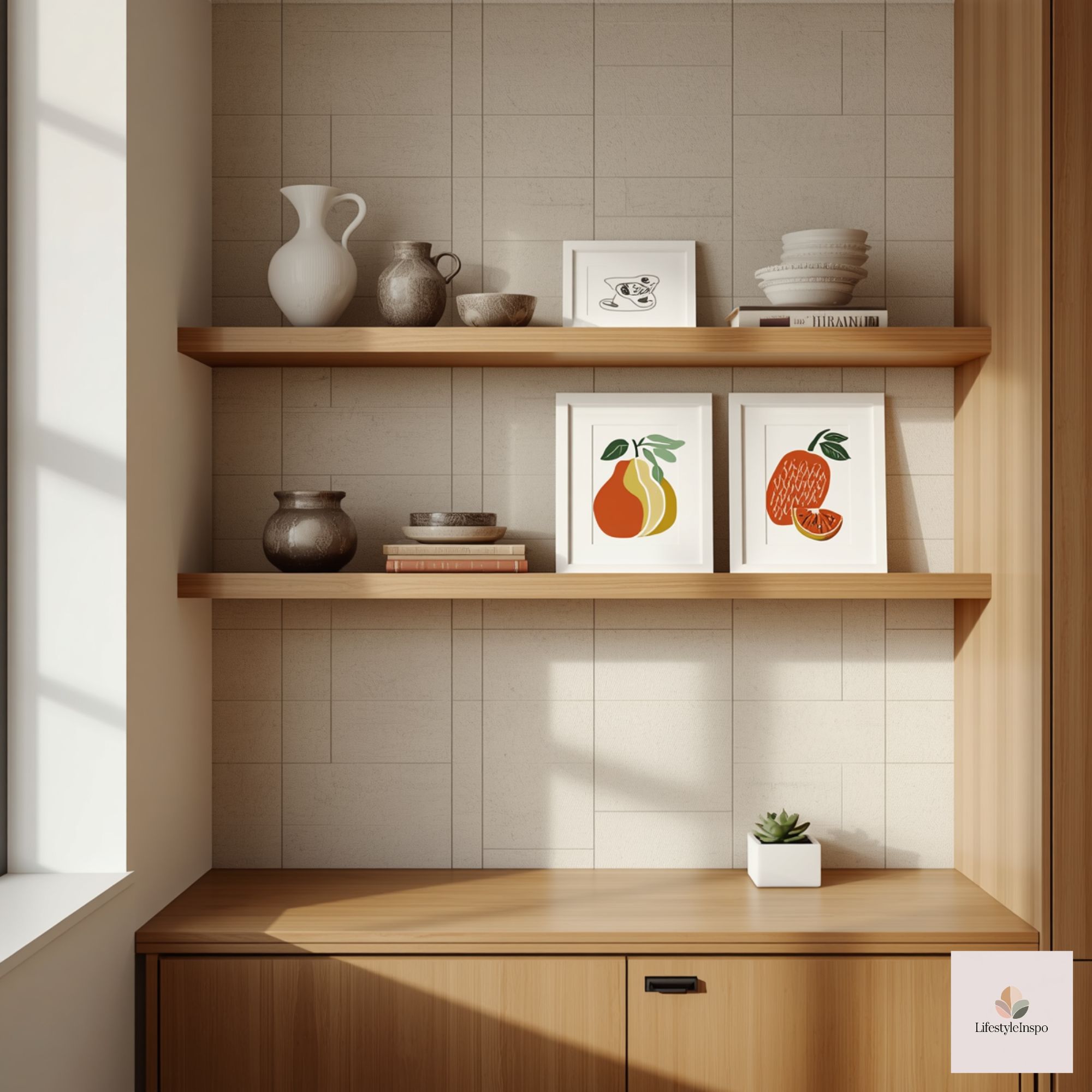
- Consider scaled series: Three medium frames or a triptych reads more intentional than one small print. Matting and spacing between frames should be consistent.
Framing workflow for clipart
- Print the artwork at a local print shop on quality paper (check the seller’s listing for recommended file specs and permissions).
- Choose archival or heavy matte paper for a luxe look; again, verify details with the product listing.
- Bring a sample swatch of your wall paint and a small metal finish (if possible) to the framing shop for color matching.
Scale and placement: make the nook feel purposeful
Scale is often the difference between artwork that enhances the space and art that fights the room. In a breakfast nook, aim for art that complements the table and the seating area.
Placement guidelines
- Over a bench or banquette: Hang artwork in a cluster that spans roughly two-thirds the length of the seating. Leave 6–12 inches between the top of the seat back and the bottom of the frame.
- Over a small round table: Consider a single large piece or a vertical pair centered on the table alcove. Keep the midline of the artwork at eye level (about 57–60 inches from the floor), adjusting if your seating area has different sight lines.
- In a corner nook: Use a vertical stack or tall frame to accentuate height and make the area feel anchored.
Scale tips
- For small tables (diameter <36 in): use single pieces sized 16×20 to 24×30 with mats.
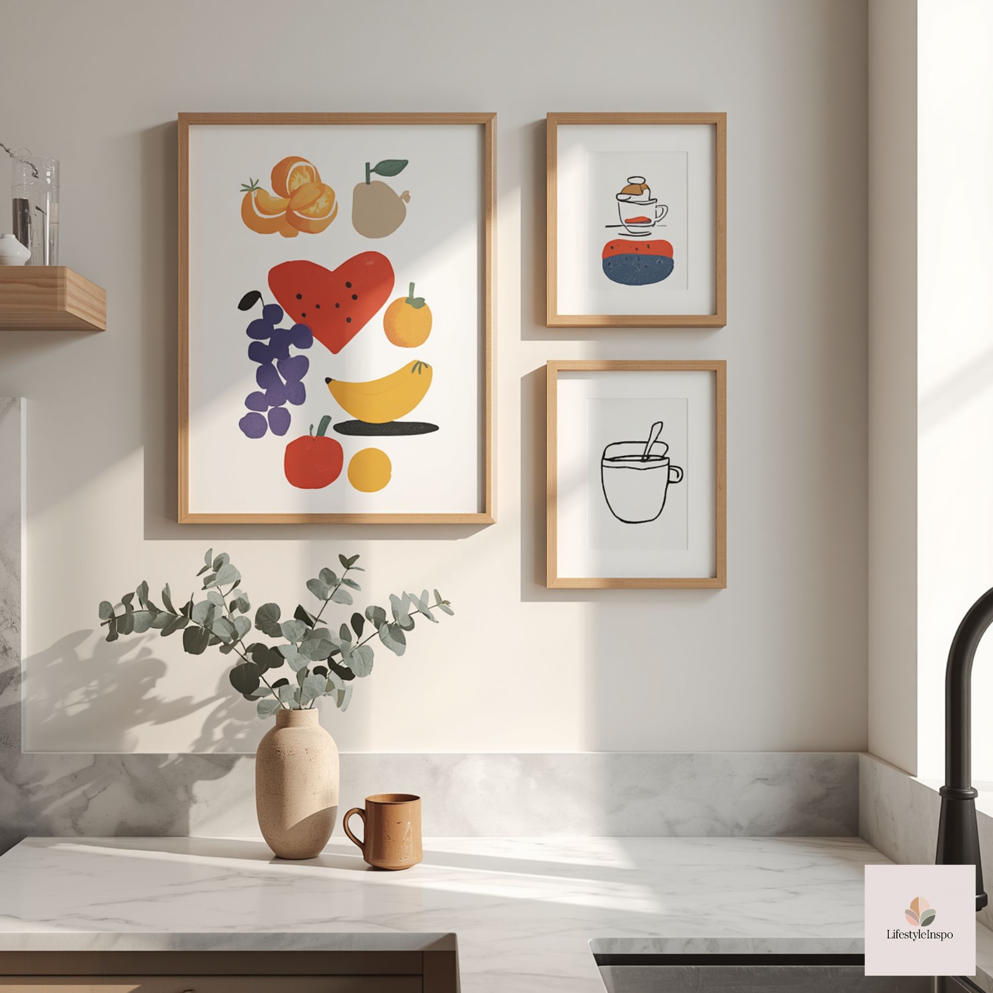
- For banquettes: assemble a series of 3–5 pieces in 11×14 to 16×20 with equal spacing.
- Try mockups: Tape kraft paper cutouts to the wall at the dimensions you’re considering. This prevents surprises and helps you visualize groupings.
Restrained accessories: less is more with playful art
A few well-chosen accessories complement whimsical art without competing with it. The trick is restraint: choose quality over quantity, and let the artwork remain the focal point.
Accessory strategies
- Choose one playful object: Let one small accessory echo the art’s tone—think a ceramic toast-shaped trinket dish or a quirky salt cellar.
- Use elevated materials: Natural wood, linen, glass, or glazed ceramics look mature even if they have playful shapes.
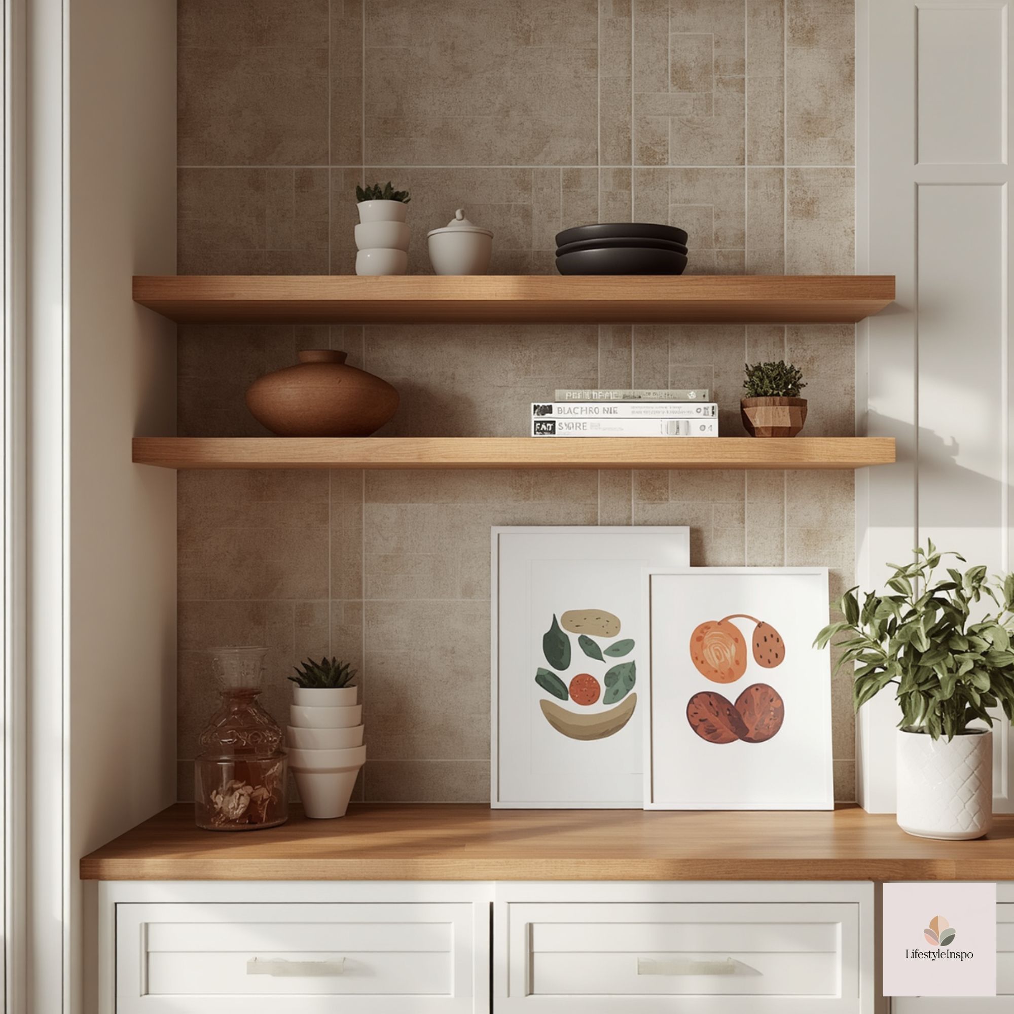
- Keep counter clutter to a minimum: Store everyday tools in a drawer and leave only the essentials on display (a carafe, fresh fruit bowl, or a single cookery book).
- Bring height variation: Use a slim vase with a single stem, a compact lamp, or a small stack of plates to create vertical interest.
Easy swaps to keep the nook adult
Playful art should be dynamic, not permanent. Make small swaps to keep the room fresh without a full redesign.
Swap ideas
- Seasonal napkins: Switch linen napkins or a table runner seasonally to coordinate with different pieces of art.
- Rotating frames: Use matching frames with easy-open backs so prints can be swapped every few months.
- Single-object swaps: Change one accessory—like a vase or placemat—rather than redoing the whole nook.
How to use clipart as a creative starting point
Clipart collections like Fun Food Pair Cuties Clipart – Vol.1 are great starting points for playful kitchen art. These illustrations can be printed, colored, or combined into small series; the important part is treating them as design elements to be curated, not as the finished look.
Practical ways to use clipart
- Series set: Choose three complementary clipart images, print them at the same size, mat them identically, and hang in a horizontal row for a clean, modern look.
- Single oversized print: Scale one illustration up with ample matting to create a statement piece.
- Mixed-media board: Pair a clipart print with a small, framed recipe card or vintage spoon to balance modern playfulness with tactile history.
- DIY coloring: If the file allows personal modification, consider printing a set on quality paper and personally coloring or watercolor-washing them for a bespoke, adult take — check the seller’s listing/terms for permissions and file details.
Linking the clipart into a larger scheme
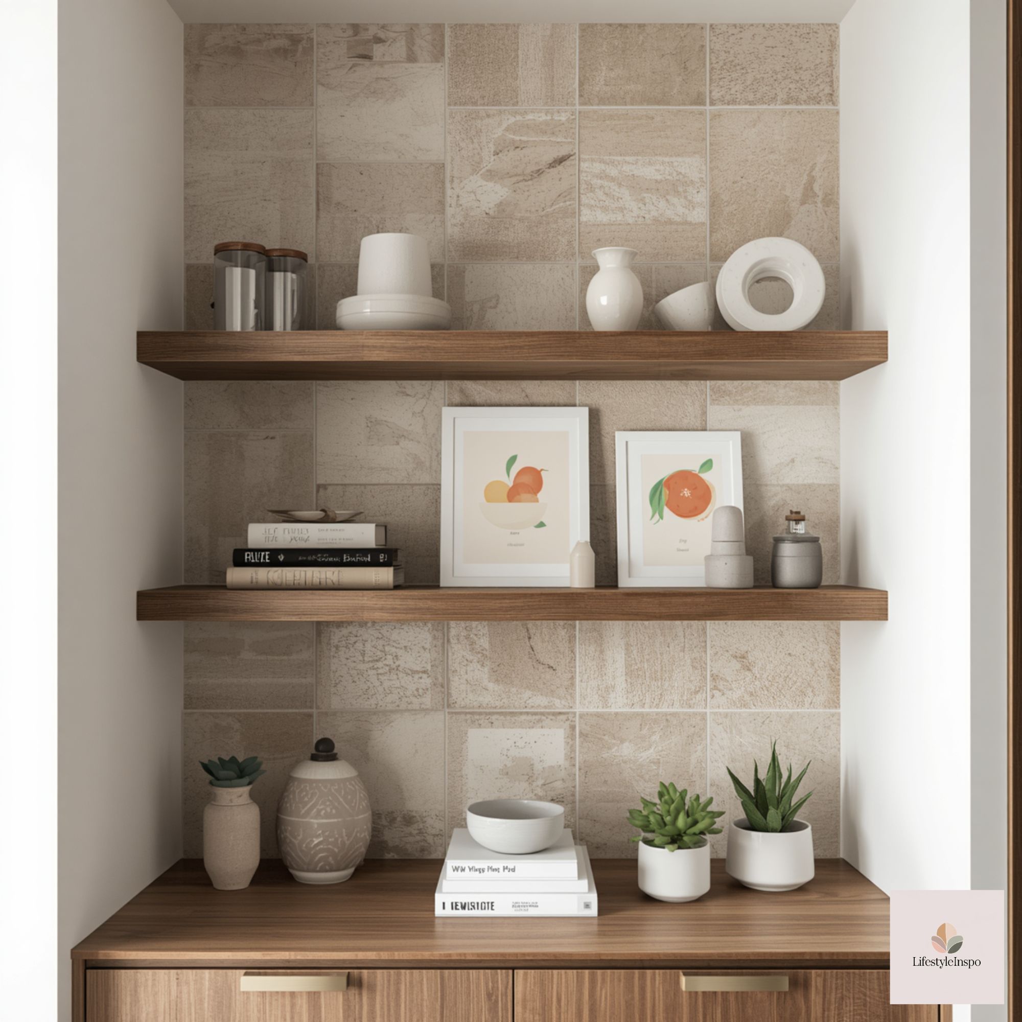
When you choose clipart, plan its companions: a matte black frame, a light oak shelf below for a plant, and a muted runner in a coordinating hue will place that charming illustration firmly in the adult category. For a direct starting resource, consider Fun Food Pair Cuties Clipart – Vol.1 as a playful creative option you can scale, color, and frame to suit your breakfast nook’s voice.
Lighting and finish: polish the look
Lighting and finish details complete the transformation from cute to curated. Lighting can either elevate the art or leave it feeling flat.
Lighting tips
- Install a centered picture light or an adjustable wall sconce to illuminate the art gently.
- Use warm LED bulbs (2700K–3000K) for a cozy morning glow.
- Avoid harsh direct ceiling lights that create glare on glassed frames; consider non-reflective glass or acrylic glazing from your framer.
Finish choices
- Glass type: Non-reflective or museum glass will reduce glare and increase clarity.
- Frame hardware: Use matching hanging hardware and keep cords hidden if a picture light is needed.
- Protective details: Use framers who offer UV protection for prints you expect to keep long-term.
Mini styling playbook — two realistic scenarios
Scenario A: Renter-friendly playful nook (budget-conscious)
- Art: Choose affordable prints from a clipart pack and print on heavyweight matte paper at a local shop.
- Frames: Buy simple black frames with mats from a big-box store.
- Color echo: Add a single teal seat cushion and a mustard napkin.
- Accessories: One ceramic sugar jar, a small timber tray for condiments.
- Lighting: Clamp sconce or plug-in picture light. No drilling? Use removable hanging strips for lightweight frames and lean a taller framed print on a shelf.
Scenario B: Investment approach for a renovated nook
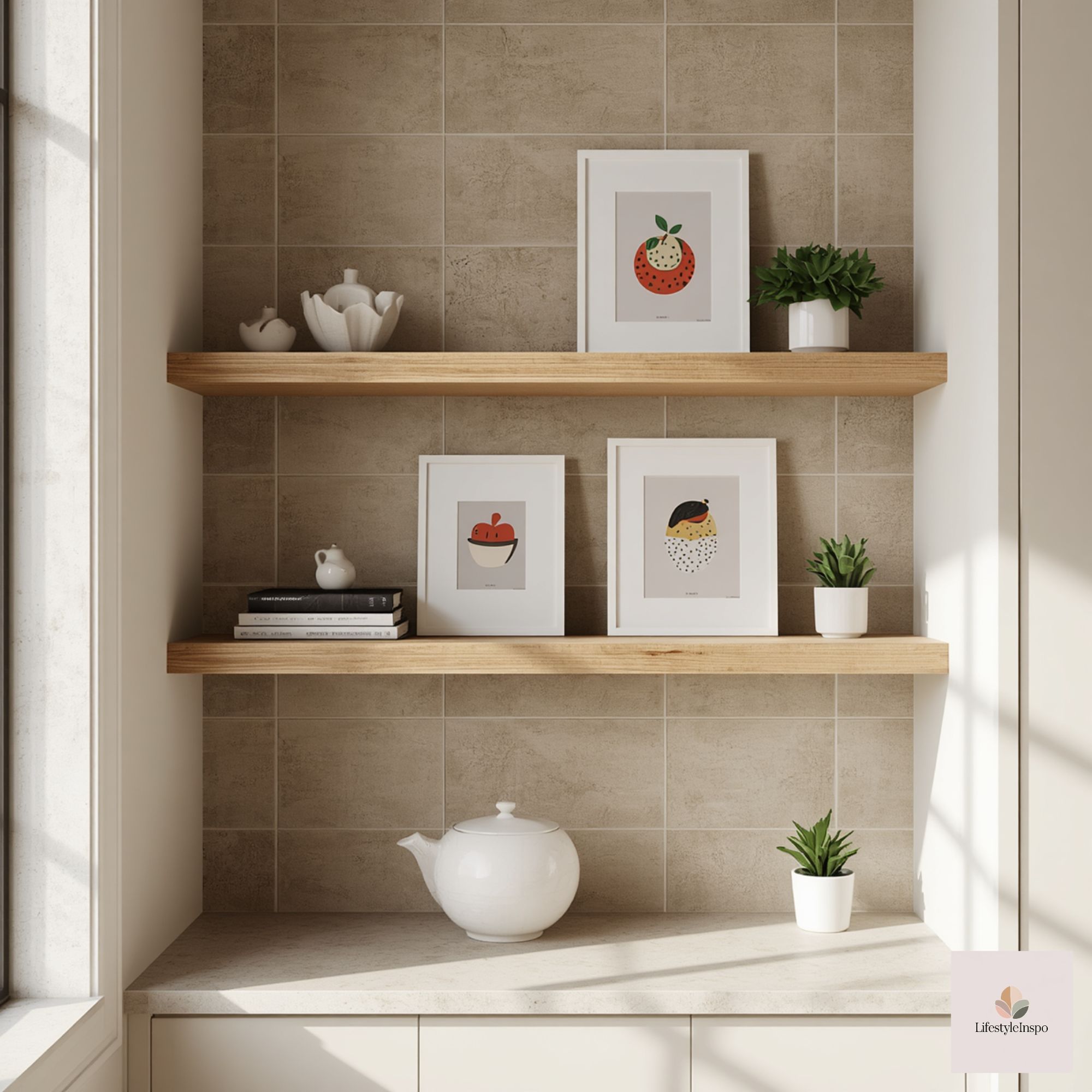
- Art: Professional printing on archival paper; custom matting and thin brass frames.
- Color echo: Upholstered bench in a muted version of the art’s color, oak table with a matching wood bowl.
- Accessories: Statement ceramic vase, leather-bound recipe book, small woven rug in a neutral tone.
- Lighting: Hardwired adjustable sconce with warm LED bulbs and museum glass for the frames.
Troubleshooting common pitfalls
- The room still feels childish: Reduce saturated color count and increase mat size. Swap one playful object for a tactile neutral like a wood bowl.
- Too busy visually: Remove one art piece and simplify accessories; solid textiles can calm a busy wall.
- Scale feels off: Measure your wall and mock up cutouts before committing to prints or frames.
Final styling checklist (quick)
- Pick one anchor color from the art and echo it in textiles.
- Use generous matting and a classic frame finish.
- Match frame hardware to room finishes.
- Scale artwork to the seating area; mock up first.
- Keep accessories restrained and elevated in material.
- Add targeted lighting to highlight the work.
- Plan for easy swaps so the nook evolves with you.
A modest takeaway
Playful kitchen wall art can be utterly grown-up: the secret is treating each illustration like part of a small curated collection. With thoughtful color echo, confident framing, correct scale, restrained accessories, and simple swaps, your breakfast nook can be both cheerful and polished — a space that makes morning feel like a little celebration, not a carnival.
If you’re ready to experiment with food-themed clipart as a starting point, take a look at Fun Food Pair Cuties Clipart – Vol.1 and consider how a modest set of coordinated prints might lift your breakfast nook without crossing into childish territory. Check the seller’s listing for details about usage and file options before printing.
About the Author