How to Use Color in Office Decor to Make a Workspace Feel More Like You
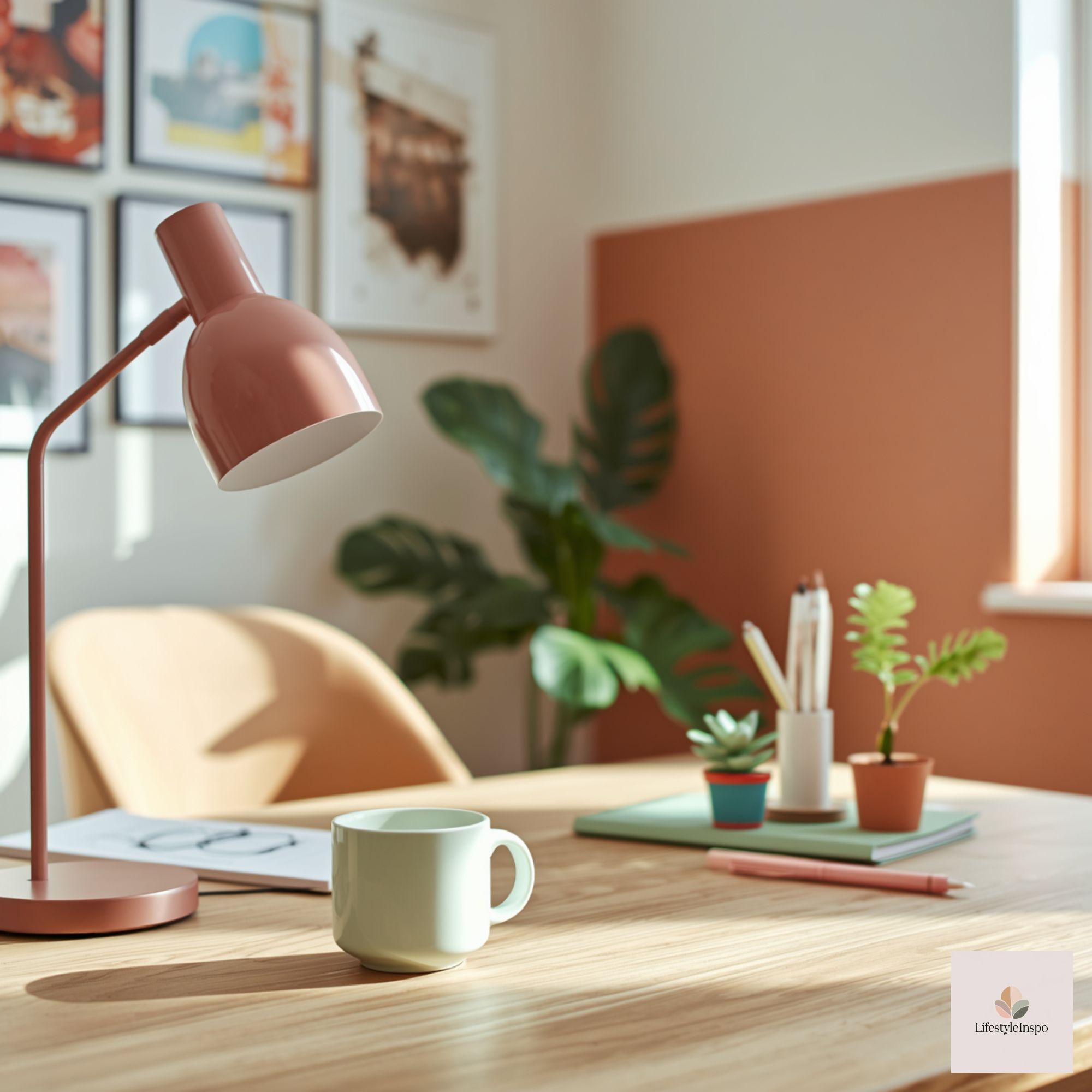
Your office should do more than hold a computer and a stack of papers. It should feel like yours: a place that sparks focus, calm, or creativity depending on the work at hand. Changing color—whether through paint, textiles, or small accents—is one of the most transformative and immediate ways to make a workspace feel personal without an overhaul. Below, you’ll find specific, approachable office decor color ideas that fit small spaces, tight budgets, and accessibility needs, plus styling steps to bring everything together.
Why color matters (and how to think about it)
Color influences mood, clarity, and how you perceive a space. But it’s not about following trends—it’s about choosing tones that support how you want to feel during the workday. Here’s a simple framework:
- Function first: What do you do most here? Deep focus work, video calls, creative brainstorming? Different tasks benefit from different colors and contrasts.
- Emotional intent: Calm and centered? Energized and creative? Professional and collected? Let that intention guide palette choices.
- Practical constraints: Natural light, room size, and existing furniture shape which colors will look best. A small, north-facing room benefits from warmer or brighter accents; a sun-drenched corner can handle richer, saturated hues.
Office decor color ideas by goal
Use these combinations and approaches tailored to the atmosphere you want to create.
- Calm, focused: Soft blues + warm neutrals
Soft blues are widely loved for their calming effect, especially when paired with warm neutrals like beige, cream, and light wood. This palette reduces visual noise and keeps the mind centered.
How to use it:
- Paint one wall a muted blue or use blue-green wallpaper behind your desk as a soft focal point.
- Swap out your mouse pad or desk blotter for a tan leather or woven neutral to add warmth.
- Add a few blue-toned accents—like a ceramic mug, throw pillow, or art—rather than saturating the room.

Product tip: For digital backgrounds, slide templates, or mood boards that echo a calm blue aesthetic, consider using assets like Blue Clip Art Assets For Business Slides to reinforce brand or personal visuals in presentations and pinned inspiration.
- Energetic creativity: Teal + coral + chartreuse
If your work thrives on sparks of creativity—brainstorming, design, or content ideation—choose punchier, lively colors. Teal as a base with small pops of coral or chartreuse can keep energy high without feeling chaotic.
How to use it:
- Anchor the palette with a teal desk lamp, rug, or desk organizer.
- Introduce coral in small doses: a calendar, stationery, or art frame.
- Use plant life to add chartreuse naturally—easy to maintain succulents or a trailing plant.
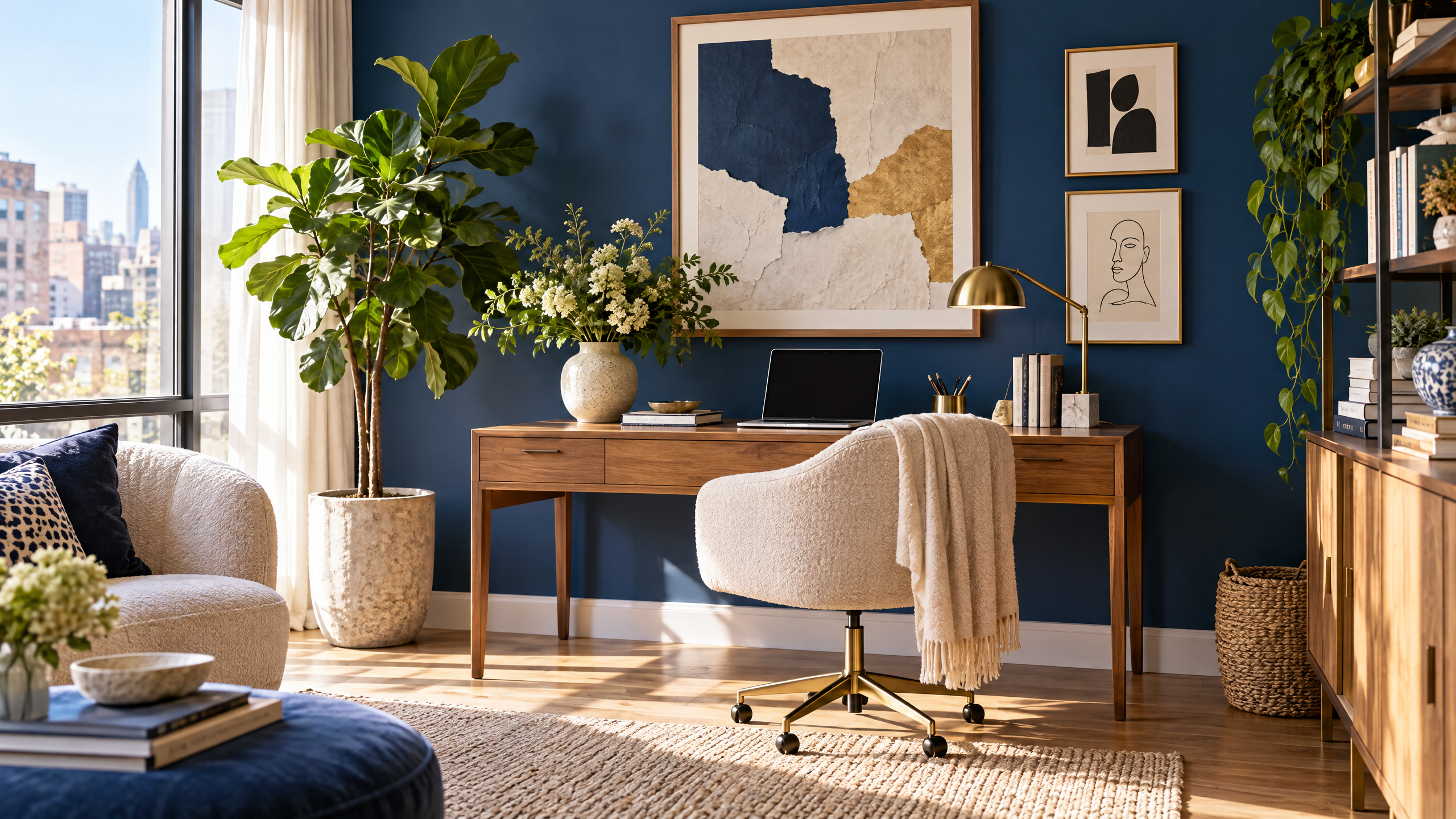
- Professional and polished: Navy + brass + cream
For client-facing spaces or those that need to feel grown-up and refined, navy pairs beautifully with brass accents and creamy whites. This palette photographs well and reads as intentional.
How to use it:
- A single navy accent wall or a navy upholstered chair anchors the room.
- Brass hardware—drawer pulls or a lamp base—adds warmth and polish.
- Keep textiles minimal: a cream rug and linen curtains maintain balance.
- Soft modern: Pastel gradient + pale wood
For a contemporary, gentle look, use a range of soft pastels—pale lavender, mint, blush—paired with pale woods and white. This feels fresh and approachable without feeling immature.
How to use it:
- Rotate pastel hues across smaller accessories so no one color dominates.
- Keep large surfaces neutral to preserve a clean backdrop for video calls.
- Use subtle texture—wool throw, ceramic vase—to avoid a flat look.
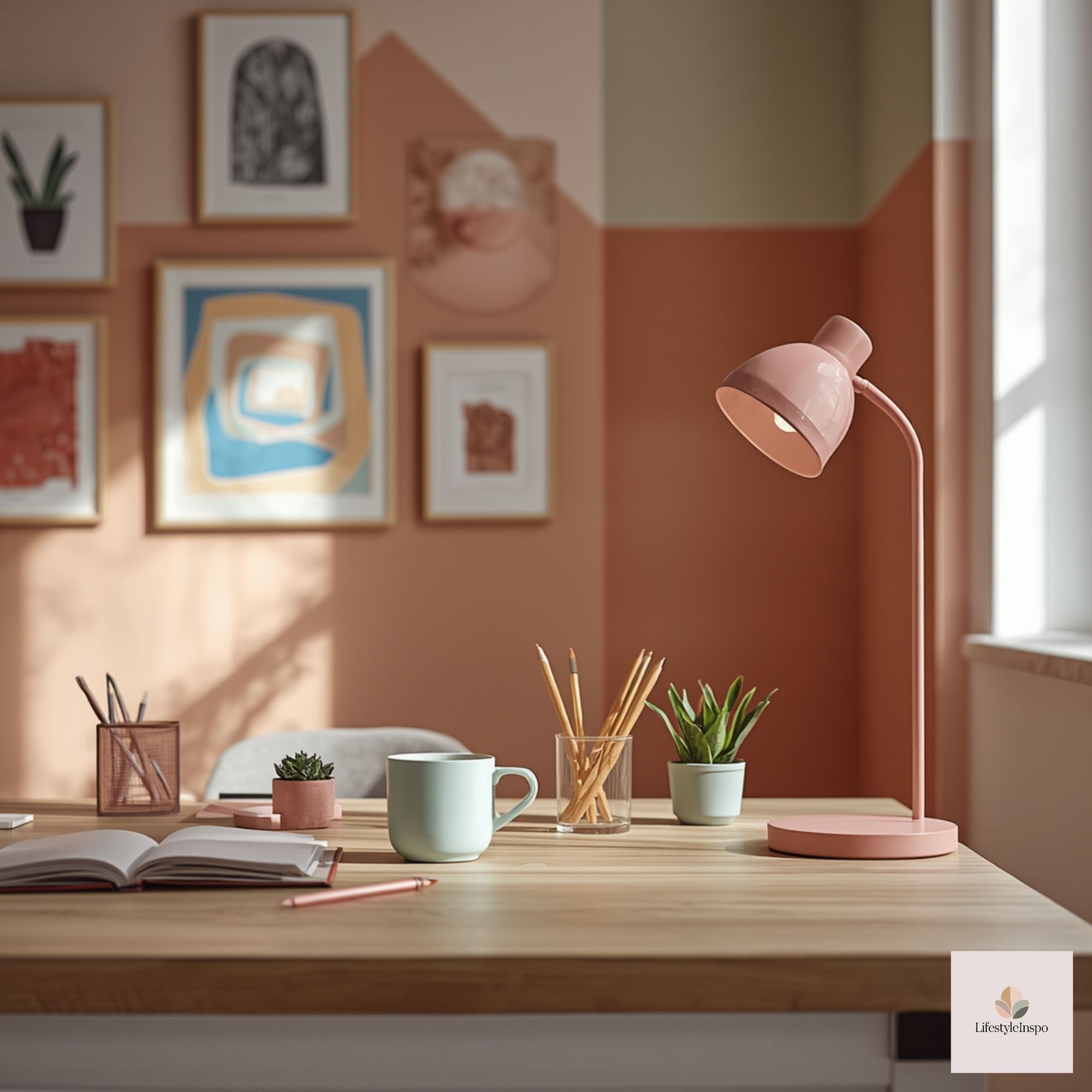
Styling steps: How to add color to your office without overdoing it
Follow these practical steps to introduce color thoughtfully and make sure it lasts
Step 1: Start with one anchor
Pick one substantial element to carry your chosen color: a painted wall, a rug, a large art piece, or a statement chair. This keeps the room cohesive and makes layering easier.
Step 2: Add three accent tones
Choose three complementary accent hues: one that reinforces the anchor color, one neutral, and one contrasting pop. For example: deep teal anchor + soft blue accent + warm beige neutral + coral pop.
Step 3: Use texture to add depth
Color alone can feel flat. Introduce woven baskets, a boucle chair, ceramic planters, or a metal lamp to create layers and visual interest.
Step 4: Balance with neutrals
Keep larger surfaces (desks, shelving, curtains) in neutral tones so accents feel deliberate rather than overwhelming.
Step 5: Group items in odd numbers
Stylistically, groupings of three or five items—books, vases, frames—look more curated. Cluster colorful objects with neutrals for cohesion.
Small-space solutions: Inject color without crowding
If your office is tiny—a nook or a shared corner—you can still achieve a strong color story.
- Vertical color: Use a tall shelf painted in an accent color to draw the eye upward and create the illusion of height.
- Mini-gallery: Create a small gallery wall above the desk with two to four frames in your palette rather than one oversized piece.
- Removable options: Peel-and-stick wallpaper or large-scale decals make a statement without commitment.
- Multi-use textiles: Use a colorful throw that doubles as a chair cover or a lap blanket for warmth and a pop of color.
Budget-friendly picks: Color upgrades under $50
You don’t need to redecorate to refresh your space. Try these affordable swaps:
- Swap pillow covers and curtains in a new hue. Fabric covers are inexpensive and instantly change the feel.
- Invest in new stationery in your palette—calendars, notebooks, and pen cups serve practical and stylistic roles.
- Repaint or recover an old bulletin board with a colorful fabric or paint.
- Hang a single, striking print or poster instead of multiple frames.
Accessibility and color contrast
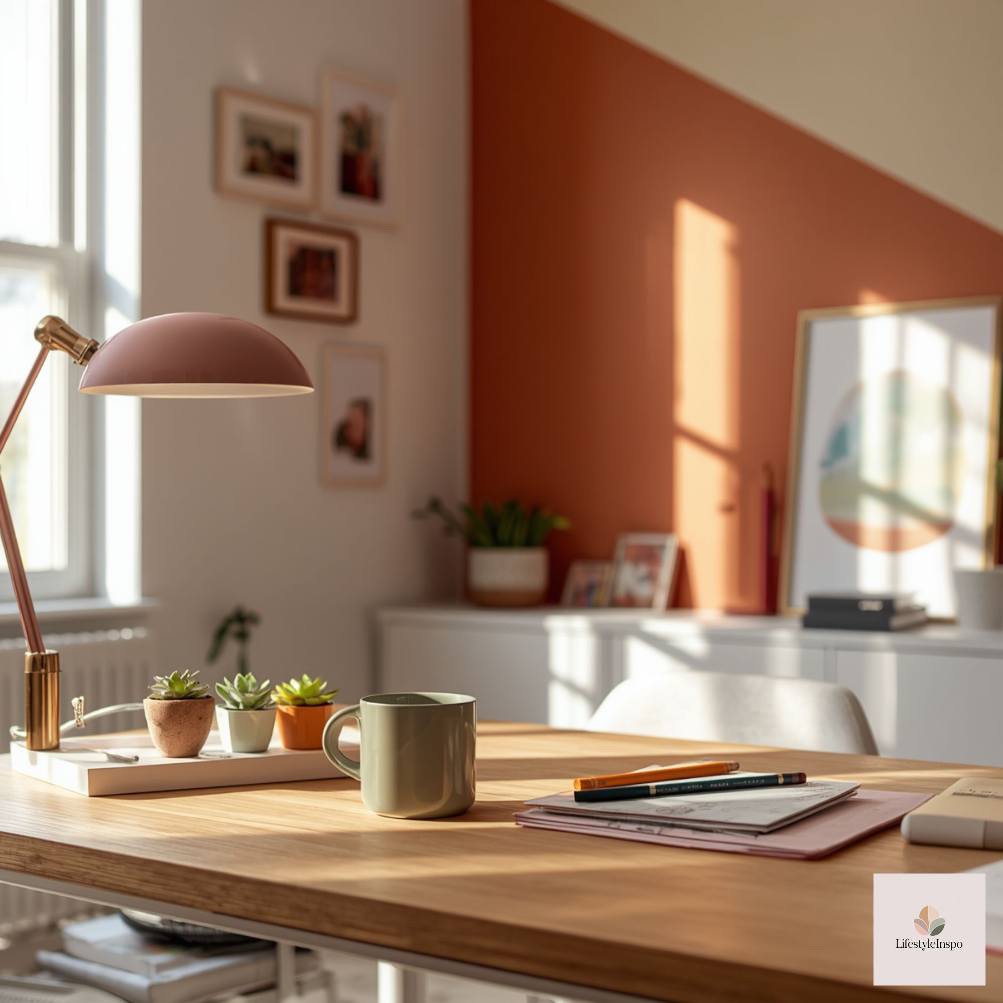
Designing for accessibility means ensuring sufficient contrast for readability and navigation.
- Text and background: If you use colored backgrounds (wall, board, screens), make sure text or critical elements are readable. Dark text on light backgrounds or light text on dark backgrounds are easiest to read.
- Glare and lighting: Bold colors with glossy finishes can create glare under strong lamps. Matte paints and fabrics reduce reflection.
- Visual clarity: Use color to highlight, not to confuse. For example, color-code storage or folders but label them with high-contrast text for quick recognition.
Color on camera: What to know for video calls

Your color choices show up on screen. Keep these tips in mind for a professional, flattering background:
- Avoid wearing the same color as your background to retain separation.
- Softer tones photograph more evenly; very bright hues can skew skin tones on some webcams.
- If you want a branded look in meetings, subtly incorporate color through a framed print, themed mug, or a calming background image sourced from assets like Blue Green Watercolor Backgroundsto create a cohesive, polished backdrop.
Blue Green Watercolor Backgrounds | Digital Paper Clip Art for Teachers & Students (PNG)
Two practical room plans with color prescriptions
Plan A: The calm creator (small apartment office)
- Anchor: single matte slate-blue wall behind desk.
- Furniture: light oak desk, white shelving.
- Accents: cream linen curtains, navy desk organizer, potted fern.
- Art: One large blue-green watercolor style print to tie the palette together (consider using Blue Green Watercolor Backgrounds for inspiration in prints or digital displays).
- Lighting: warm LED desk lamp with matte brass finish.
Plan B: The energizing corner (shared living space)
- Anchor: neutral walls; use a teal rug under the desk.
- Furniture: compact white desk, floating shelves in soft gray.
- Accents: coral desk calendar, chartreuse desk plant, teal mouse pad.
- Art/Accessories: framed clip art or slide assets—choose pieces that match your color palette; Blue Clip Art Assets For Business Slides can be a simple, on-theme choice for mood boards or desktop wallpaper.
- Storage: woven baskets in natural tones to balance the pops of color.
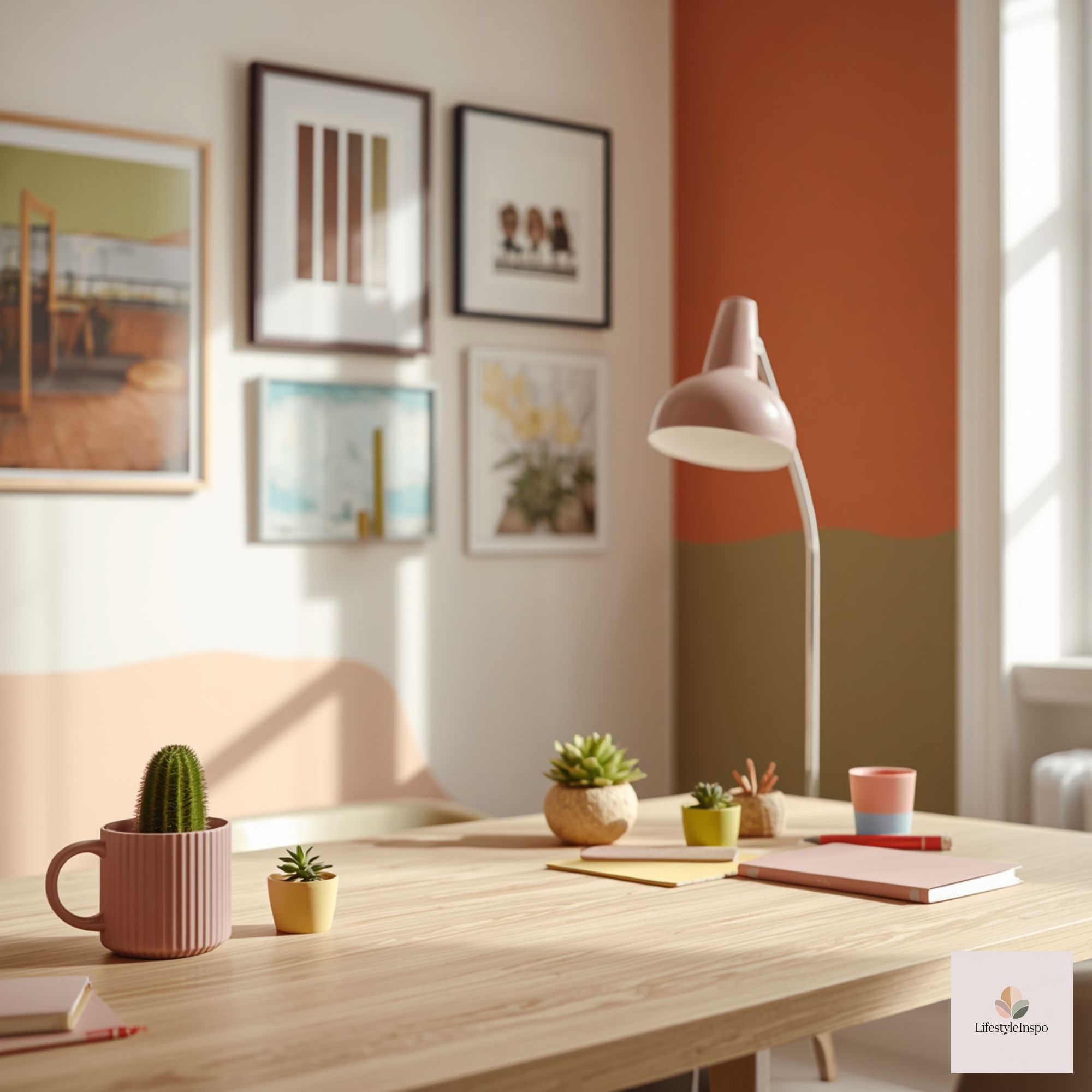
Common mistakes and how to avoid them
- Over-saturation: Too many saturated colors compete visually. Stick to one anchor and controlled accents.
- Ignoring scale: Small pops of color are lost in big rooms. Scale your anchor appropriately—larger rooms call for painted walls or rugs; small rooms for textiles and art.
- Choosing trend over temperament: Trendy palettes look great in magazines but can wear you out. Choose colors you genuinely like and will enjoy for the long term.
Maintenance and seasonal refreshes
- Rotate small accents seasonally—switch a pillow cover and some stationery for spring vs. fall hues.
- Keep a neutral base for big items, then refresh color via smaller accessories.
- Clean fabrics and textiles regularly; color fades faster with dirt and sun exposure.
Sourcing color-coordinated products
- Look for coordinated sets in home and office lines to avoid hunting for exact matches.
- Digital assets like Blue Clip Art Assets For Business Slides and Blue Green Watercolor Backgrounds are quick ways to bring consistent color into digital materials and printed pieces that complement your physical decor. Integrating these into presentation slides, printed art, or desktop wallpapers helps create a unified aesthetic.
Budget and small-space/accessibility recap
- Budget: Pick one anchor and refresh with under-$50 accents. Thrift stores and online marketplaces are great for finding colorful textiles and frames inexpensively.
- Small-space: Use vertical color, removable wallpapers, and multi-use textiles rather than floor-covering rugs.
- Accessibility: Prioritize high-contrast labels and matte finishes; use color to aid navigation, not to obscure information.
Ready to make your office feel more like you? Start with one anchor piece this week—a print, a rug, or a painted wall—and build your palette around it. If you want ready-made digital pieces to tie your space together, check out Blue Clip Art Assets For Business Slides and Blue Green Watercolor Backgrounds to add cohesive color to both your physical and digital workspace.
FAQ (exactly 3 concise Q&A)
Q: How many colors should I use in an office palette?
A: Aim for one anchor color, one neutral base, and one or two accent colors—three to four colors total keeps the space cohesive without feeling busy.
Q: Can I use bright colors in a small office?
A: Yes—use bright colors in smaller accents (pillows, art, organizers) or place them on a single wall. Balance with neutrals to avoid visual overwhelm.
Q: How do I ensure my color choices work on video calls?
A: Avoid matching your clothing to your background color, favor softer tones for walls, and keep busy patterns off camera. Add a single focal element—art or a plant—that complements your look without dominating the frame.
About the Author