Country Kitchen Art, Reimagined: A Charming Cow Print DIY With a Modern Finish
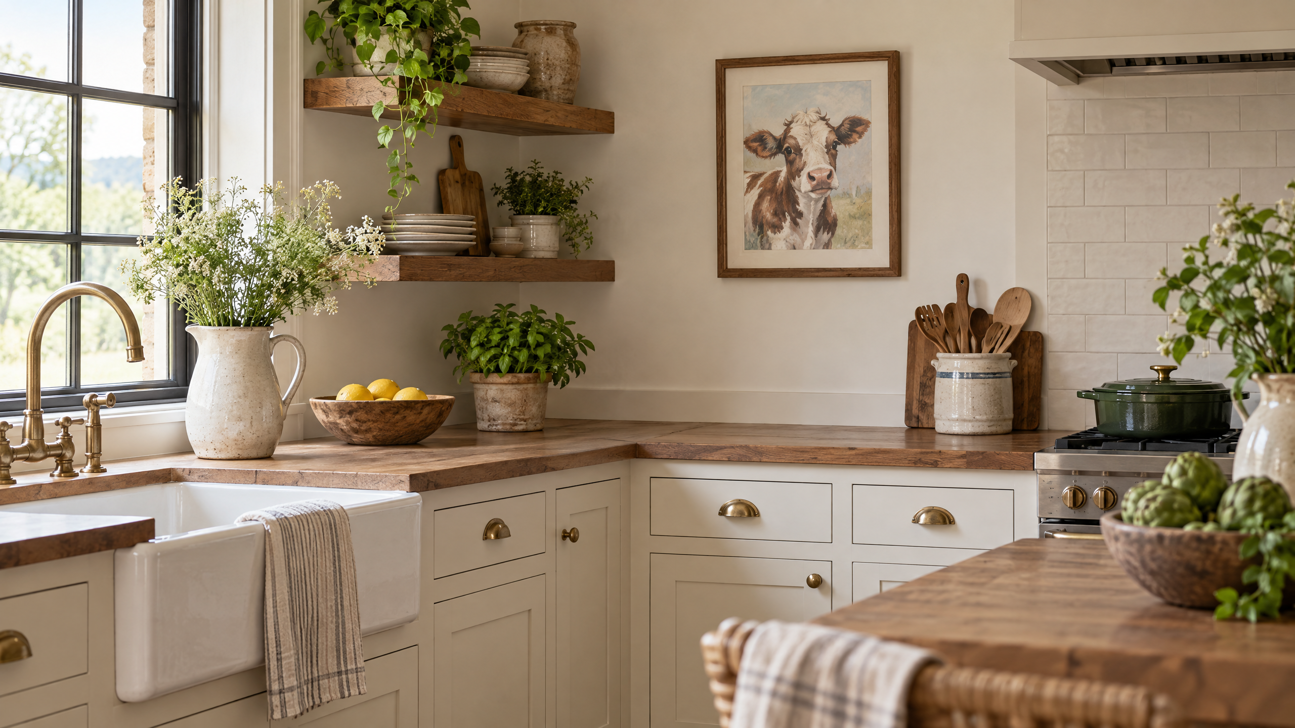
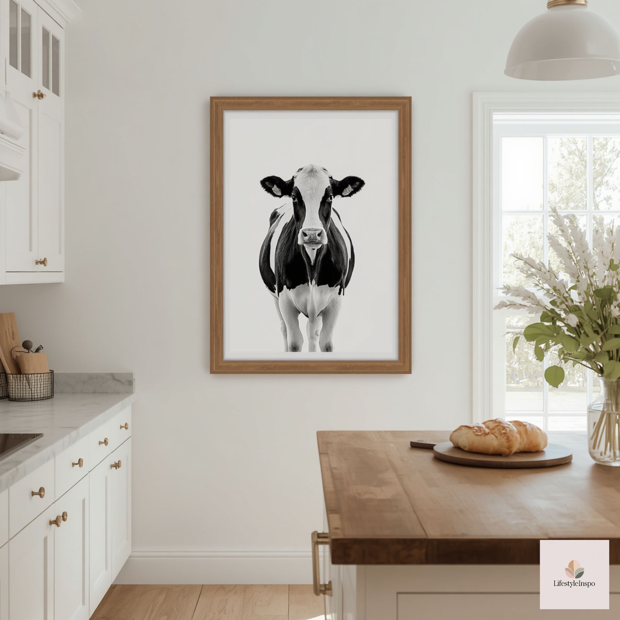
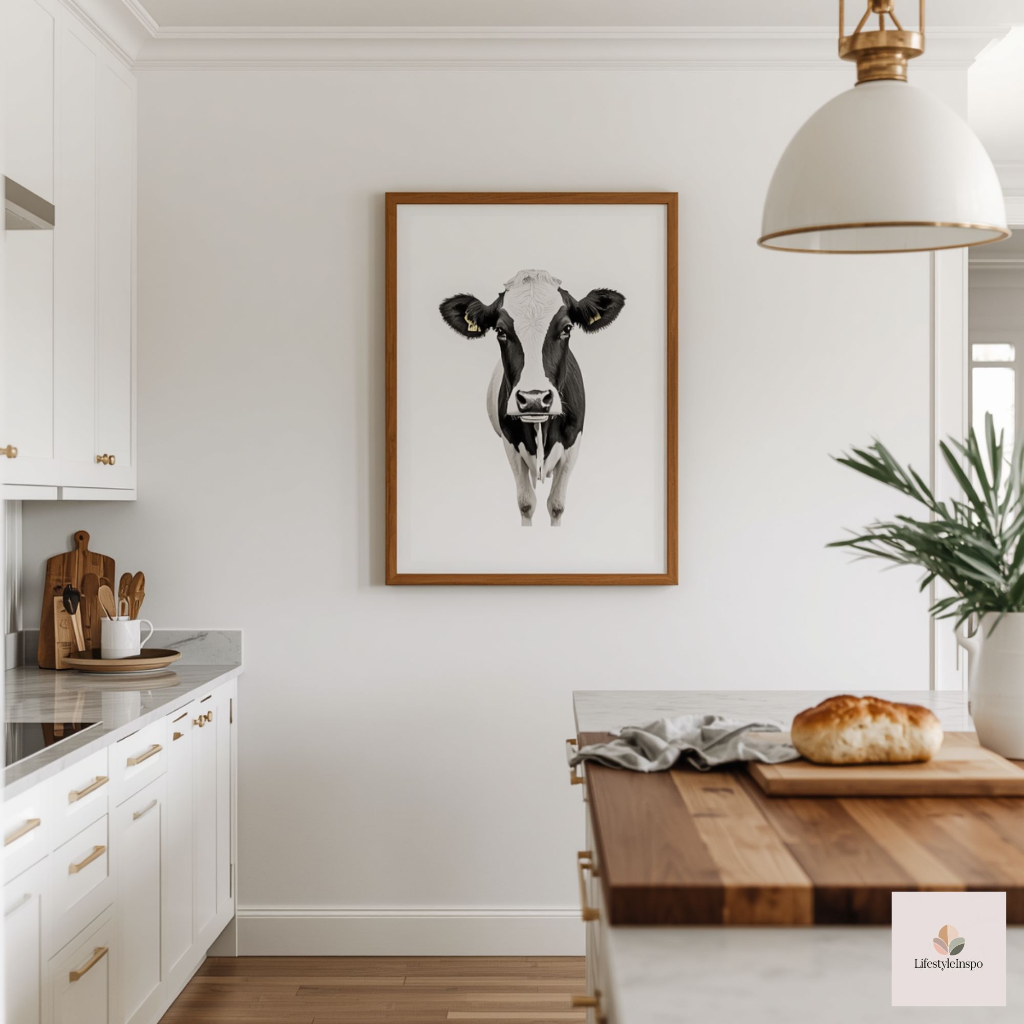
Invite a little pastoral charm into your kitchen without surrendering a modern sensibility. If you’re drawn to country motifs but want a cleaner, more edited look than the usual farmhouse clichés, a single hand-colored cow illustration can be just the ticket. This project takes one approachable creative element—the Cute Cow Coloring Pages—and turns it into a polished modern country kitchen wall decor vignette that reads intentional, not theme-park.

Below you’ll find a guided plan for choosing, coloring, framing, and styling your cow print so it complements warm woods, matte ceramics, and the uncluttered lines of contemporary kitchens. There are practical alternatives for renters, tight budgets, and little hands who want to help. The emphasis is on restraint: one whimsical focal piece, supporting elements that feel curated, and finishes that keep the overall look clean and fresh.
Cute Cow Coloring Pages / Sheets of Cute Cow {Coloring Book}
Why one print works better than a gallery
- In a modern country kitchen, restraint feels luxe. A single, well-placed art piece becomes a gentle exclamation point rather than background noise.
- Focused scale helps bridge country charm and modern design. One medium-sized print hangs confidently above a small shelf, peg rail, or over the coffee station.
- It’s easier to edit accessories around a single piece—essential when you want warmth without busyness.
Materials and tools (mini shopping guide)
- Cute Cow Coloring Pages — the simple line art that’s the basis for the project:
- Quality paper or cardstock (if you plan to print)—see seller listing for file and printing guidance.
- Coloring media: water-soluble colored pencils, soft graphite for shading, and a couple of alcohol markers or fine-tip pens for bolder accents.
- Lightbox or a bright window (optional) for tracing if you want to preserve the original sheet.
- Clean-lined frame with a mat, ideally in white, black, or natural wood.
- Mounting materials: acid-free backing board, archival tape, and museum putty for renter-safe hanging.
- Small vignette decor: a low ceramic pitcher, a narrow wooden shelf or floating shelf, a small potted herb, and one or two neutral ceramics.
Choosing your cow illustration and the palette
- Think scale first: a 9×12” or 11×14” final image reads nicely in most kitchens without competing with cabinetry or open shelving.
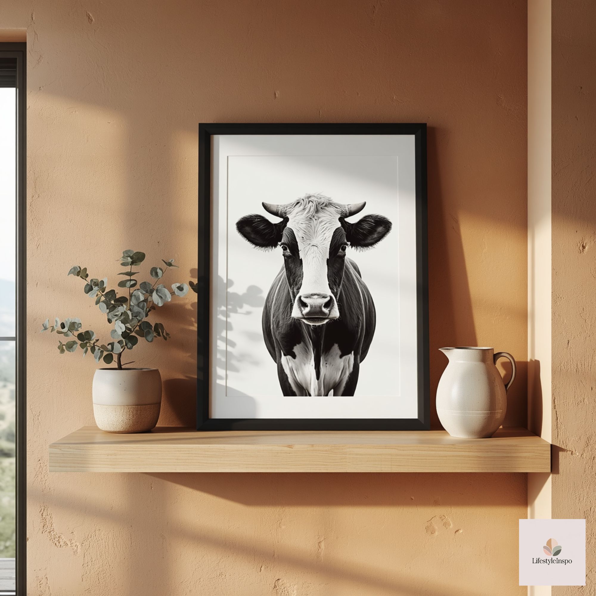
- Use the cow line art as a foundation. Decide whether you want it naturalistic (tonal blacks, soft greys, warm browns) or stylized (muted terracotta, sage green, or dusty blue to tie into existing finishes).
- Keep background color minimal. Modern country leans on negative space—let the paper remain bright, or add a very pale wash (think: milk-white, light parchment, or barely-there warm gray).
- Consider two-tone accents only: pick one color for cheeks/ears or a scarf detail and another neutral for the body shading. This preserves the simple, contemporary feel.
Step-by-step coloring approach
- Prep your surface. If you printed on heavyweight paper, allow it to relax flat under a board. If using originals, secure them to a flat surface.
- Establish light direction. Decide where your “light” comes from (top-left is common). This will inform shadows and shading for the cow’s form.
- Base tones first. Lightly layer colored-pencil strokes for broad planes—cheeks, the base of the muzzle, and the inside of the ears. Use circular, feathering motions to avoid harsh lines.
- Add depth with a softer tool. Apply a soft graphite pencil or a darker colored pencil for shadow areas under the jaw, around the eyes, and where legs meet the body. Blend very lightly with a tortillon or clean finger.
- Reserve detail tools. Use a fine-tip pen for the eyes and nostrils if you want sharper contrast; otherwise deepen with a dark pencil. Keep eyelash and whisker marks minimal to maintain a modern aesthetic.
- Accent selectively. Want a pop? Add a slim band of muted color (terracotta or faded indigo) as a mini scarf or a floral sprig near the cow’s ear. Keep it small so it reads as a designed touch.
- Fix and protect. If you used pencils only, a light spray of workable fixative can secure the surface—test first. For mixed media, consult the advice that came with your art supplies.
Framing and matting: modern choices that sing
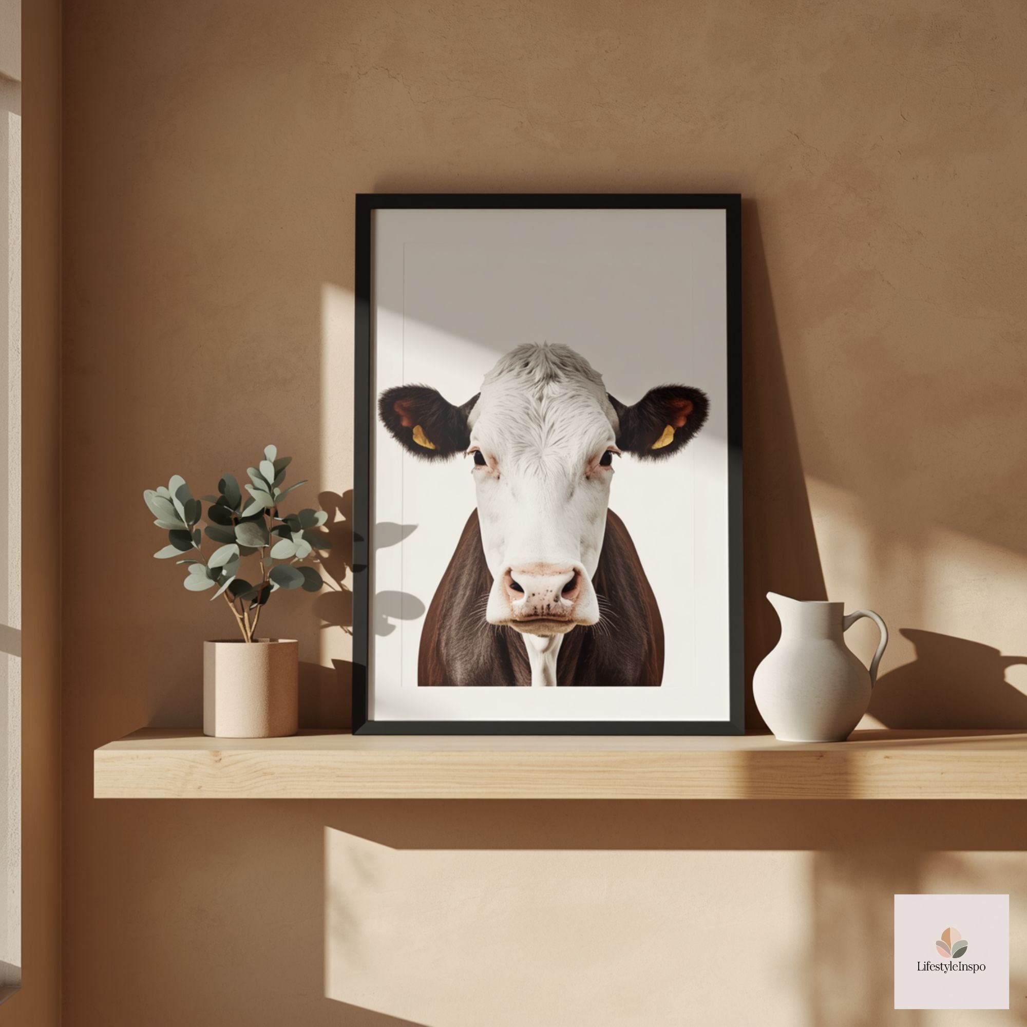
- Frame: Choose either a slim black metal frame for crisp contrast, a warm stained wood to echo kitchen cabinetry, or a painted white for a softer look. Avoid ornate or heavily distressed frames; the contrast should be intentional and measured.
- Mat: A white or off-white mat creates breathing room and keeps the eye on the illustration. Opt for a 1.5–2″ mat width for an 8×10 print; scale up for larger sizes.
- Glazing: Non-glare glass keeps the look casual and homey but consider museum glass if the piece will be in direct sunlight.
- Backing: Use acid-free materials to prevent yellowing if you plan to keep the piece long-term.
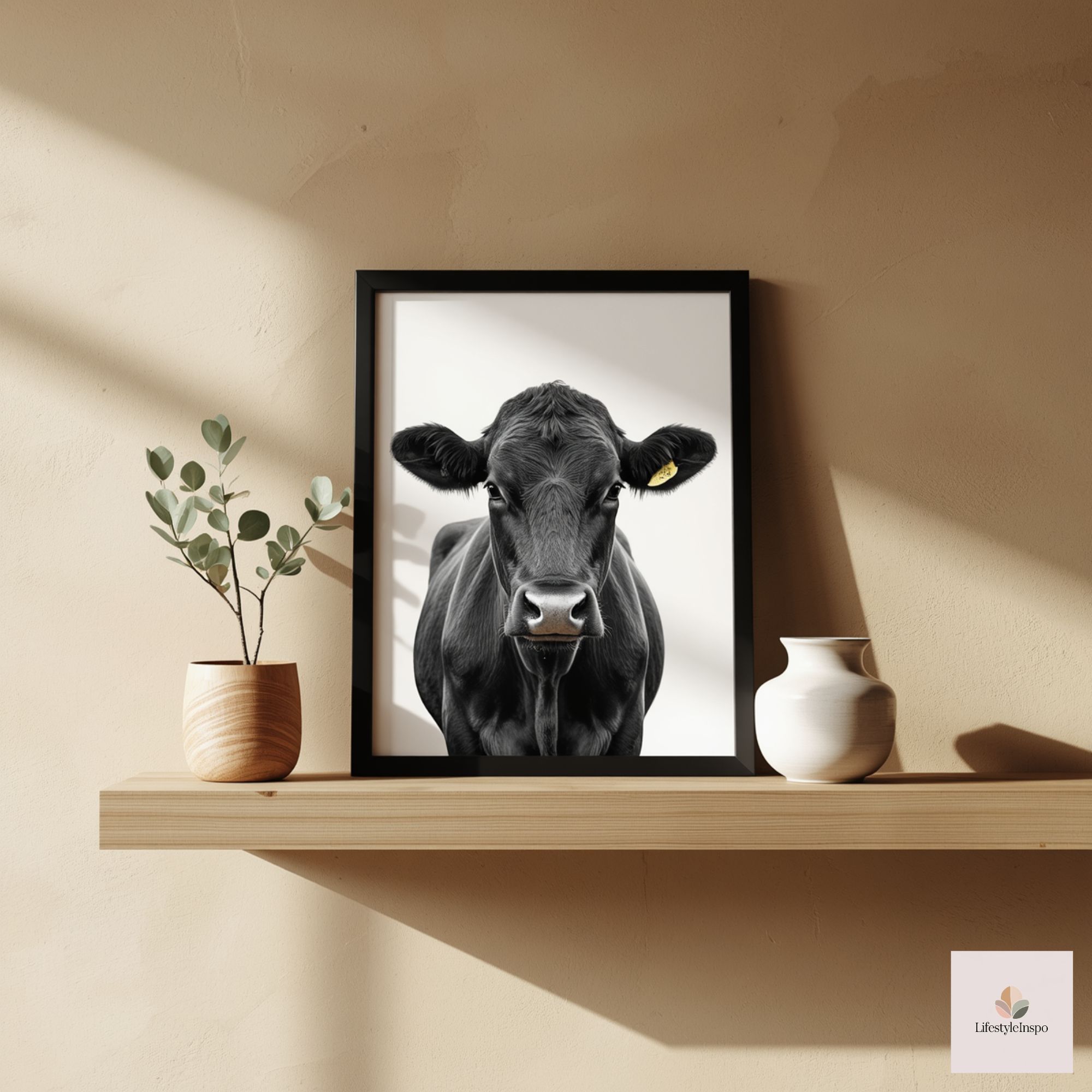
Where to hang it for maximum charm
- Above a narrow shelf or peg rail: Install a small floating shelf at eye level and center the framed cow above it. The shelf provides space for layered ceramics and a small herb pot.
- Over a coffee or tea station: The print gives personality without becoming kitchen clutter. Place it near a tray with your favorite mugs and a small creamer.
- Beside open shelving: Let it anchor a run of ceramics without competing. Position the print so its midpoint is at eye level when standing—about 57–60″ from the floor.
- As part of a recessed niche: If you have a small recessed section, centering the framed cow against a painted-back wall (muted sage or cream) creates depth.
Styling the vignette: balance rustic warmth with modern restraint
Follow the “one-voice” principle: choose one material to be the hero (warm wood, matte white ceramic, or matte black metal), a secondary texture for contrast, and an accent color repeated in small doses.
Vignette examples:
- Warm wood + matte white ceramics + soft green:
- Place the framed cow over a slim oak shelf.
- On the shelf: one low white pitcher, two stacked shallow bowls, and a small terracotta pot with rosemary.
- Add a folded linen napkin in a muted sage draped under the pitcher to echo the greenery.
- Matte black metal + stoneware + bleached wood:
- Frame in a slim black metal.
- Shelf: a speckled stoneware mug, a narrow black utensil holder, and a small wooden salt pot.
- Add a single stem in a fluted narrow vase for height variation.
- Bleached wood + neutral ceramics + linen:
- Frame in a light wood frame and hang above a peg rail with a single looped linen tea towel.
- On the shelf: stacked plates with a small ceramic milk jug on top.
- Keep colors in a warm, desaturated palette: oatmeal, cream, and soft browns.
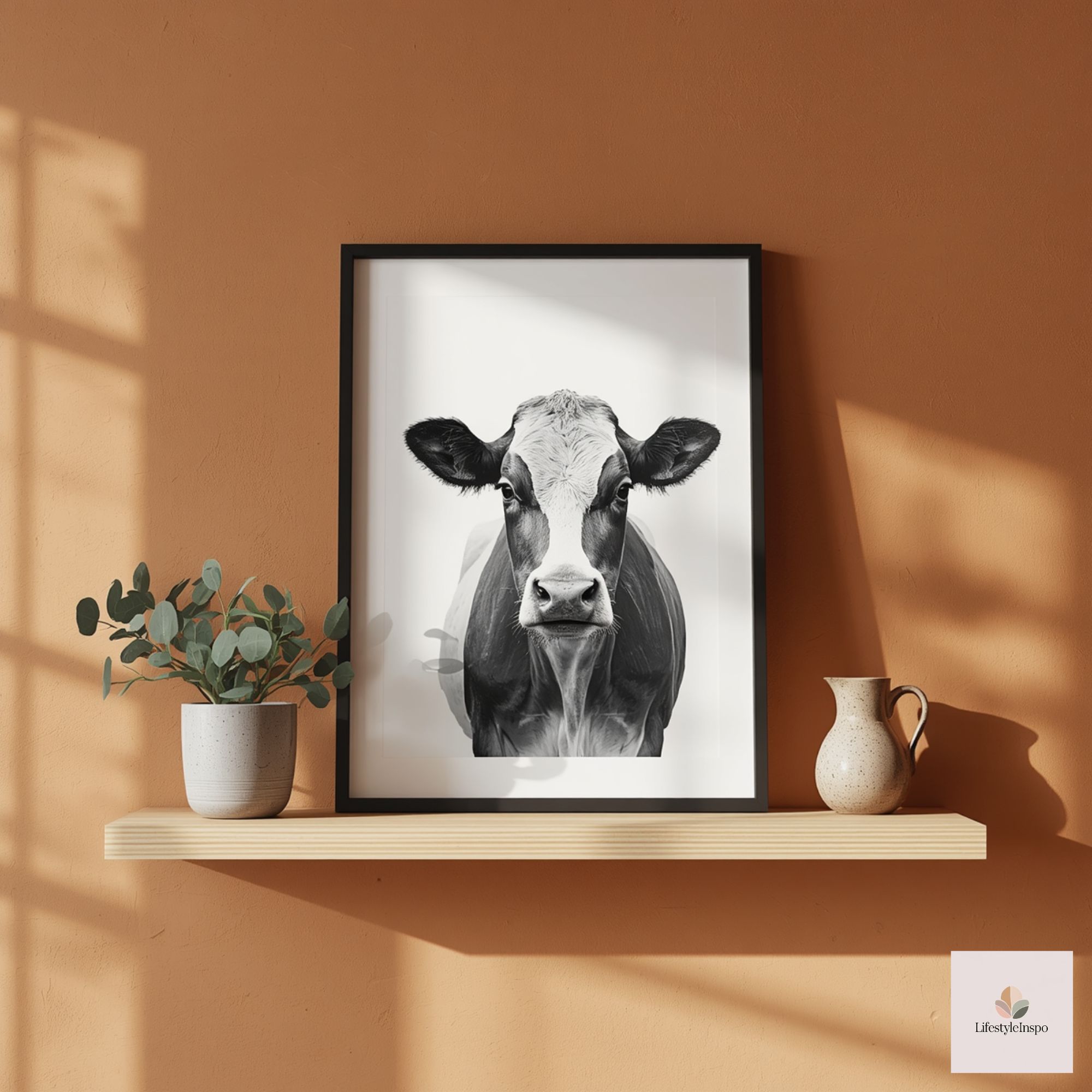
Practical swaps for renters and tight budgets
- No-hang solution: Lean the framed print on open shelving, the countertop backsplash ledge, or the top of the refrigerator. Use museum putty on the bottom corners to keep it steady.
- Inexpensive framing: Many photo labs and big-box stores offer budget frames with matting. Alternatively, use a clip frame or a magnetic poster hanger for a simpler, modern look.
- DIY mat: If matting services are expensive, create a faux mat by mounting the print on a slightly larger piece of archival cardstock behind glass.
- Print and color at home: If you want to test different colorways before framing, print several copies on heavyweight paper and experiment. Keep one pristine for the final piece.
Involving kids (without losing the look)
- Assign roles: Have kids color a secondary element—tiny flowers, a little scarf, or the cow’s cheek blush—on a separate printed copy. Frame the adult-hand-colored piece and display a smaller, more playful version nearby, perhaps in a floating frame on the refrigerator or in a child-height spot.
- Collaborative color block: Give kids a swatch card with 3–4 approved colors so their contribution stays within the modern palette. This encourages creativity without compromising the aesthetic.
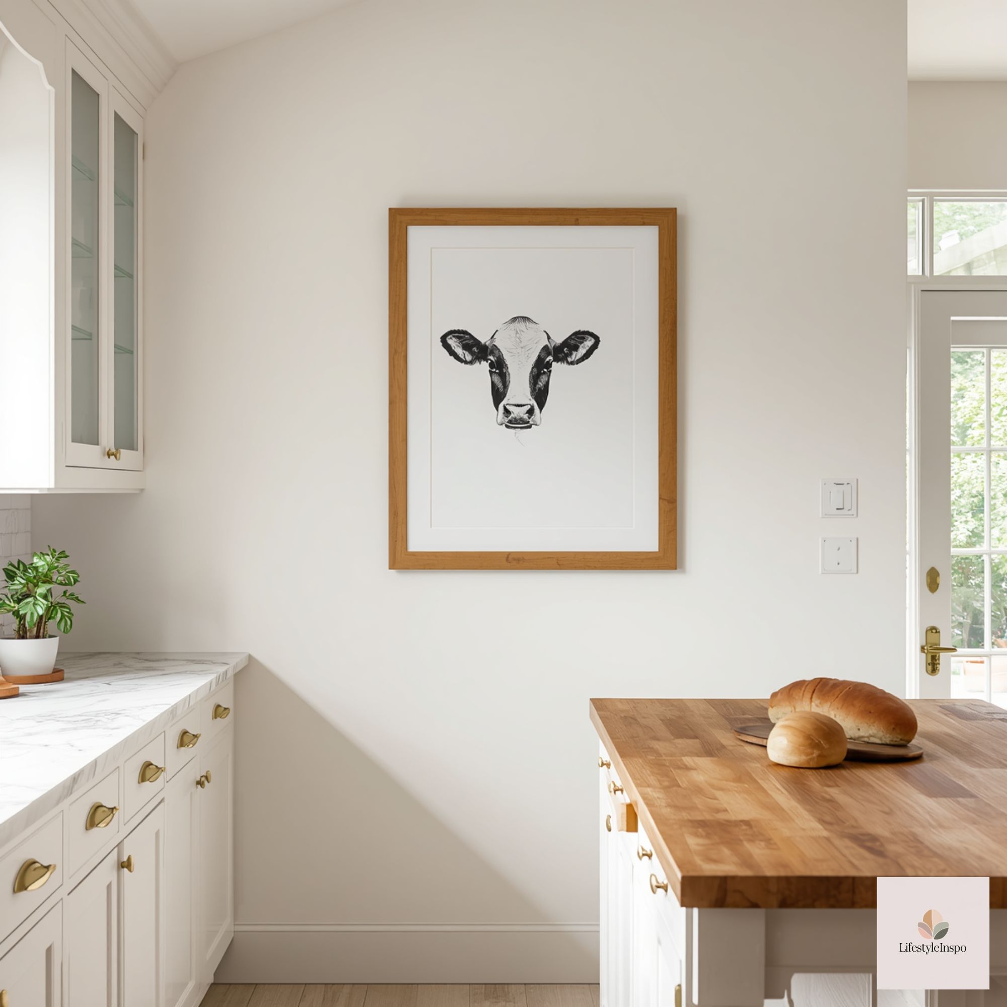
Lighting and finishing touches
- A small directional wall sconce or under-shelf puck light can gently illuminate the artwork without creating harsh reflections.
- Keep the area tidy. The charm of this look depends on curated restraint. One stack of plates, one utensil jar, and one sprig of greenery will say more than several mismatched pieces.
- Swap seasonally: Change the accent (a sprig, a napkin, a small bowl) seasonally for freshness and minimal cost—dried grasses in fall, a lemon slice in summer, eucalyptus around the holidays.
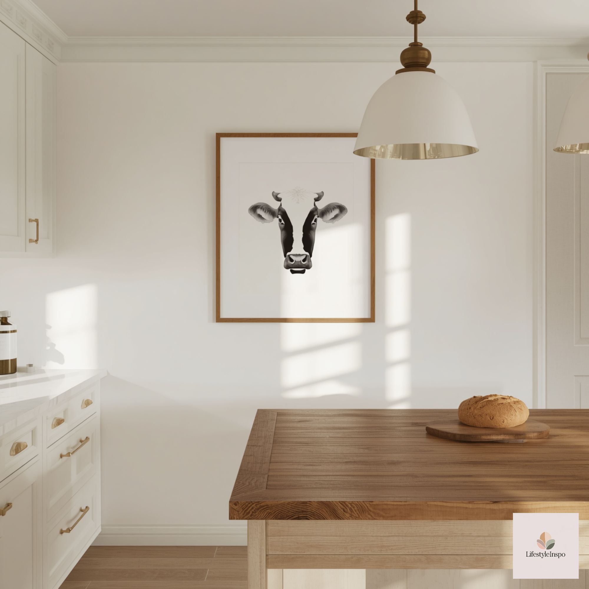
Maintaining the look over time
- Rotate art and accessories yearly to keep the vignette feeling intentional rather than permanent.
- If the cow print is hand-colored on delicate paper, avoid placing it where steam from kettles or pans could reach it; moisture will warp paper and dilute delicate media.
- Check hanging hardware every six months to ensure frames remain secure and level.
Troubleshooting quick questions
- My kitchen has lots of cabinetry—where do I put the print? Choose a small patch of wall between cabinets, over the sink backsplash if not directly above the stove, or create an open shelf break-out where the print can sit alone.
- I don’t like cows—can I use another animal? Absolutely. The method works for any line art you love; keep the same restraint in color and styling.
- How do I scale the concept for a larger kitchen? Use a pair of spaced single prints in matching frames rather than a full gallery. This keeps the feel edited and contemporary.
Final styling checklist before you hang
- Colors: 1 dominant warm material, 1 neutral, 1 small accent color repeated in two places.
- Scale: Frame size proportionate to surrounding cabinetry or shelving (avoid tiny prints on large, blank walls).
- Balance: One vertical and one horizontal element on the shelf or countertop.
- Light: Soft directional light or indirect daylight to show texture without glare.
- Edit: Remove any item that doesn’t contribute to the simple, modern country story you’re telling.
A modest takeaway
A hand-colored cow illustration can be more than nostalgia; treated with restraint, clean framing, and thoughtful materials, it becomes a modern country kitchen wall decor piece—equal parts cozy and contemporary. Start with a deliberate palette, keep the companion items minimal, and let one charming illustration set the tone for a kitchen that feels like home without feeling dated.
For the coloring pages that make this project simple to start, see Cute Cow Coloring Pages. Check the seller’s listing for details about printing and usage before you begin.
About the Author