Unexpected Nature-Inspired Entryway Decor: A Floral Animal Art DIY
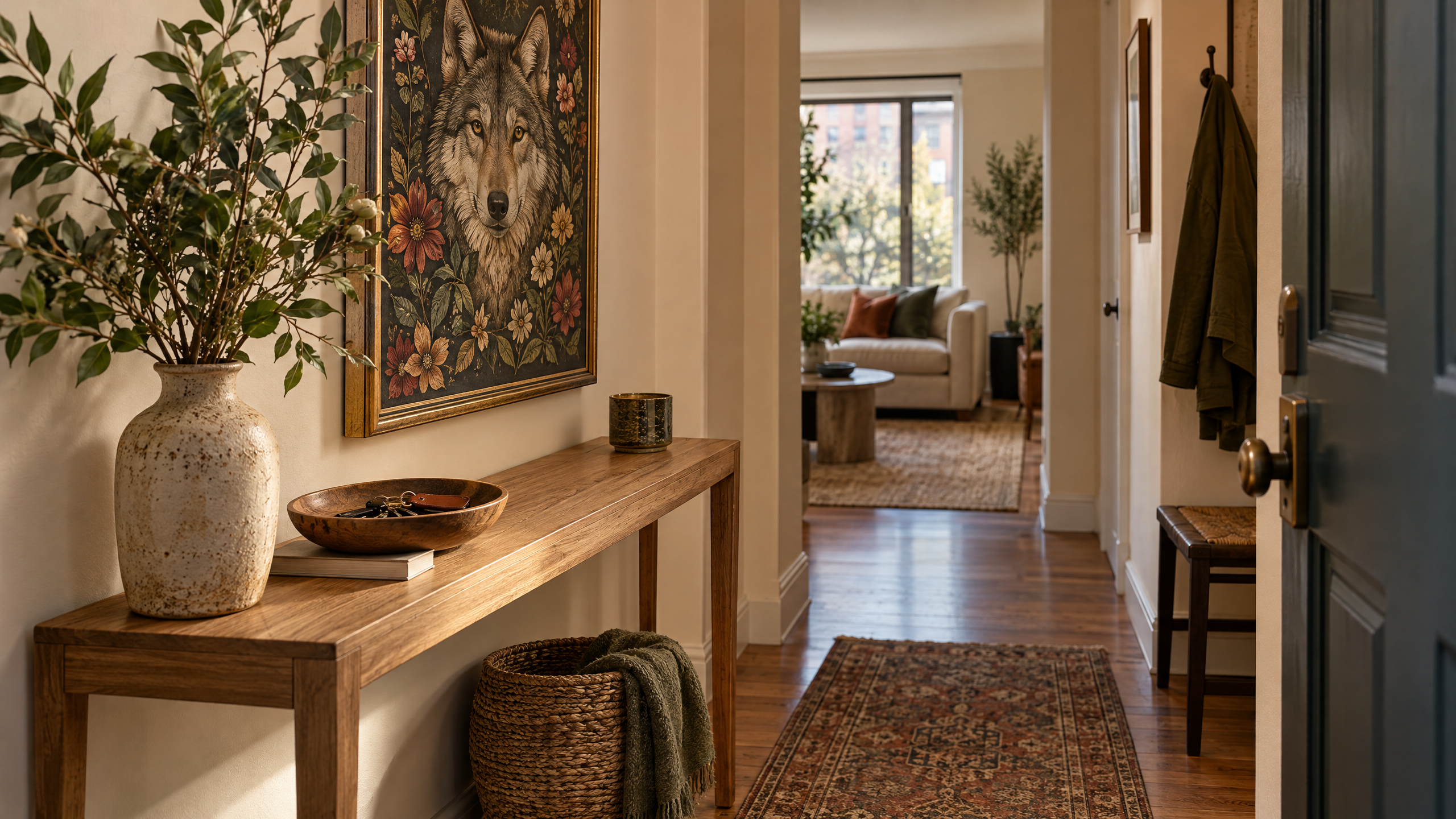
A compact entryway is often a tough design puzzle: you want personality without clutter, scale without overcrowding, and a visible focal point that feels intentional instead of an afterthought. One surprisingly impactful way to achieve that balance is with nature inspired entryway decor — specifically, a floral-animal art DIY centered above a narrow console. Think of a striking, slightly wild focal piece like a floral wolf image that brings organic energy without the heaviness of a large framed landscape.
Below you’ll find a full how-to and design guide for styling a slim console table with an earthy color story, asymmetrical composition, and a floral wolf print created from coloring-page clip art (a perfect creative starting point). This approach is renter-friendly, scale-conscious, and easy to personalize whether you’re working with thrift finds, a modest budget, or an apartment lease.
Why a floral animal image works for entryways
- Nature inspired entryway decor feels inviting: animals and botanical motifs conjure homey, lived-in warmth. A floral wolf combines soft florals and a bold silhouette, giving the entryway an edge without being aggressive.
- The graphic nature of coloring-page art reads well at small scale: high-contrast lines and patterning hold up when printed smaller than a full poster, so it suits narrow walls over slim consoles.
- A DIY approach increases adaptability: you can color, mount, or frame the artwork to match your palette, making it an excellent way to introduce green, terracotta, or smoked-wood tones into the entry narrative.
Materials and the starting asset

If you want a floral wolf image to build around, coloring-book style art provides a structured, adaptable template. One option to consider is Wolf With Floral Patterns Coloring Pages — use it as a creative base rather than a finished product. Check the seller’s listing and terms to confirm what you can do with the file before printing or reproducing it for display:
Wolf With Floral Patterns Coloring Pages / Sheets of Wolf With Floral Patterns {Coloring Book}
Beyond the image, gather:
- Slim console table (console depth ideally 10–14 inches for narrow entries)
- Two lightweight frames (one to hold the floral wolf print; one smaller or shaped frame for a secondary piece)
- Mounting materials safe for rentals: picture-hanging strips, adhesive hooks, or removable drywall anchors
- Printing paper or cardstock (if printing at home) or professional print shop services
- Color media for the print: colored pencils, markers, watercolor pencils, or a salon-style single-tone wash
- Small decor accents in earthy materials: stone or terracotta vase, small woven tray, a slender ceramic lamp, and a low plant like a snake plant or pothos
- Optional: a small bench cushion, umbrella stand, or tray for keys
Design principles to tailor the narrow console
Respect the vertical field
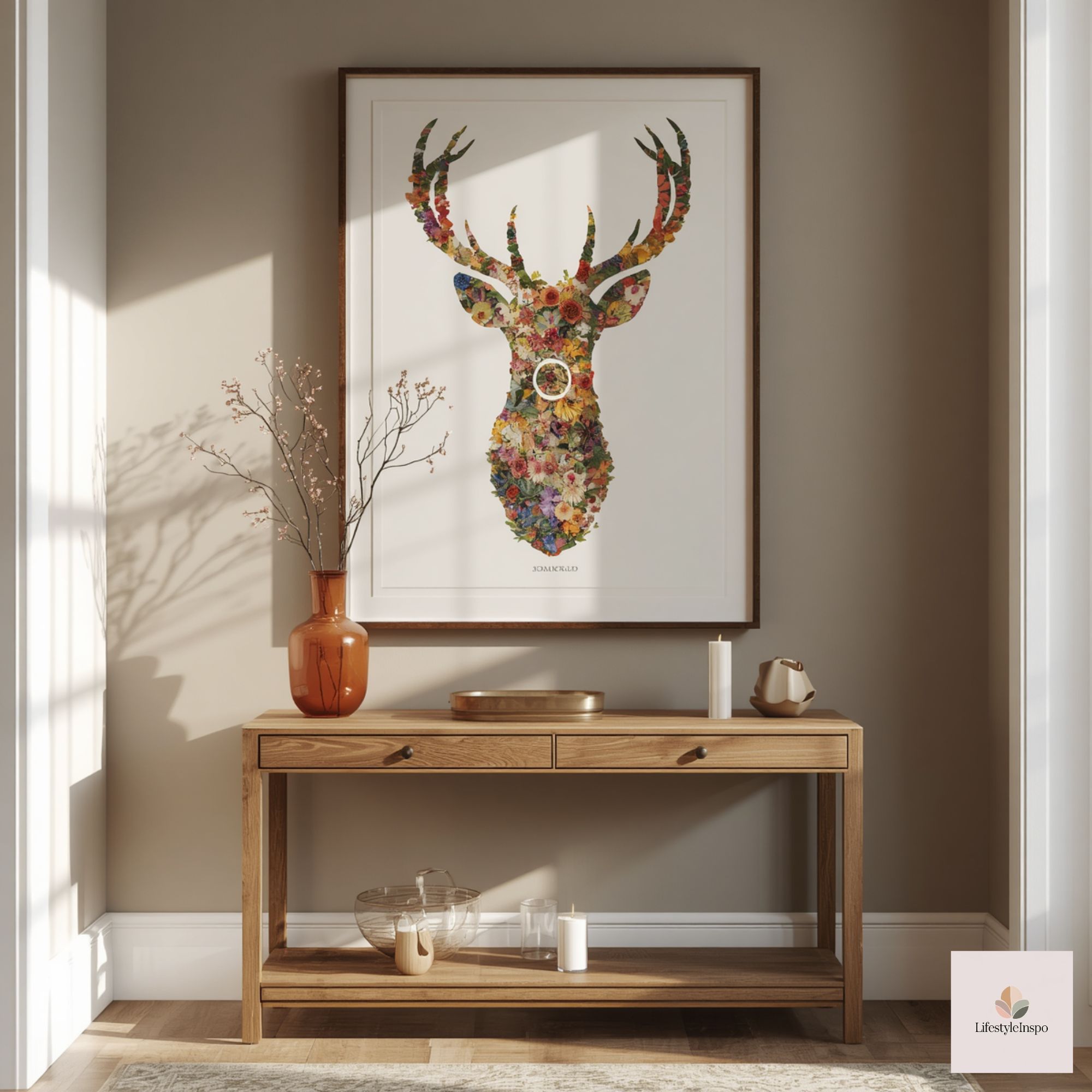
Narrow entry walls offer limited horizontal real estate, so work with vertical elements. The floral wolf image should be hung at eye level (center about 57–60 inches from the floor). Because the console is narrow, a single strong vertical artwork rather than a wide gallery wall anchors the space without overwhelming it.
Use asymmetry to make small spaces feel curated
Balanced symmetry can read formal and heavy in compact spaces. Instead, place an off-center artwork slightly to one side, and balance with a vertical lamp or tall vase on the opposite end of the console. This asymmetry feels intentional and allows breathing room for functional items like a wallet tray.
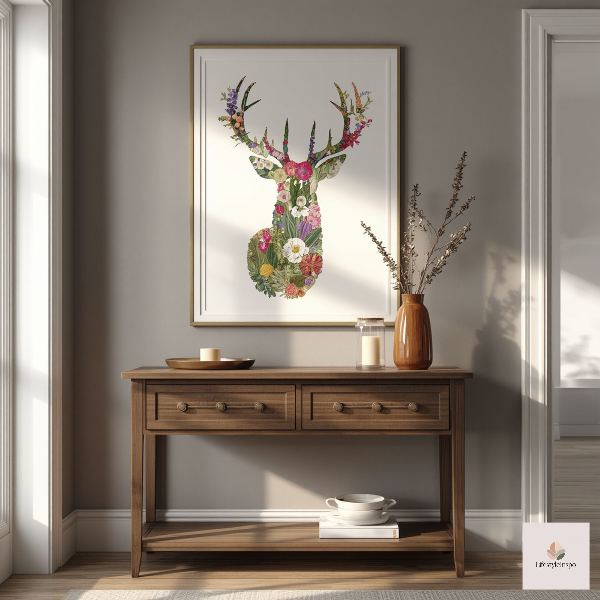
Scale for narrow depth, not width
Consoles for tiny entries usually have shallow depth. Choose accessories that emphasize height over depth—tall, narrow vases, stacks of slim books, or a taller lamp. Keep one surface plane clear (for daily drop-offs) and layer decorative items on the other.
Earthy palette for a grounded arrival
To echo nature inspired entryway decor, favor muted, earthy colors—olive green, warm terracotta, soft ochre, and smoke-gray accents. The floral wolf print can be colored to include these shades so the art ties into the vignette rather than floating as an isolated piece.
Step-by-step: Creating and presenting the floral wolf art
Choose how you’ll personalize the coloring-page design
- Full-color botanical: Color florals in subdued but saturated hues (deep marigold, moss green, dusty rose) for a folk-art feel.
- Monochrome with a pop: Keep the wolf in black ink and add a single accent color (for example, terracotta flowers) if you prefer a quieter statement.
- Watercolor wash: Lightly wash the floral elements in diluted watercolors to create a soft, organic backdrop; then re-ink defined lines with a fine pen for contrast.
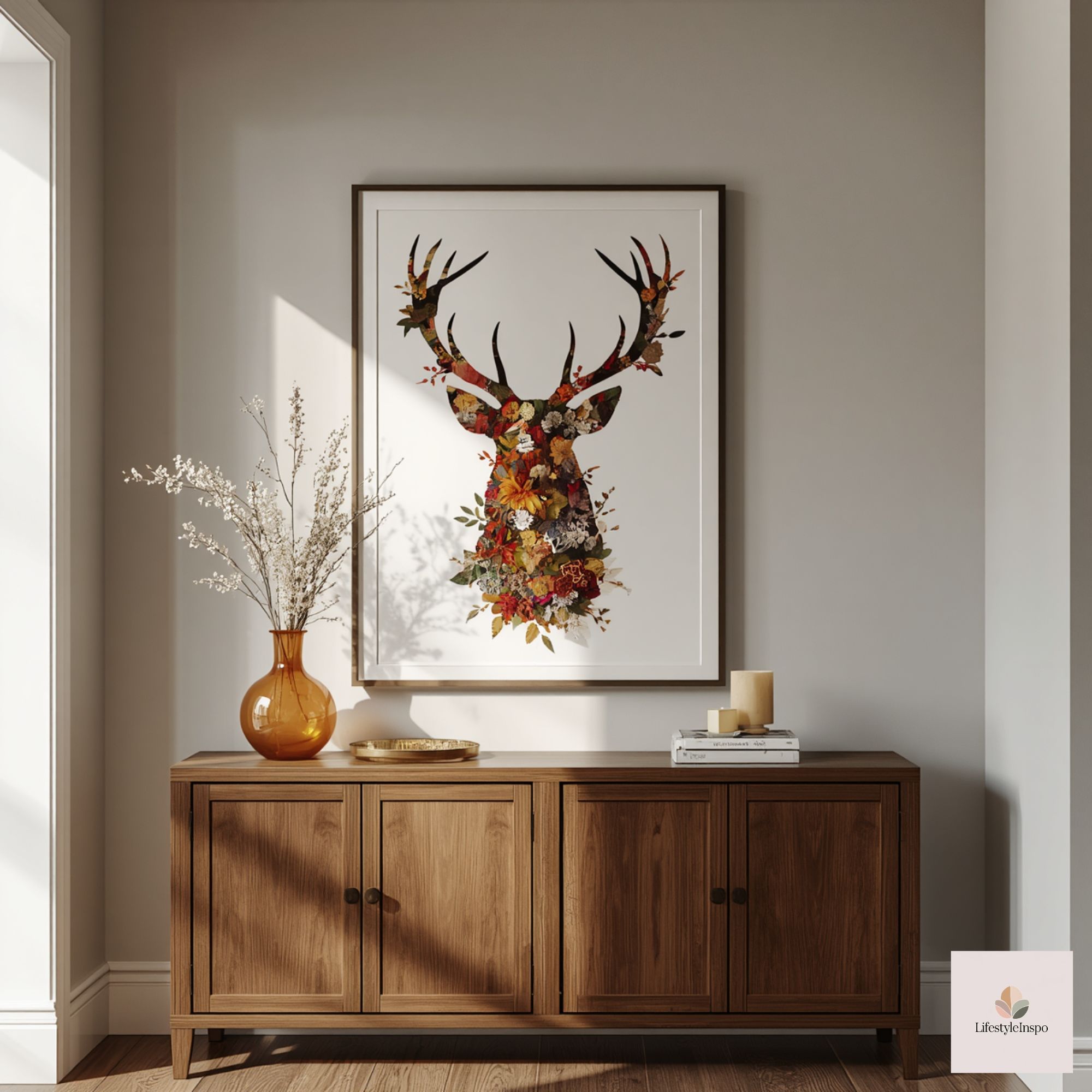
Print and size considerations
- For narrow entryways, a vertical layout around 11×17 inches often fits well above a slim console. If your wall is very petite, a 9×12 may be better; for slightly taller walls, a 12×16 or even 16×20 can create a stronger focal point. The coloring-page lines remain clear at these sizes, but check with your printer if you’re enlarging beyond typical page size.
- Consider printing options: home inkjet on smooth heavyweight paper (80–100 lb/200–270 gsm) or a local print shop on matte fine art paper for sturdiness and color fidelity.
Mounting and framing on a budget or in rentals
- Simple frame: Choose a shallow-profile frame in matte black, warm wood, or brushed metal. Floating frames give a contemporary lift; thin black frames emphasize the linework for a graphic look.
- Matting: A small mat (1–2 inches) gives breathing room and adds a modest luxury feel. For a more casual, artsy vibe, skip the mat and choose a hand-painted frame.
- Rental-friendly hanging: Use heavy-duty picture-hanging strips for frames under 10 pounds. For larger pieces, removable anchors that don’t require studs are a good compromise—just confirm your lease’s rules. Another renter-friendly trick: prop the framed print on the console, leaning it slightly against the wall to avoid holes entirely; pair with a ribbed runner or tray to prevent scratches.
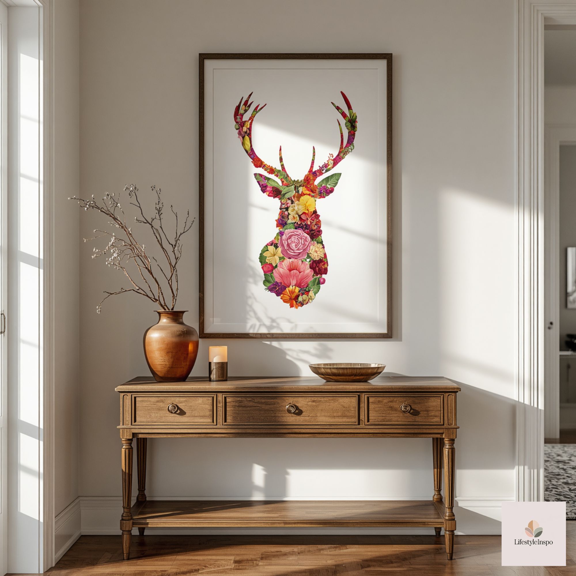
Styling the console: three variations for different budgets and personalities
Variation A — Minimalist earthy (budget-friendly)
- Console: Narrow metal-legged table with a wood or laminate top.
- Art: 11×17 framed floral wolf print in a thin black frame.
- Left side: Small woven tray for keys and mask, a stack of two slim paperback books with a dried eucalyptus sprig.
- Right side: Single matte terracotta cylinder vase with long-stemmed dried grasses.
- Lighting: Rely on overhead lighting to keep costs down, or use a battery-operated LED touch lamp for ambiance.
Why it works: Clean lines and a restrained selection prevent visual clutter while the terracotta and dried greens bring an immediate natural vibe.
Variation B — Layered boho-earth (mid-budget)
- Console: Refinished narrow console with a warm wood top.
- Art: 12×16 framed print with a narrow cream mat.
- Left side: Tall ceramic lamp with a linen shade and a small ceramic bowl for change.
- Middle: Lean a low, round mirror behind the print at a slight angle to increase perceived depth (use adhesive mirror pads).
- Right side: Stack of vintage books topped with a small potted snake plant in a woven planter.
- Accent: A patterned runner in muted rust and olive tones.
Why it works: Layering reflective surfaces and textural materials creates a lived-in, collected look that still reads tidy.
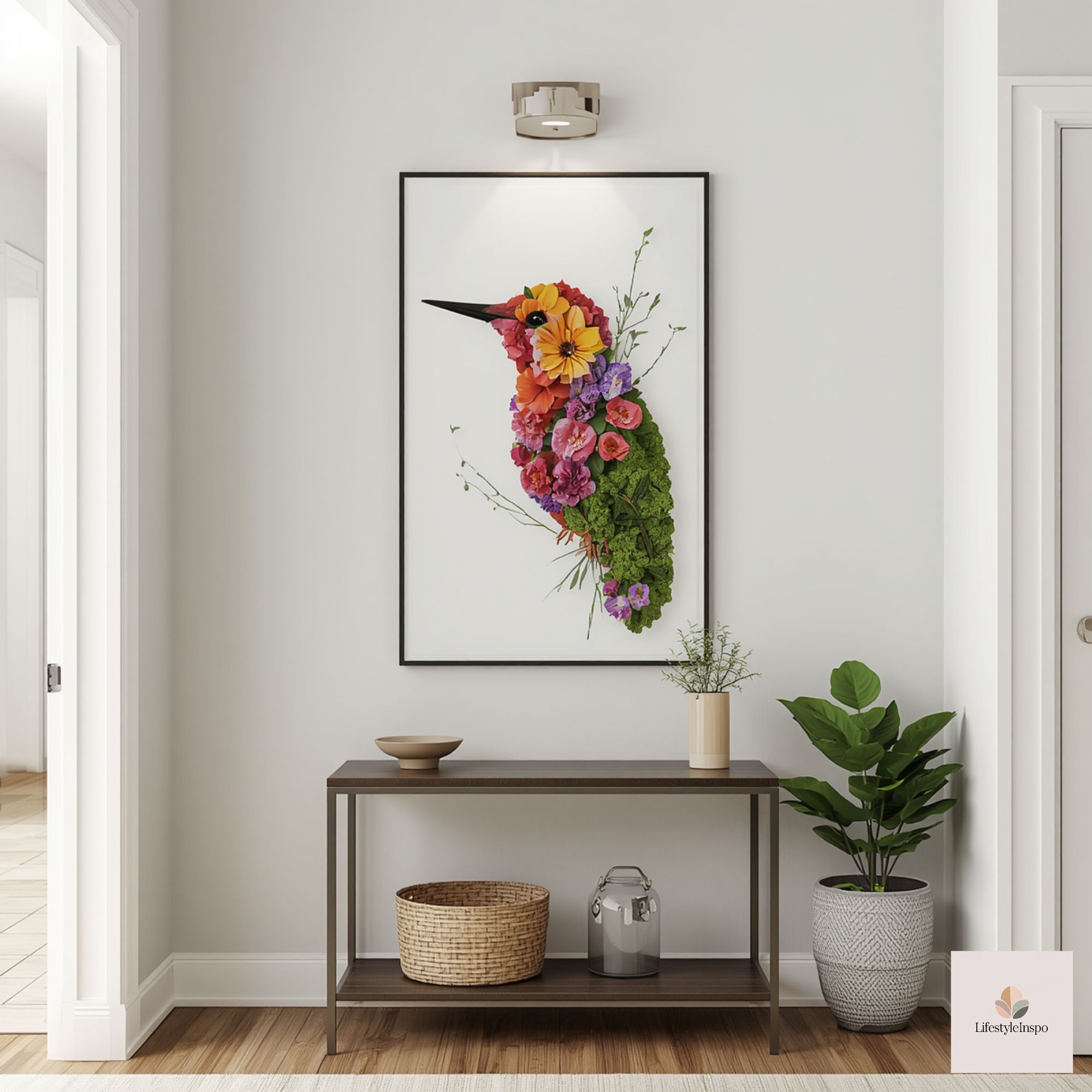
Variation C — Curated gallery-lite (higher budget, eclectic)
- Console: Slim sideboard with drawers for mail and hats.
- Art: 16×20 print framed in a reclaimed-wood frame hung slightly off-center.
- Surrounding pieces: To the left, a sculptural brass candleholder and a stoneware bowl; to the right, a handcrafted ceramic lamp and a small framed botanical sketch. Add a narrow wall-mounted shelf under the print to hold seasonal items.
- Seating: A slim upholstered bench or a mid-century stool beneath the console for putting on shoes.
Why it works: The larger print anchors a slightly busier vignette; curated objects and mixed metals lend an artisanal refined character.
Coloring tips that make printed art sing against earthy backdrops
- Contrast is key: If your console and larger decor are warm-toned, lean into cooler greens or muted teal in the floral work to create depth without clashing.
- Pick three dominant colors: Choose two neutrals (stone, sand) and one accent (rust or olive). Repeat these colors elsewhere—on a vase or the runner—to create cohesion.
- Texture over saturation: Instead of loading on bright pigment, use layering—crosshatching with pencils or a light watercolor wash—to give the print a subtle, sophisticated finish.
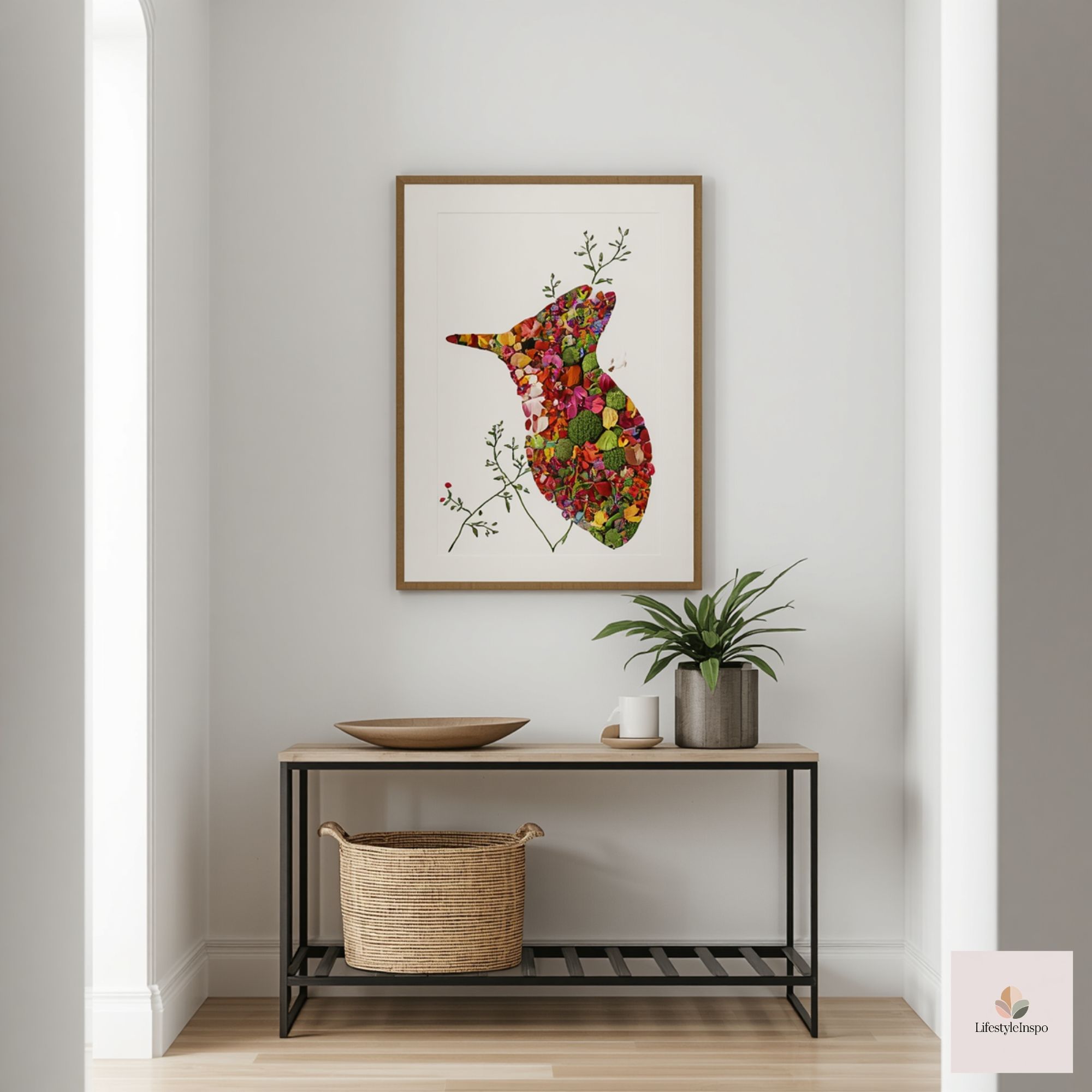
Practical renter-friendly touches
- Storage without bulk: Use the console drawers for mail and sunglasses. If your console is open, add a small basket tucked beneath for gloves or reusable bags.
- Season swap-outs: Replace the floral hues in the print or surrounding textiles by swapping a runner and a small pillow on the bench. The base art stays constant while the vignette refreshes cheaply.
- Protect surfaces: Use felt pads under decorative objects. A narrow runner or tray protects the top from keys and damp umbrellas.
- No-drill mirror or shelf solutions: Choose command-style hanging products for light shelves or mirrors; they keep the wall as-is for move-out inspections.
Lighting: ambiance that flatters the art
- A low, warm lamp (2700–3000K) on the console offers a welcoming glow and highlights the art without creating glare. If your print has delicate linework, angle the lamp so light washes across the paper rather than reflecting directly into the viewer’s eyes.
- If you prefer overhead fixtures, consider a small dimmer switch to keep the entry softly lit in evenings and brightly functional during mornings.
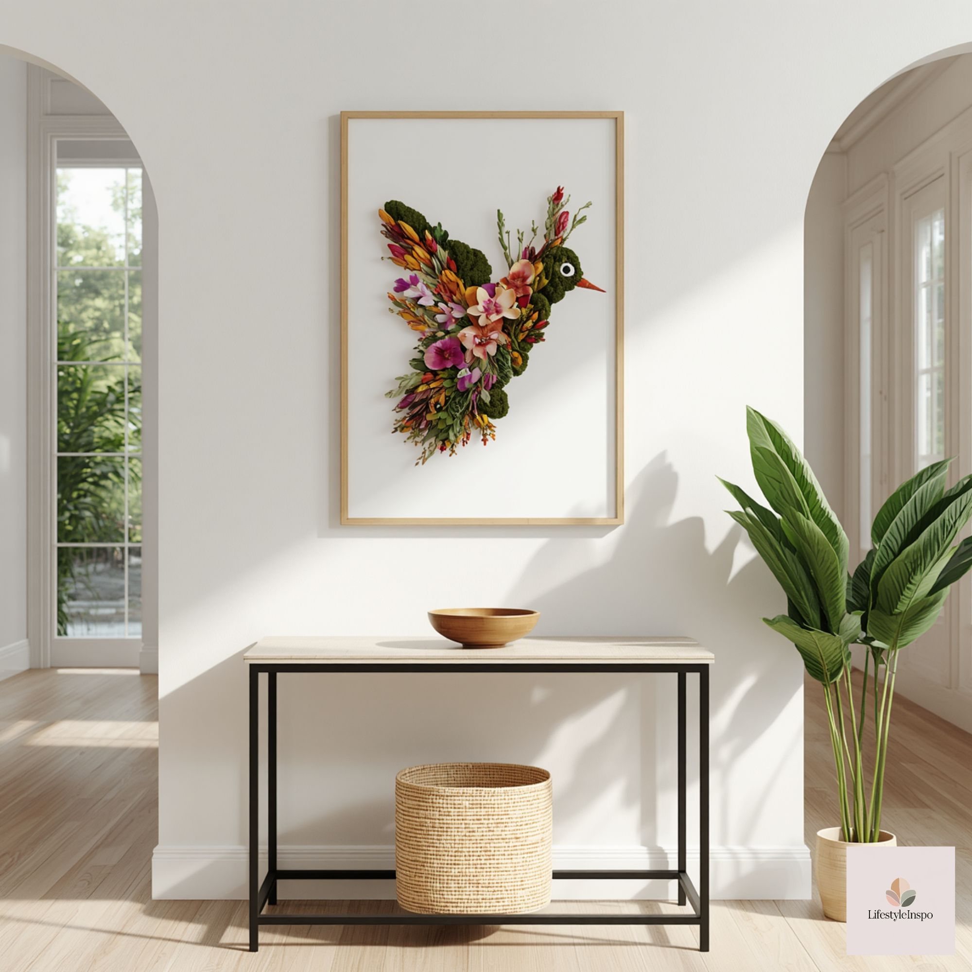
Maintenance and longevity
- Keep a microfiber cloth handy to dust the frame and table weekly. Paper prints can fade in direct sun, so avoid long-term exposure to bright windows; rotate or remove the print during peak summer if the entry gets lots of sun.
- If you color the original page with delicate media like watercolor, consider scanning or printing a copy for display and storing the original in a portfolio.
A few creative spins once you’ve mastered the setup
- Seasonal coloring swaps: Keep several colored versions of the same floral wolf print and rotate them with the seasons—muted sepia for fall, brighter greens for spring.
- Kid-collaborative entry: Use one version of the printable as a family piece—ask children to add small colored elements with washable markers and display it as a friendly, personal arrival point.
- Mixed-media upgrade: Add hand-lettered guest greetings around the frame or mount small pressed flowers on acetate layered in front of the print for texture.
Final practical checklist before you finish
- Confirm printing and framing size choices against your wall and console measurements.
- Decide whether you’ll hang the print or lean it; choose mounting hardware accordingly.
- Select three small decor objects in varied heights and textures to complement the art.
- Add a protective runner or tray for keys and daily clutter.
Takeaway
A narrow entryway doesn’t need to be an afterthought. With a nature inspired entryway decor plan that centers on a floral animal print like a floral wolf, you get bold character in a small footprint. The combination of earthy colors, asymmetry, and renter-friendly hanging options makes this a flexible, accessible project—one that reads thoughtful and layered without taking up space. Check the product listing for details if you plan to use the coloring-page art as your starting point, then personalize the print and the vignette to suit your rhythm and season.
About the Author