Christmas Color Scheme Ideas: 8 Palettes and How to Use Them
Open any box of holiday decor, and you’ll find that it didn’t come from a single plan. A red ornament from a gift swap, a green garland from a sale, a gold star from your grandmother, a bright blue bauble you couldn’t resist. Each piece is lovely on its own. Together, they sometimes look like a very festive jumble sale.
That’s where a color scheme comes in. It’s the quiet organizing principle behind every beautifully decorated home. When you pick a palette and stick with it, your tree, mantel, table, and door all start to look like they belong together, even if the pieces came from ten different places.
These Christmas color scheme ideas will help you choose a palette that fits your home and your style, and show you how to use it so it looks intentional, not accidental.
Why a Color Scheme Matters
A palette does a lot of invisible work.
- It creates cohesion. Repeated colors tie different rooms and pieces together.
- It calms visual noise. Fewer colors mean a more soothing space.
- It simplifies shopping. You know exactly what to buy, and what to skip.
- It makes inexpensive pieces look intentional. A consistent palette elevates everything.
- It helps you decide. When you’re unsure about an item, the palette answers the question.
If you only do one planning step before decorating, choose your colors.
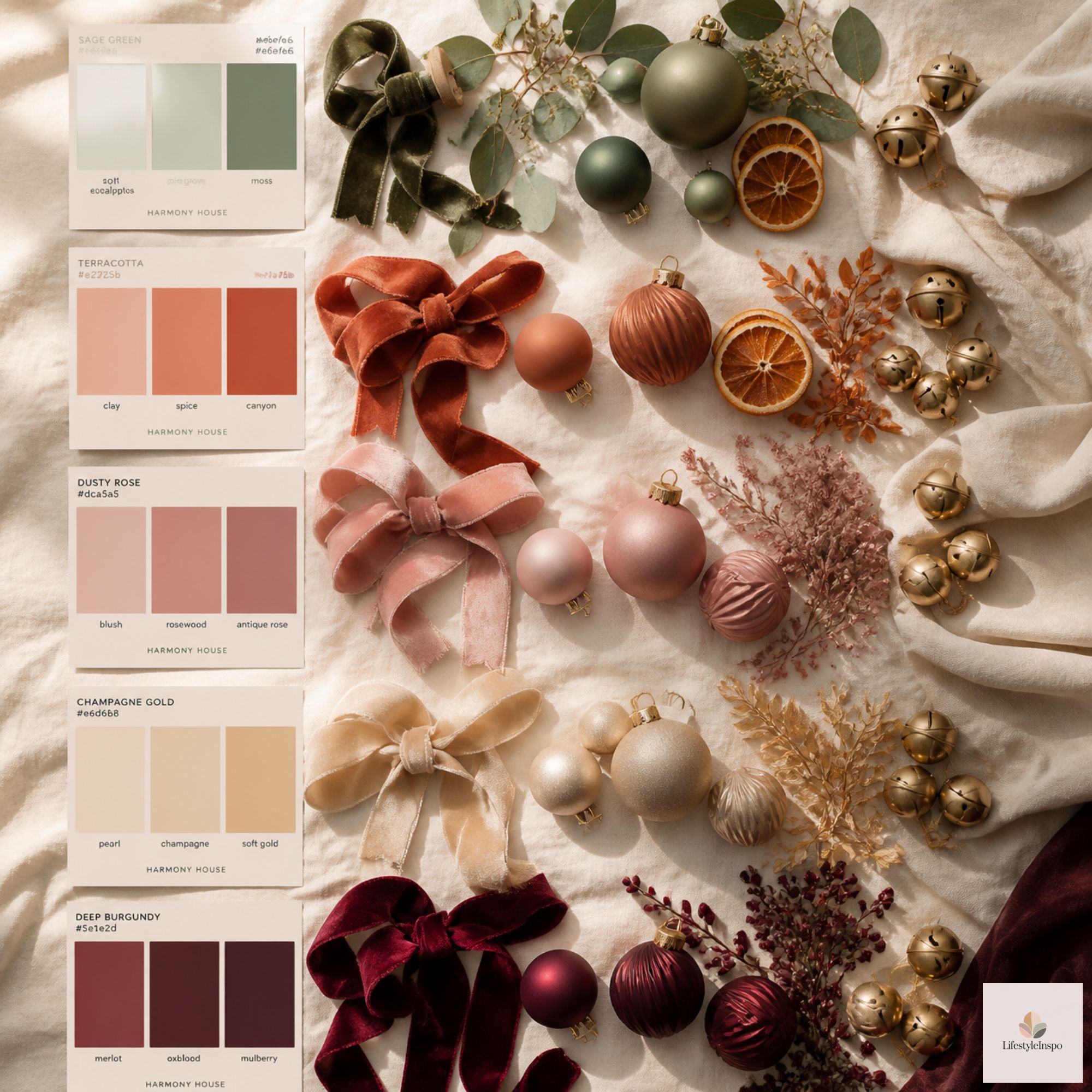
The Simple Rule: The 60-30-10 Formula
Designers use a simple ratio to keep palettes balanced, and it works beautifully for holiday decor.
- 60% dominant color: the main color, often a neutral or a natural tone
- 30% secondary color: the supporting shade
- 10% accent color: the pop that adds interest
For example, in a classic scheme, you might use 60% natural greenery and wood tones, 30% cream, and 10% red. Or in a neutral scheme, 60% white, 30% soft gold, and 10% deep green.
This ratio keeps the look balanced, and it prevents any single color from overwhelming the room.
Palette 1: Classic Red and Green
The timeless Christmas combination. It’s warm, nostalgic, and instantly recognizable.
Colors: deep red, evergreen, cream, and gold or wood accents
How to use it:
- Let greenery be the dominant color
- Use red as the star accent, in ribbon, stockings, and a few ornaments
- Add cream and gold to soften the contrast
Best for: traditional homes, families who love a classic look, and anyone who wants Christmas to look like Christmas.
A Christmas garland provides the green foundation, and you can layer in red ribbon and ornaments for the accent.
→ Shop it: Christmas garland pre-lit for mantel
Palette 2: Red, White, and Natural Wood
A cozy, farmhouse-inspired palette. It’s bright and fresh, with a touch of rustic warmth.
Colors: red, white, cream, and natural wood tones
How to use it:
- Use white and wood as the dominant colors
- Add red in plaid, ribbon, and small accents
- Bring in greenery for freshness
Best for: farmhouse, cottage, and cabin styles.
A plaid Christmas table runner is a great way to introduce red and cream in one piece.
→ Shop it: Christmas table runner plaid
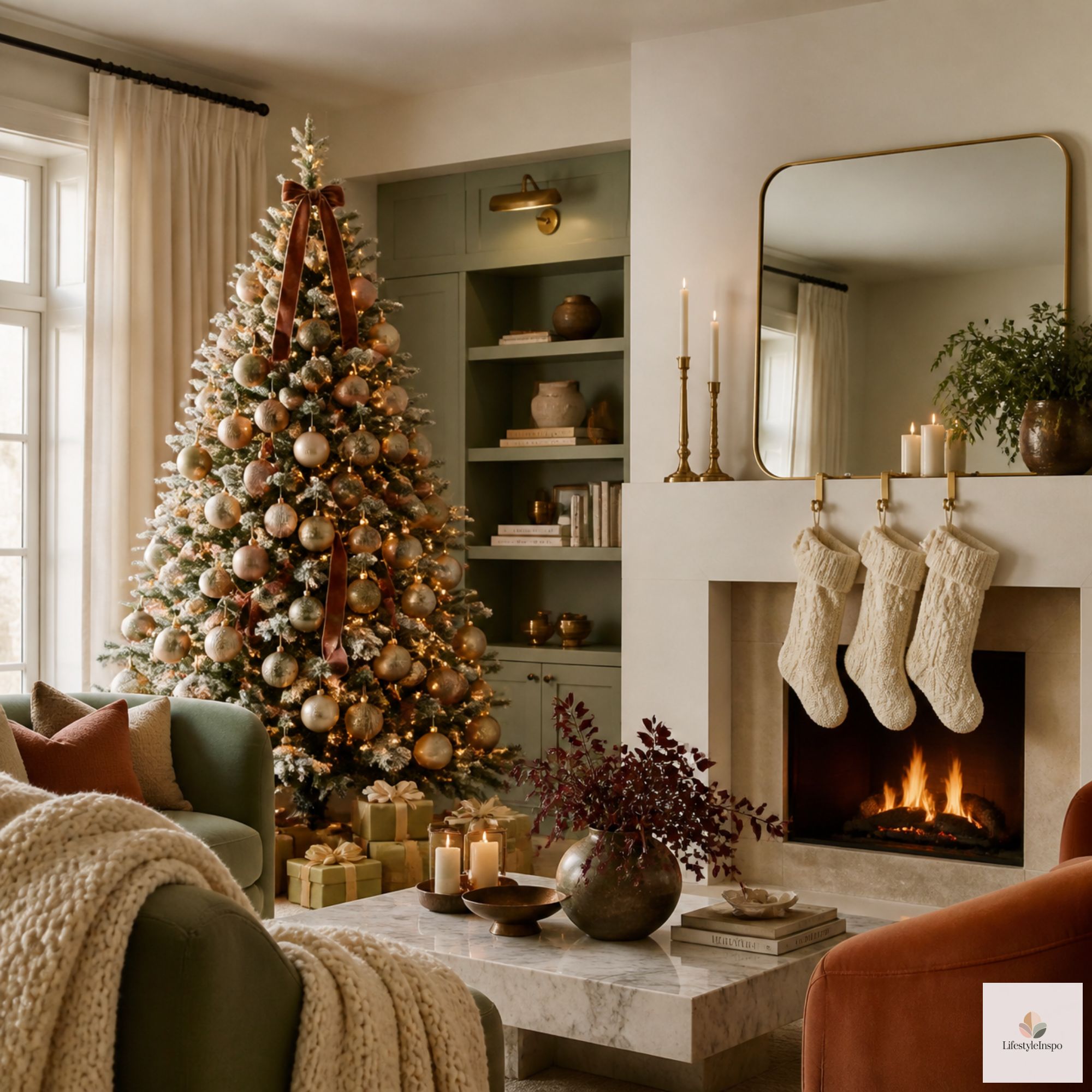
Palette 3: Warm Neutrals
A soft, calming palette that feels modern and elegant. It’s popular for people who like a quieter look.
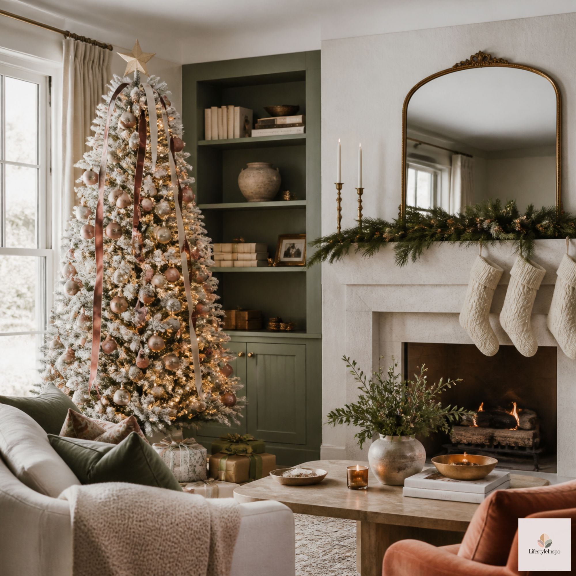
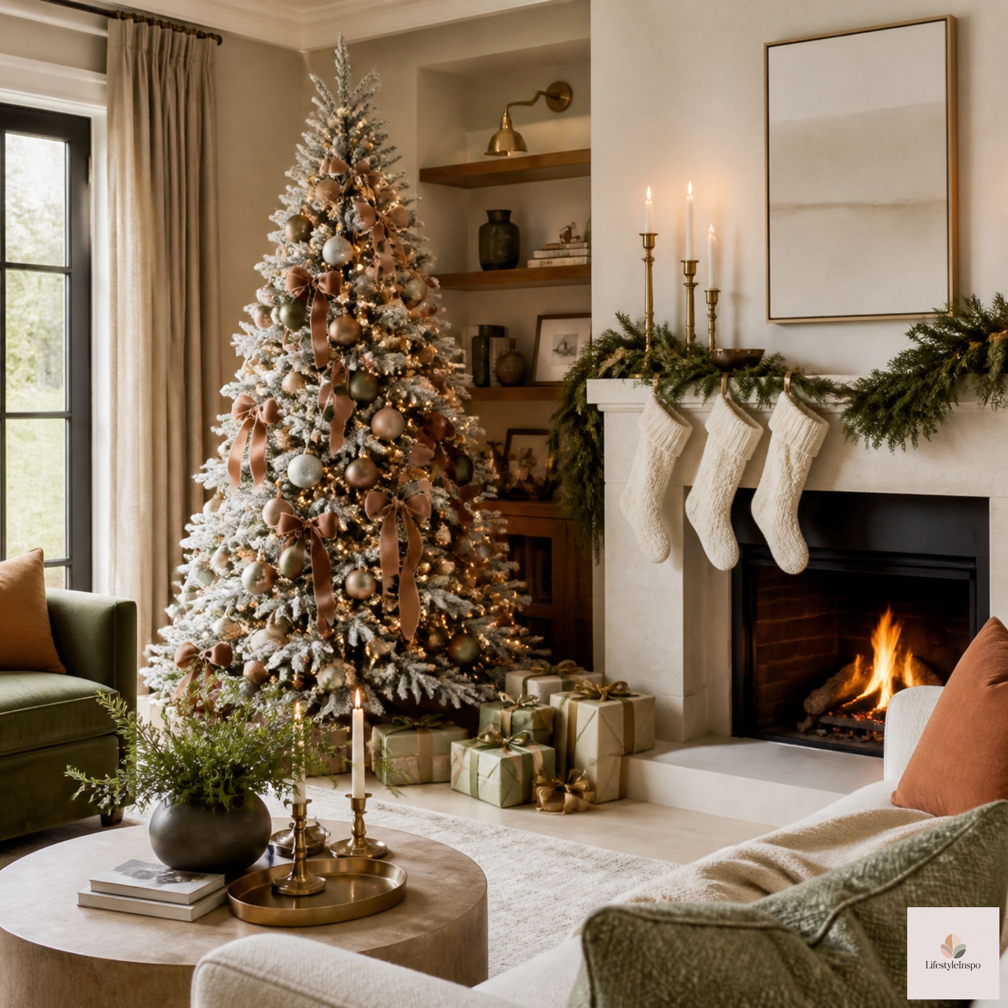
Colors: cream, beige, soft gold, and natural linen, with touches of green
How to use it:
- Keep the base soft and light
- Use texture, like knit, velvet, and burlap, to add interest
- Add greenery as the single bright note
Best for: minimalist, Scandinavian, and modern homes.
A roll of burlap Christmas ribbon brings natural texture to a neutral tree, and it works with every shade in this palette.
→ Shop it: Burlap Christmas tree ribbon
Palette 4: Gold and White
A glamorous, luminous palette that feels festive and refined.
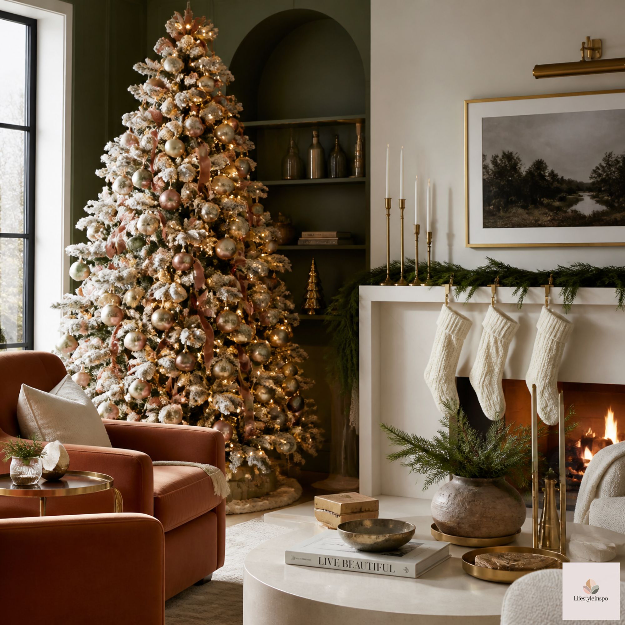
Colors: white, ivory, gold, and champagne
How to use it:
- Use white as the main shade, with gold for sparkle
- Mix finishes, like matte, glitter, and metallic
- Add warm white lights to make it glow
Best for: formal, elegant, and winter-wonderland looks.
Palette 5: Silver, White, and Icy Blue
A cool, wintry palette that looks like fresh snow and frost.
Colors: silver, white, pale blue, and a hint of gray
How to use it:
- Use white as the base, with silver and blue as accents
- Add mirrored or glass elements for reflection
- Choose cool-toned lighting for a frosty feel, but keep it consistent within the room
Best for: modern homes, apartments, and anyone who loves a crisp, snowy look.
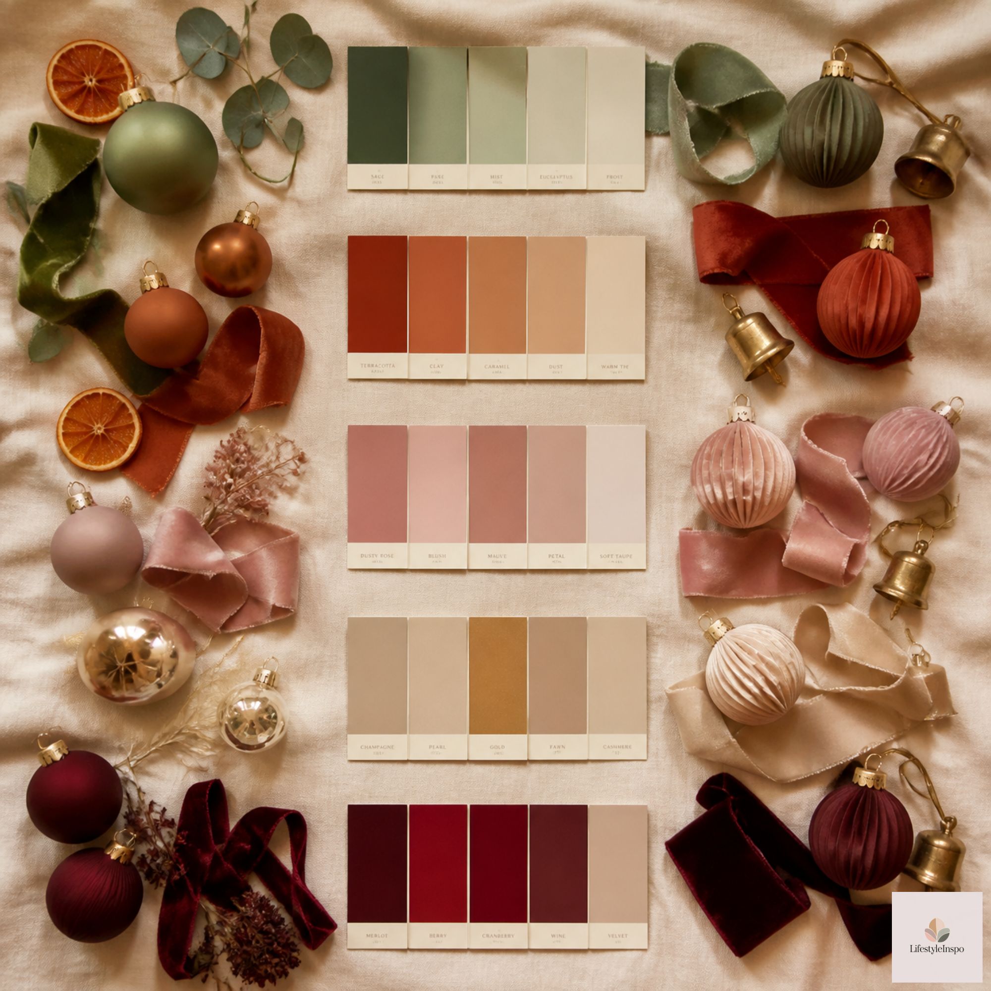
Palette 6: Moody Jewel Tones
A rich, dramatic palette for people who want depth and luxury.
Colors: emerald, burgundy, navy, and deep gold
How to use it:
- Choose one or two jewel tones as the main colors
- Use gold for warmth
- Add velvet and satin for richness
Best for: formal living rooms, dining rooms, and bold decorators.
Palette 7: Black, White, and Natural
A graphic, modern palette that feels clean and bold.
Colors: matte black, white, natural wood, and greenery
How to use it:
- Keep the black accents limited, for contrast
- Add warm wood and greenery to soften the look
- Use simple shapes and clean lines
Best for: modern, industrial, and minimalist homes.
Palette 8: Playful and Bright
A cheerful, colorful palette for people who love fun.
Colors: red, pink, turquoise, yellow, and green
How to use it:
- Distribute colors evenly across the tree and room
- Choose one color as the lead, to keep it from feeling chaotic
- Use white or neutral backdrops to let the colors pop
Best for: families with kids, retro lovers, and anyone who wants joy over polish.
How to Choose Your Palette
Not sure where to begin? Ask yourself these questions.
- What colors are already in my home? Your palette should work with your walls, furniture, and rugs.
- What mood do I want? Cozy, elegant, playful, or calm?
- What do I already own? Start with what you have, and build from there.
- What do I love? The best palette is the one that makes you happy.
- How much do I want to buy? A simpler palette often means a smaller shopping list.
If you’re torn, look at the colors in your favorite holiday photos or decor pieces, and see which ones show up most.
How to Repeat Your Palette Throughout the Home
The magic of a palette is in the repetition. Here’s how to carry it through.
- Tree: ornaments, ribbon, and a topper in your colors
- Mantel: garland, stockings, and candles that match
- Table: a runner, napkins, and centerpiece in the same shades
- Door: a wreath and a bow that echo the palette
- Gifts: wrapping paper and ribbon that follow the scheme
- Small accents: pillows, blankets, and candles that repeat the colors
Aim to see each main color in at least three places in each room. That repetition is what makes a palette feel deliberate.
Pair Your Palette With Ornaments and Accents
Ornaments are the easiest way to bring your palette to life. A coordinated set makes it simple.
A set of shatterproof Christmas ball ornaments in your palette colors gives your tree a cohesive, curated look. Choose a mix of finishes, like matte and shiny, for depth.
→ Shop it: Shatterproof Christmas ball ornaments set
For a finishing accent, plush Christmas gnomes in your palette colors add a playful touch to shelves and tables.
→ Shop it: Christmas gnomes plush decor
Mixing Warm and Cool Tones
One question that often comes up: can you mix warm and cool colors? You can, but with care.
- Choose one dominant temperature. Keep most of the room warm or cool.
- Use the opposite sparingly, as an accent.
- Use consistent lighting. Warm white lights flatter warm palettes, and they can also soften cool ones.
- Test with a small area first, and see how it feels.
A mostly warm palette with a hint of cool blue can look sophisticated, while a mix that’s evenly split can feel jarring.
Color Scheme Mistakes to Avoid
- Using too many colors. Stick to two to four.
- Mixing too many metals. Choose one or two, like gold and silver, and use them intentionally.
- Ignoring the existing room colors. The palette should work with your home.
- Forgetting neutrals. White, cream, and wood give the eye a place to rest.
- Not repeating colors. Repetition creates cohesion.
- Skipping texture. A limited palette needs texture for interest.
Christmas Color Scheme Ideas FAQ
What colors go well with red at Christmas?
Green, white, cream, gold, and natural wood are classic partners. Navy and black can make a bolder statement.
How many colors should I use?
Two to four is ideal. Use the 60-30-10 ratio to keep the palette balanced.
Can I mix gold and silver?
Yes, if you do it on purpose. Choose one as the dominant metal, and use the other sparingly as an accent.
What’s a good Christmas color scheme for a small home?
Light, neutral palettes can make a small space feel larger and calmer. Add a single accent color for personality.
Final Thoughts
A good color scheme is the quiet backbone of a beautiful holiday home. Choose a palette that suits your style, repeat it in at least three places in each room, and let texture and light do the rest.
You don’t have to follow the rules perfectly. The best palette is the one that makes you smile when you walk through the door. Save this guide for planning day, or share it with a friend who’s staring at a pile of mismatched ornaments.
About the Author